Project Title
Battle.net MTX Platform
Project Timeline
December 2021 September 2022
ReleaseD Date
October 2022
Project Detail
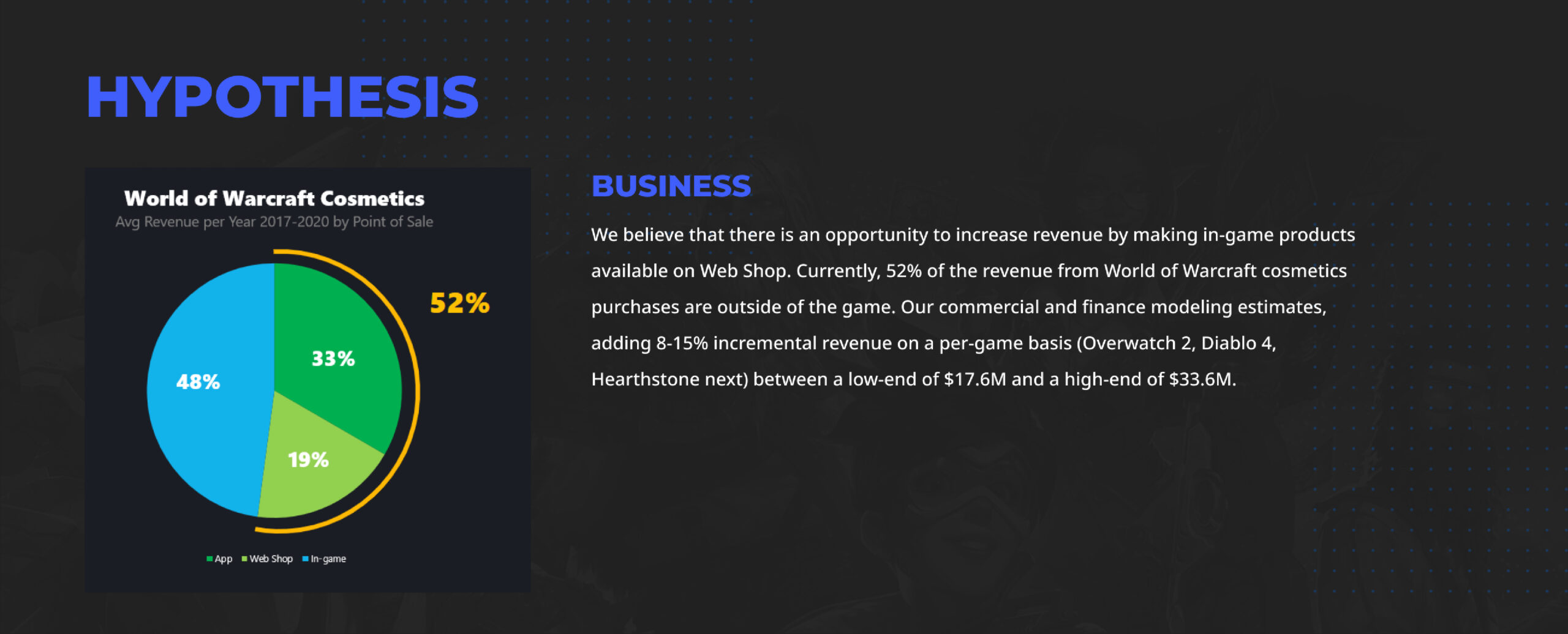
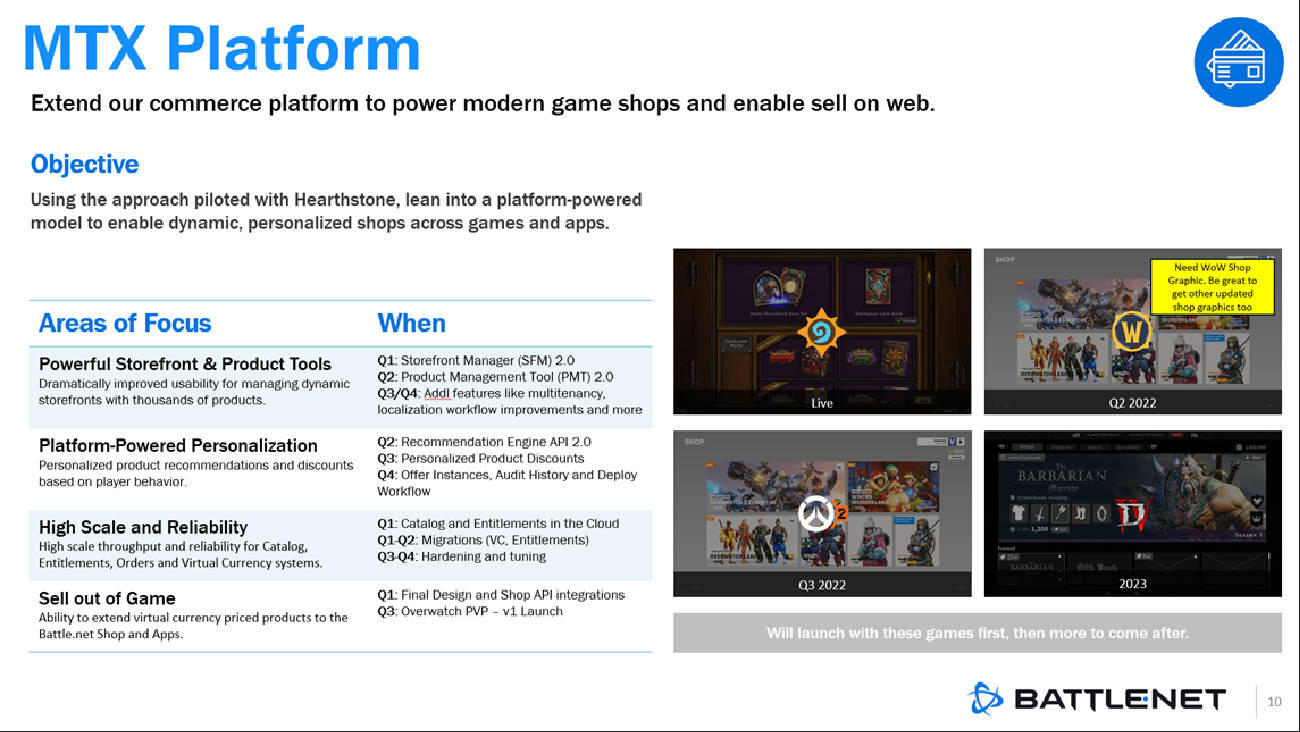
Many Activision Blizzard game teams want a dynamic, modern shop that not only offers a large catalog of products but also leverages premium virtual currencies. Overwatch 2, Diablo 4, and Hearthstone are next in the pipeline as the strategic teams to partner with to support the delivery of their shops.
The objective of this project is to expand the source of sales on the Battle.net Web Shop by offering future MTX products on the platform. This not only increases business value, but it also improves the shopping experience for our users.
My Role
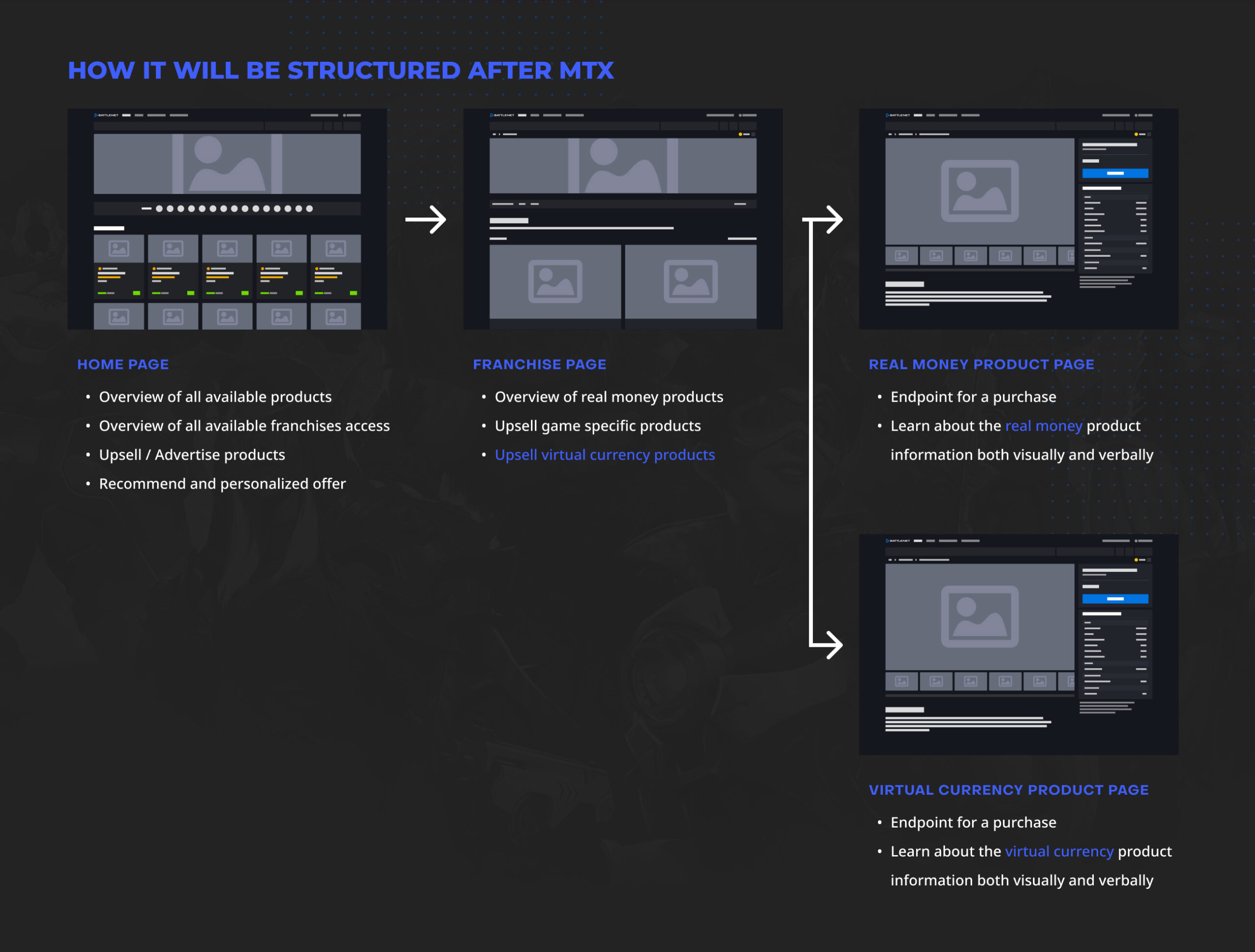
This project can be divided into 2 main parts: Franchise and Product pages. The Franchise page displays in-game products with various scenarios and user statuses while the Product page shows users information about in-game items. I was responsible for designing the Product Pages, which came with the key challenge of intuitively communicating the difference between the two sale types to users: bundle and single items.
Goals
Primary
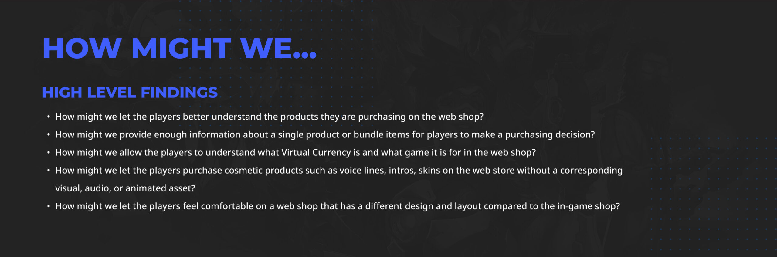
Discover which product information users need to understand in order to feel confident about purchasing an in-game product (both on the web and in-game).
Secondary
Understand what users want out of a web-based in-game item purchasing experience and what problems are being resolved by selling in-game items on the web.
Step 1
Research and Hypothesis
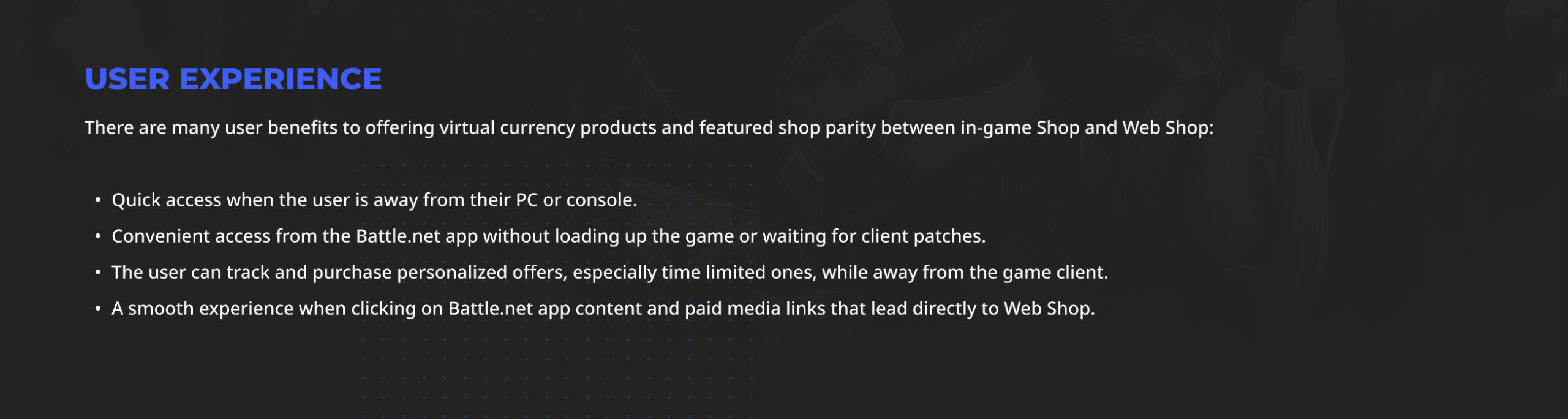
User Experience Benefits
Besides the basic user experience benefits, our team anticipates additional benefits with the MTX initiative.
advance Benefits (hypothesis)
- Increased discoverability across franchises, which may help bring back churned players.
- More Battle.net Shop platform-wide sales events that include in-game item products.
- Easier, more intuitive interface compared to using a controller on consoles.
- Give users the ability to view, share, and add products to Wish Lists.
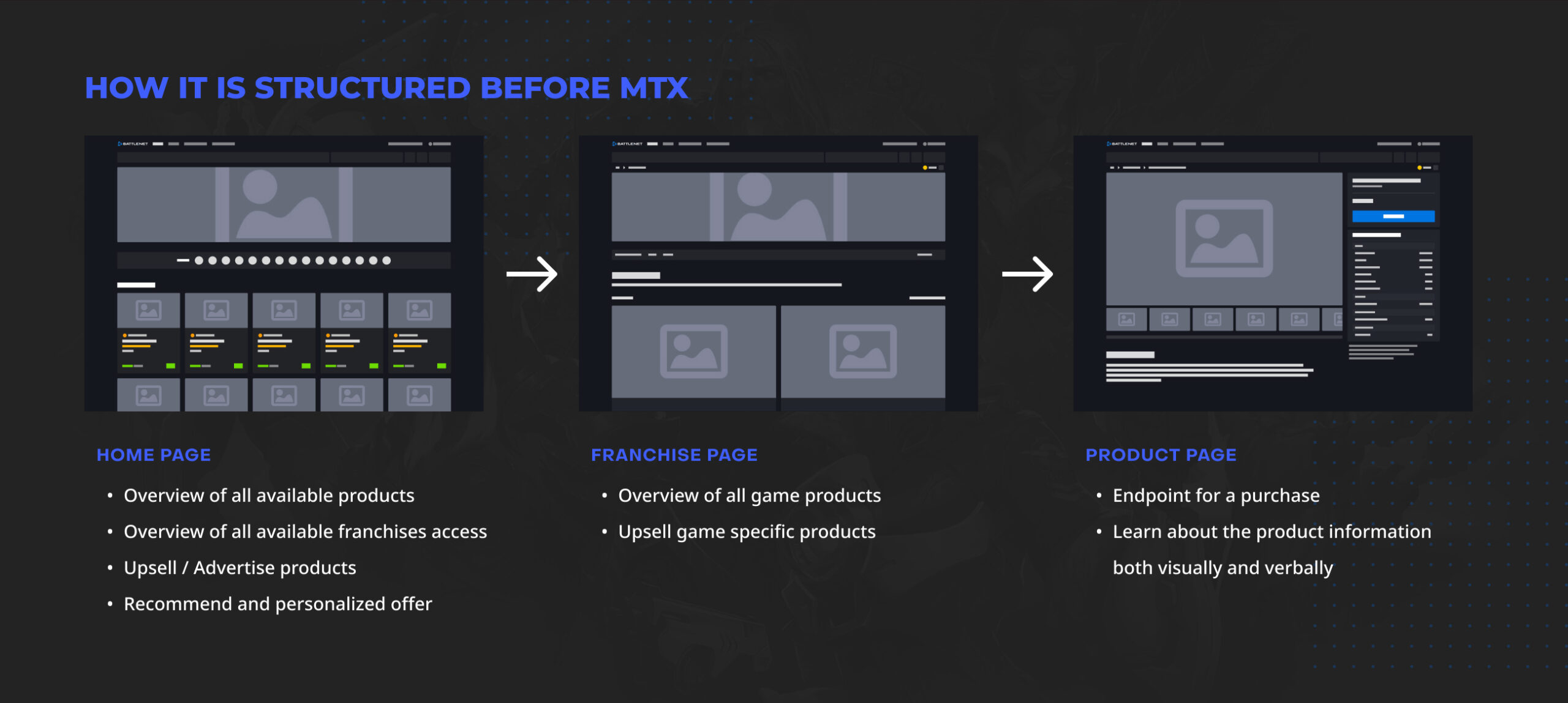
The current Battle.net system is not well adapted to incorporate the MTX initiative. In order to create the best user experience, it was crucial to first build a new infrastructure.
One of the main challenges was separating real money and virtual currency products. We needed to not only design a new UX to differentiate them but also create new components to support the designs. This required engineers to rework a significant chunk of the backend code to familiarize the platform to MTX products.
Another challenging part was to come up with a new product page. Virtual currency products required a lot more sophisticated sales information and user cases. I needed to come up with new UX features and components to support the needs of the target users.
Step 2
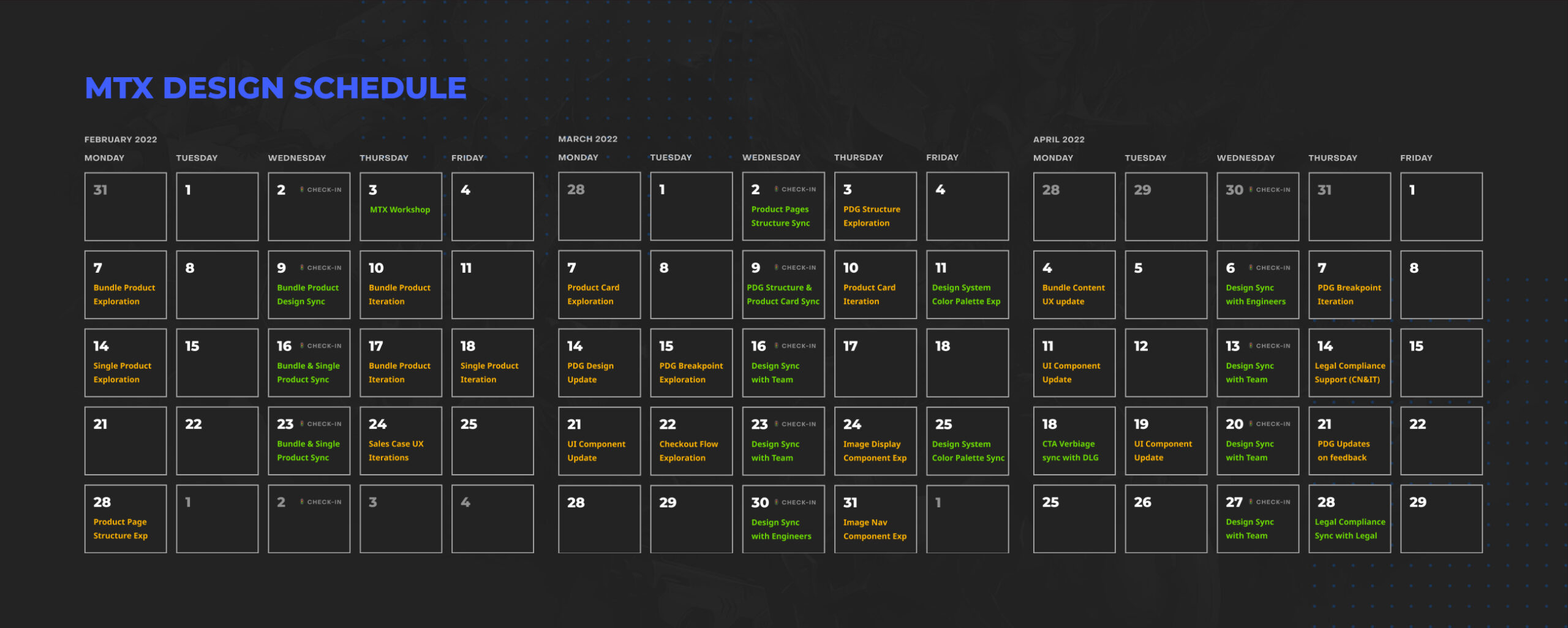
Design Planning Schedule
Meeting with Overwatch team to learn their BM
Meeting with Diablo team to learn their BM
Directional sync with B&OP Leadership
Team Workshop Findings
Planning Schedule & Workshop
The game team stakeholders first reached out to us in October 2021 and request the MTX platform to be released by June 2022. However, 8 months of time was not enough considering this project required a whole new set of features.
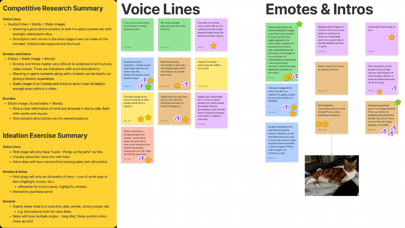
Thew research work was split between the designers. But initially we could not get accurate analytics data because the business model behind MTX was unprecedented. We continued to reach out to stakeholders and leadership to gather as much information as possible.
Traditional UX approaches were not feasible due to limited time. So, the designers agreed to adopt the process of Lean UX sprints along with collected observations and hypotheses because this style would save a lot of time while building features quickly.
Step 3
Design Exploration and Final Design
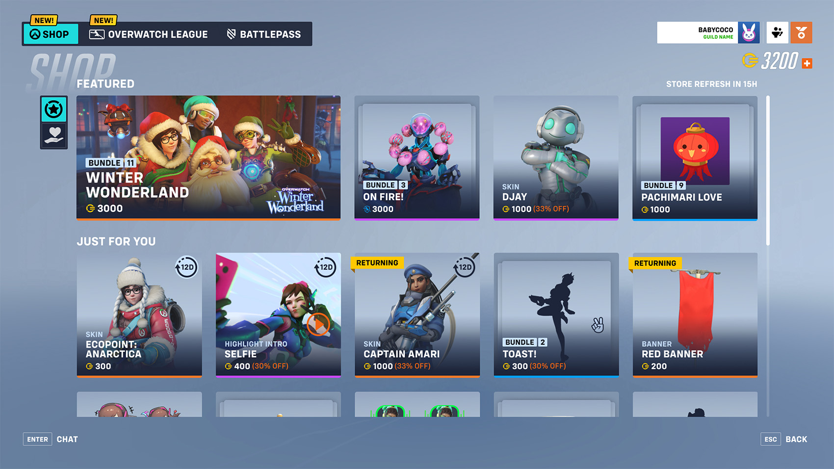
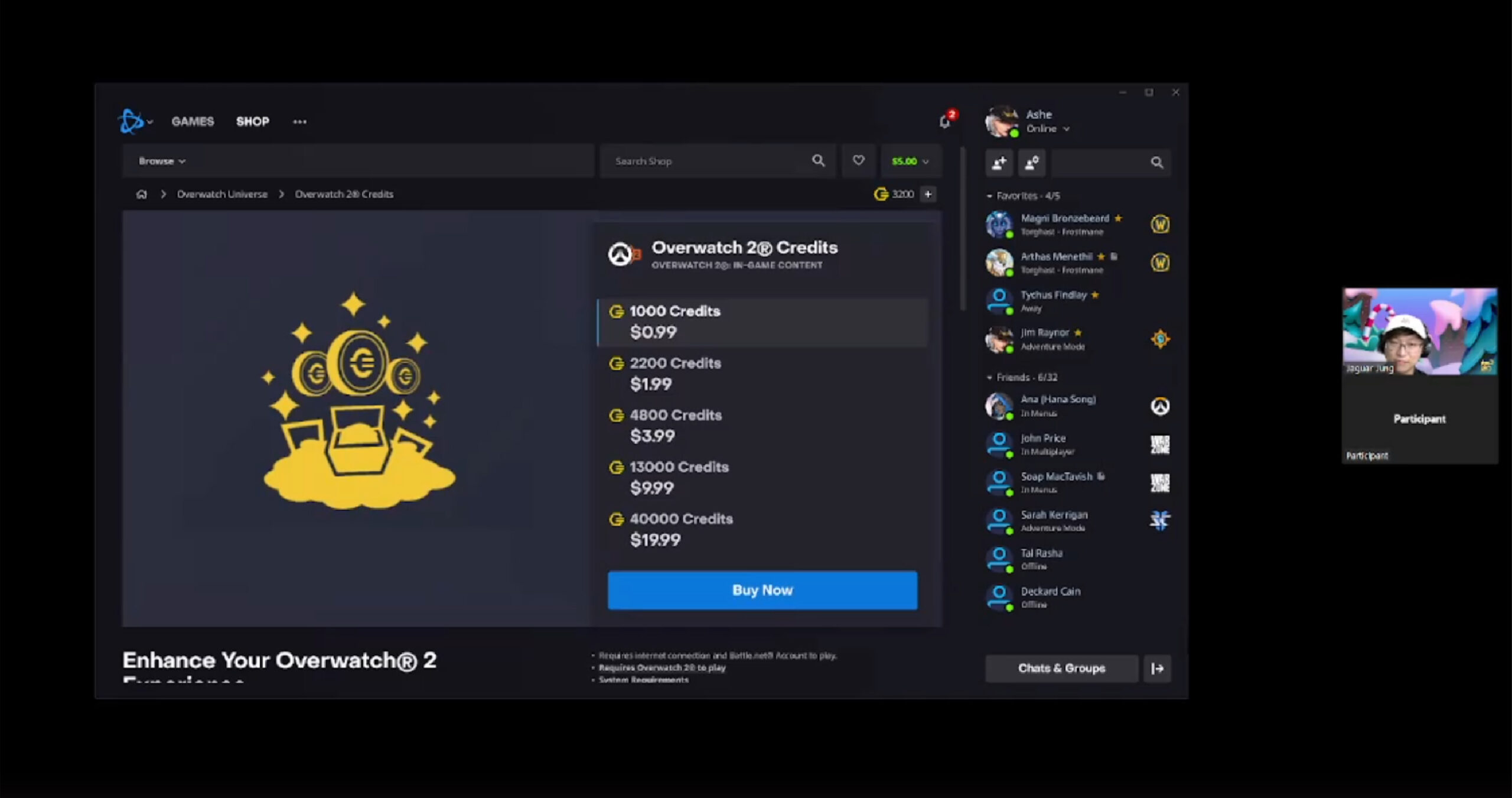
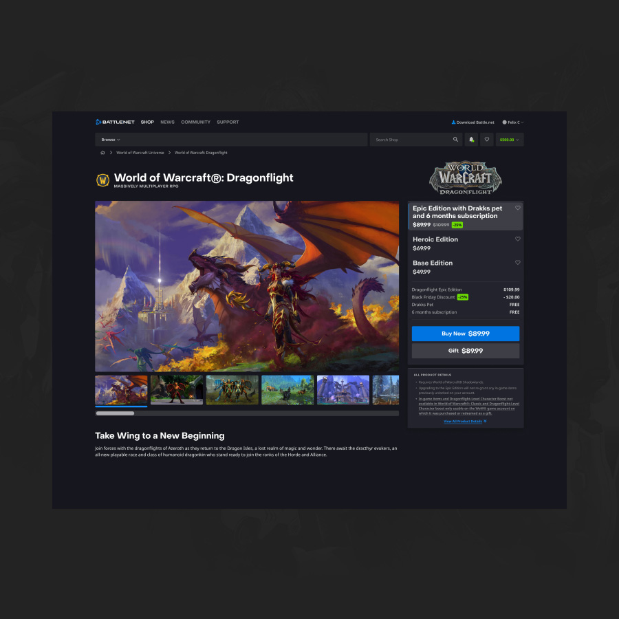
Product Page look without MTX features integrated
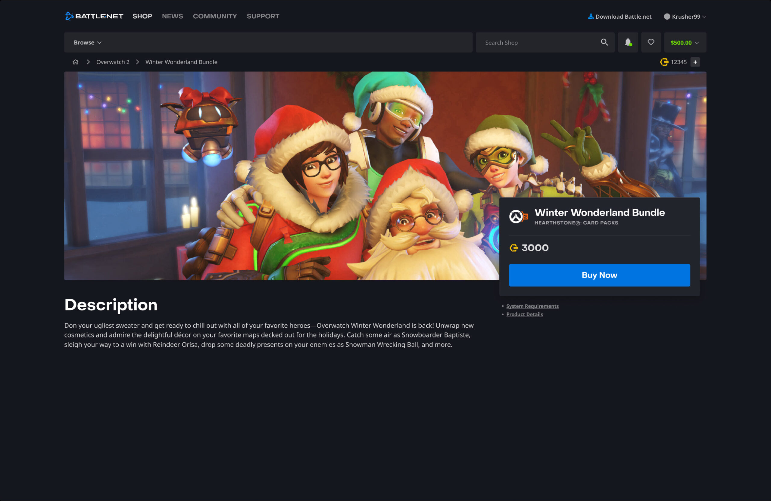
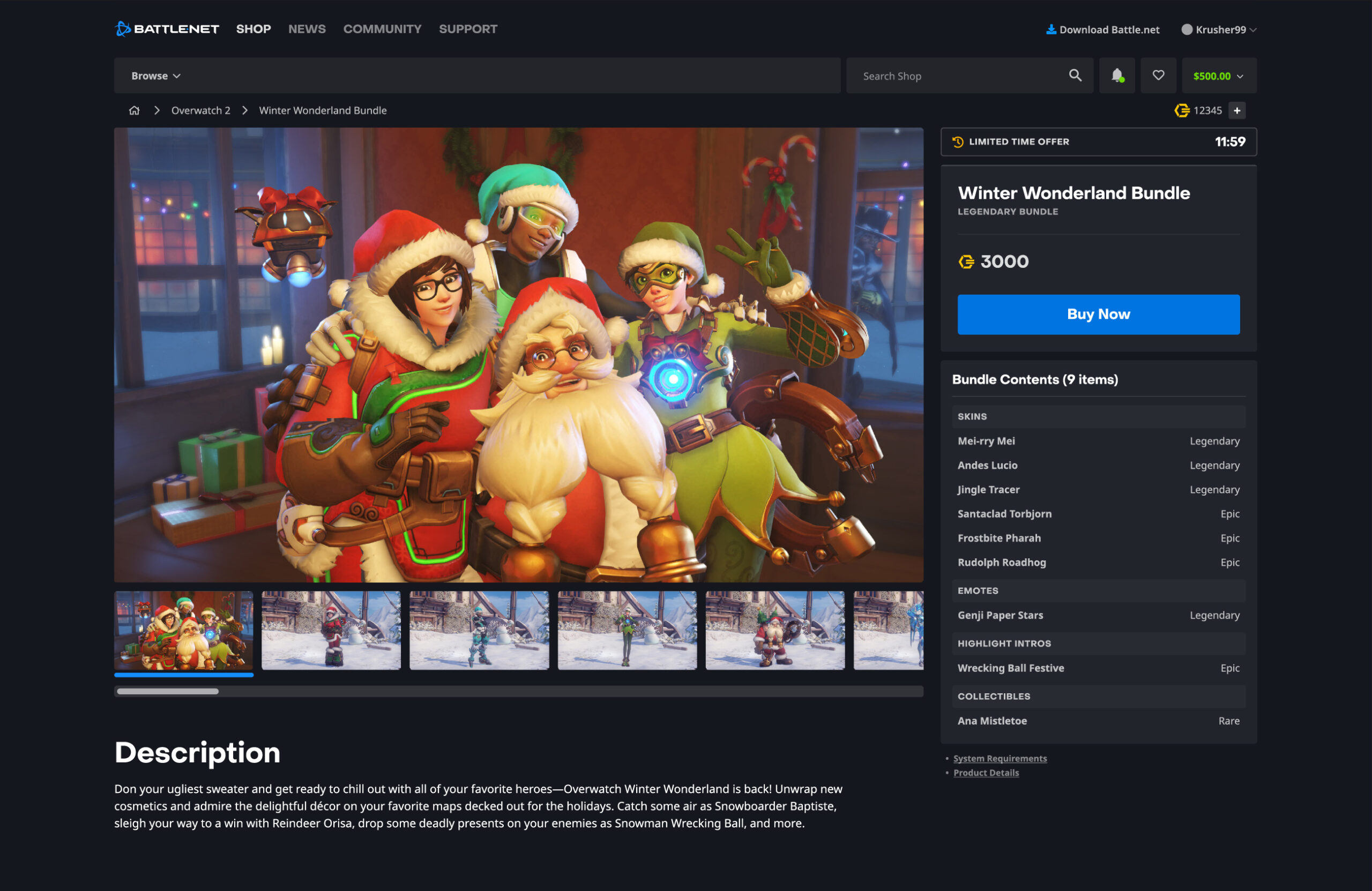
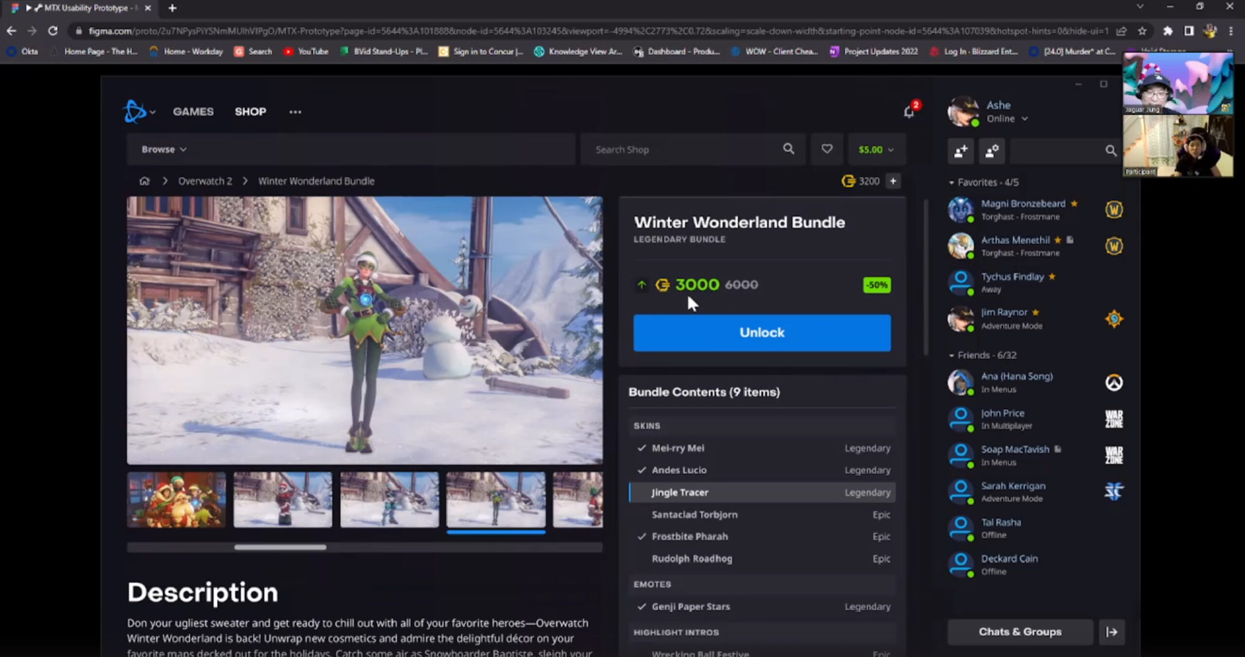
MTX Product Page
Product Page look after MTX features integrated
The outcome of this MTX project can be categorized into 3 major parts: Franchise Page, Product Page, and Checkout Stage. Because I worked on the product page redesign, I had a lot of expertise on the Product Page and that allowed me to make most of the decisions. All the previous research, user testing, stakeholder interviews, workshops and team syncs turned into a huge asset on this MTX Product Page design.
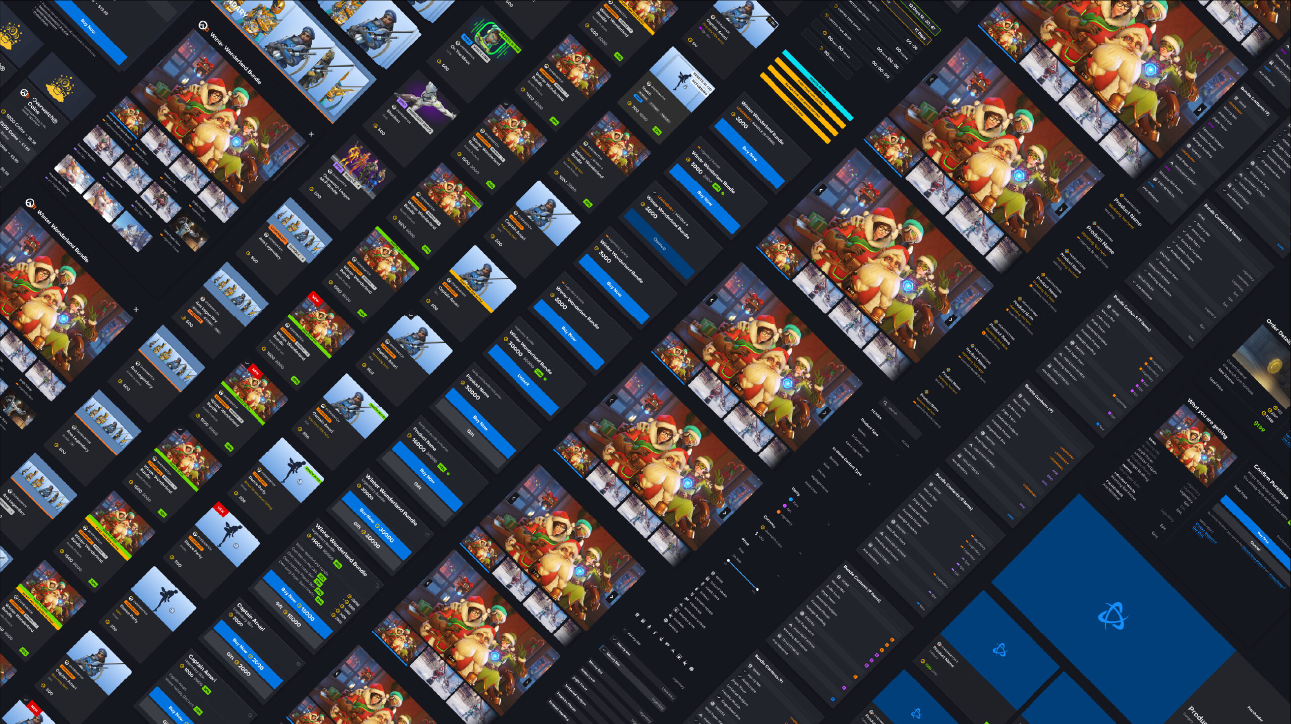
Design Explorations
Although I managed the Product Page and the other pages were managed by other designers, I was involved in other components.
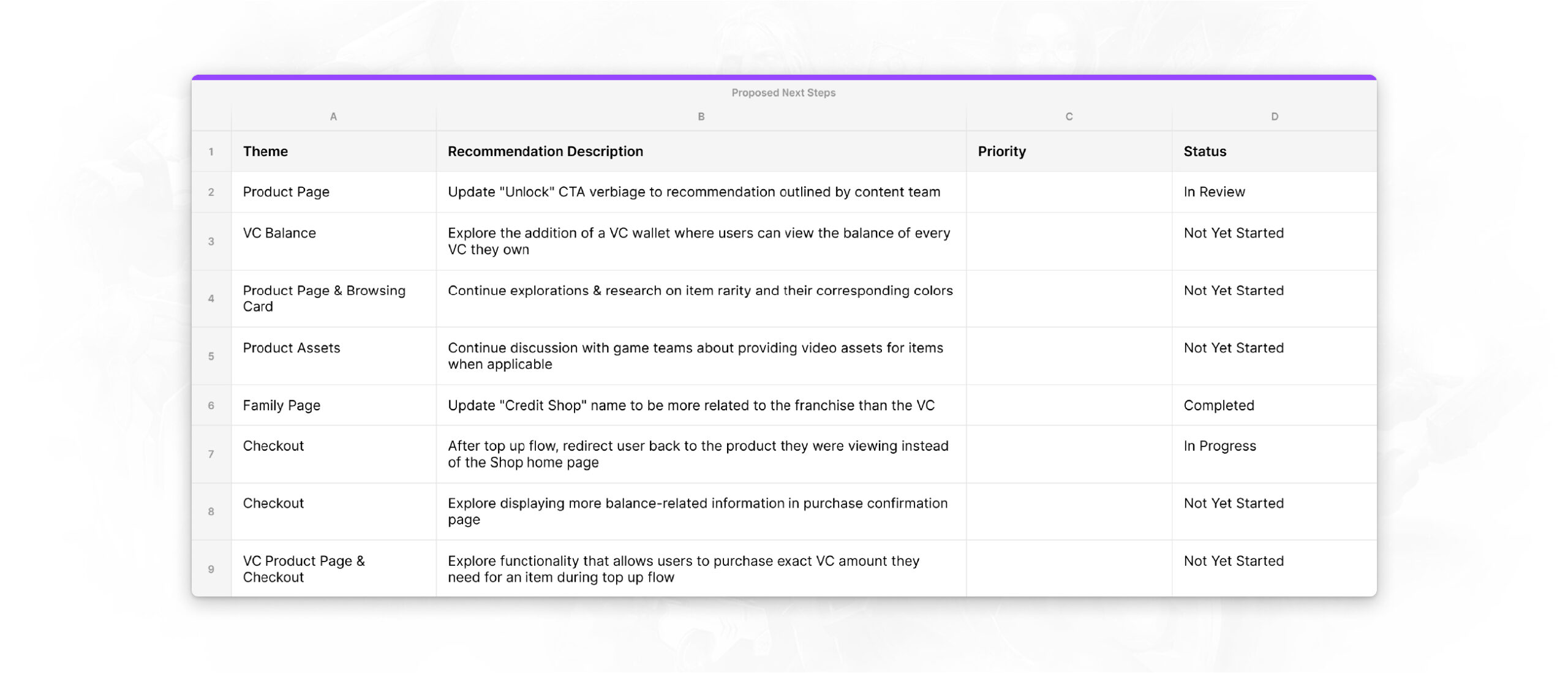
During the exploration stage, many new UX feature updates and new components were suggested. Unfortunately, a lot of them were pushed back to Phase 2 of MTX due to the lack of validation from analytics data. Although these features are postponed, I plan to come back to them with more user research and analytic data. Some of these features include an… Item Rarity Indicator, Icon Integration, Redesign “Owned” Indicator, and Visualize Discount Reasons.
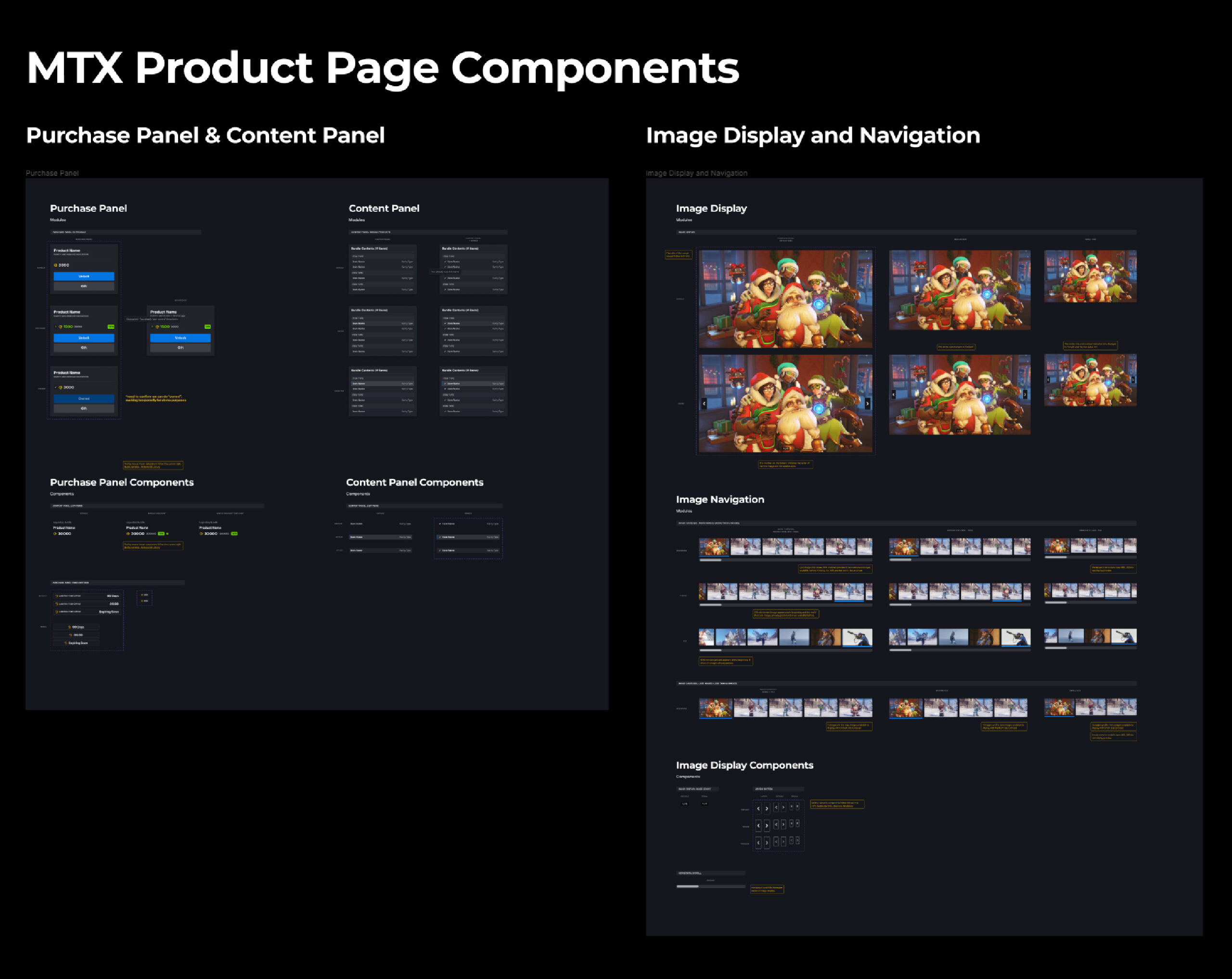
Introducing New Components
Battle.net Web has an extensive pre-built UI Library that allows designers to reuse components to support new features. However, it was difficult to reuse existing components to build the new UX features for MTX so we needed to create new components.
I spent a lot of time iterating the design with front-end engineers and other designers to make sure that the new components not only worked well with existing components but also seamlessly integrated into the new MTX pages.
These new components that we created are a Virtual Currency Product Card, New Purchase Panel, New Content Panel, Limited Time Offer Indicator, New Image Display, New Image Navigation and New Product Page Structure.
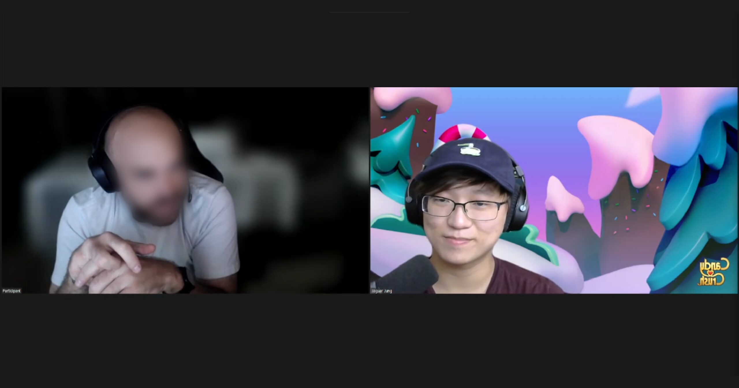
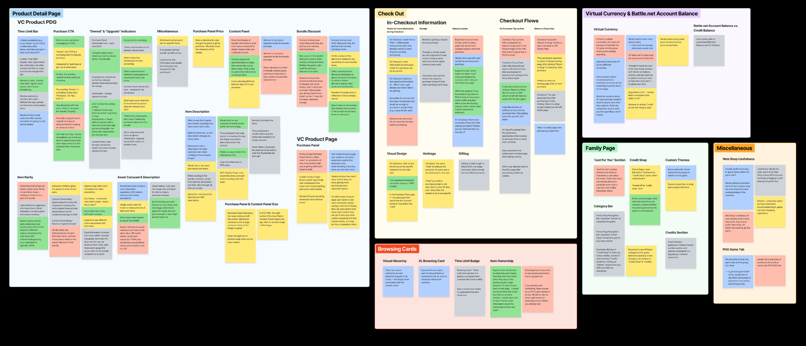
User Testing
Our team reached out to 5 participants for user testing with the help of the UX Research team.
Primary Goal
- Validate designs that utilized the findings & recommendations from previous MTX research study and identify pain points within the MVP MTX experience in Shop.
Secondary Goal
- Validate our assumption that users are able to easily discern MTX products from real money products based on sectioning and section styling.
- Validate the placement of the VC amount & CTA within the tertiary nav bar.
- Validate the information hierarchy displayed to users for MTX products within the family page and product details page.
- Validate our assumption that users will easily understand the implications behind an “owned” checkmark next to a bundle item.
- Validate our logged out flow.
Research team could have discovered many good insights but due to the time constraints, the team had to narrow down and only focus on some features. Team made an Impact & Effort diagram and filter out the low hanging fruits first. The other features were archived and pushed for MTX Phase 2.
New MTX Product Page Interaction
When Some Items are Owned Case
Single Product Page and Top Up Flow
Final Thoughts & Takeaway
Although the timeline was extremely tight, I enjoyed working on and am proud of having contributed to the MTX project as I learned a lot and grew from this experience. I look forward to working on Phase 2 of the project!
Check my other works too!


© 2025 Felix Junghwan Choi; All rights reserved.