Project Title
Battle.net and Online Products; Logo Redesign
Project Detail
Two departments, “Battle.net” and “Web & Mobile”, merged and turned into one giant department in 2019. We wanted to keep the “Battle.net” brand identity but also to keep the Web & Mobile’s spirit. We came up with a new name “Battle.net & Online Products” and now we needed a new logo.
The Team
Group Design Manager - Mike Metcalf
Design Lead - Hawke Bassignani
Designers - Felix Choi, Daniel Peterson
My Role
Redesign Battle.net and Online Products Logo with 1 other designer and 2 leads.
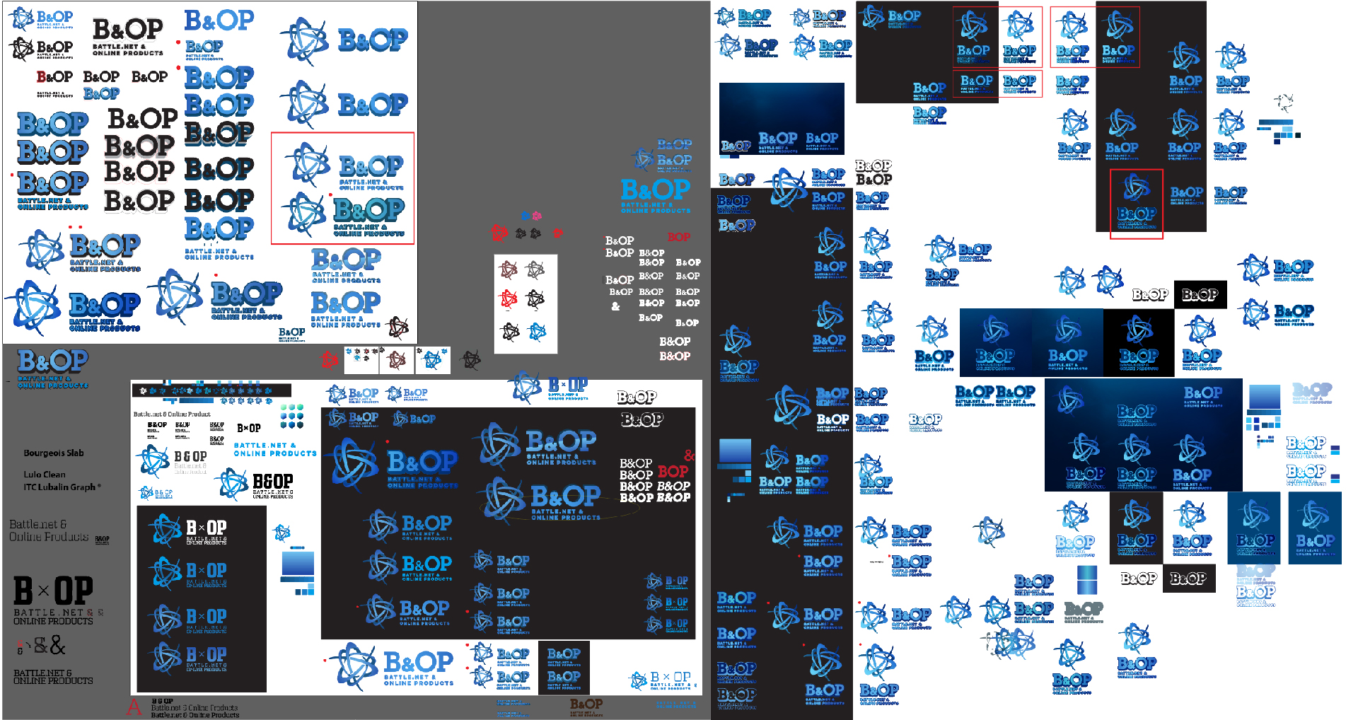
Our Working Files
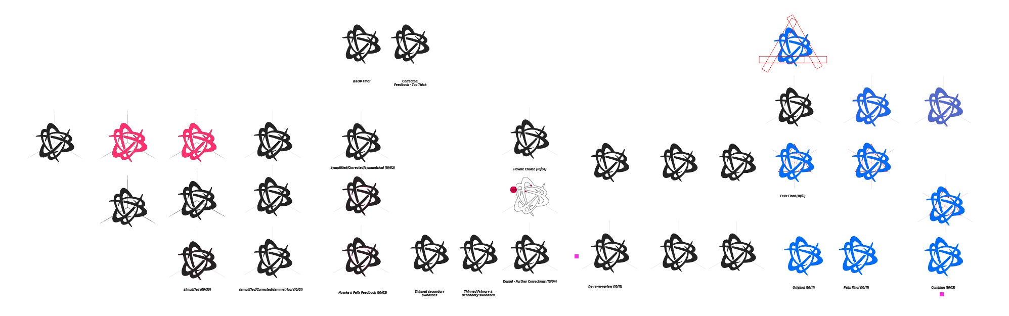
Bloom corrections - Bit by bit.
The key was to redesign around consistent geometric shapes.
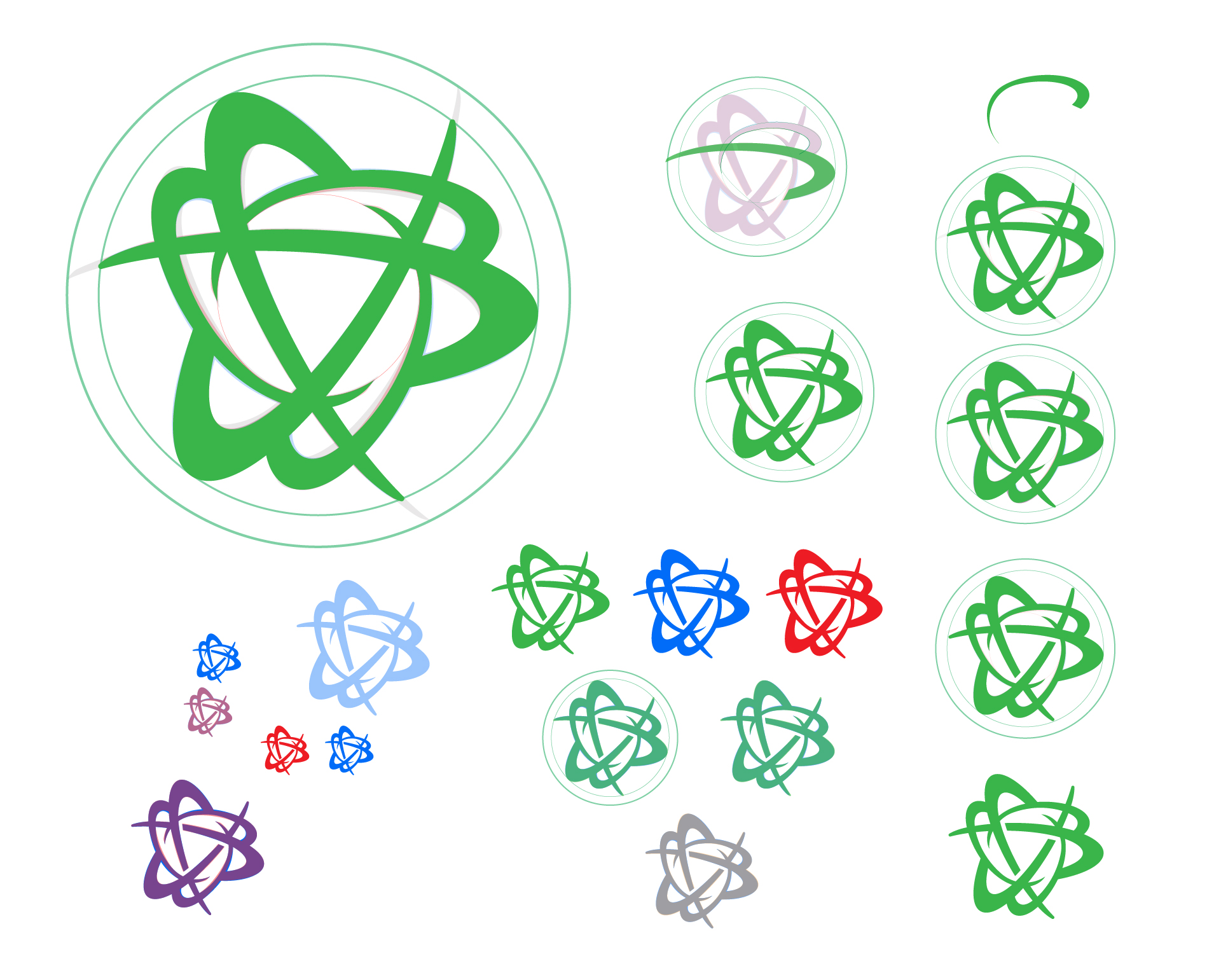
Modified to fit into a circular form, the tail of the bloom was too long and sharp. It felt a bit intimidating.
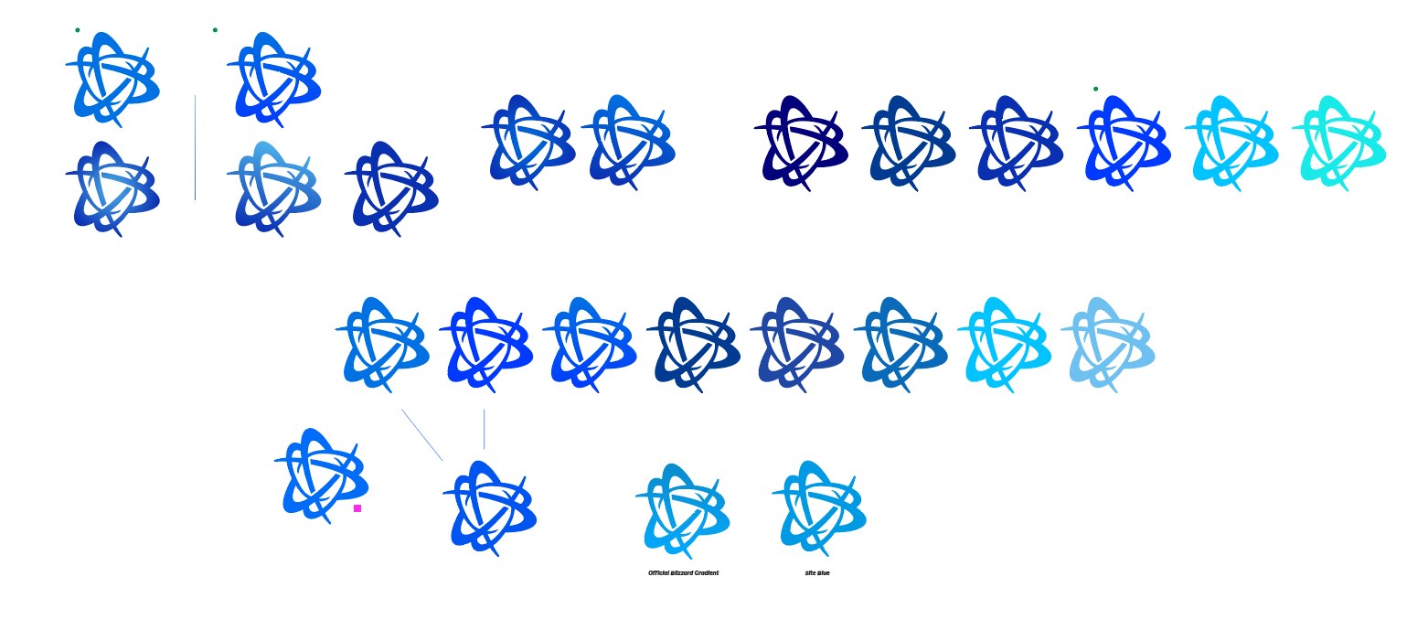
Exploring colors. There are a LOT of blues.
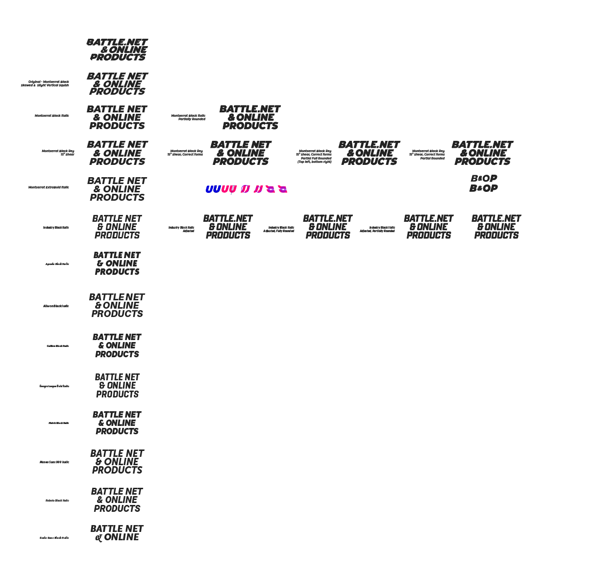
Type Exploration. We knew we wanted the logo to feel modern and energetic, but what typeface would feel the best?
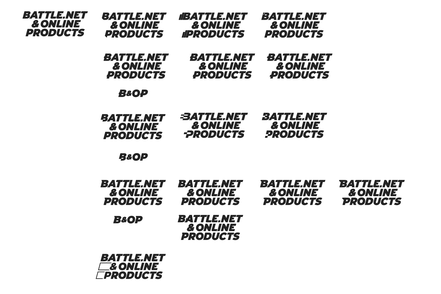
Character exploration. We wondered if the type needed some more oomph. But then we had to ask ourselves, "Is less oomph really more oomph...you know?"
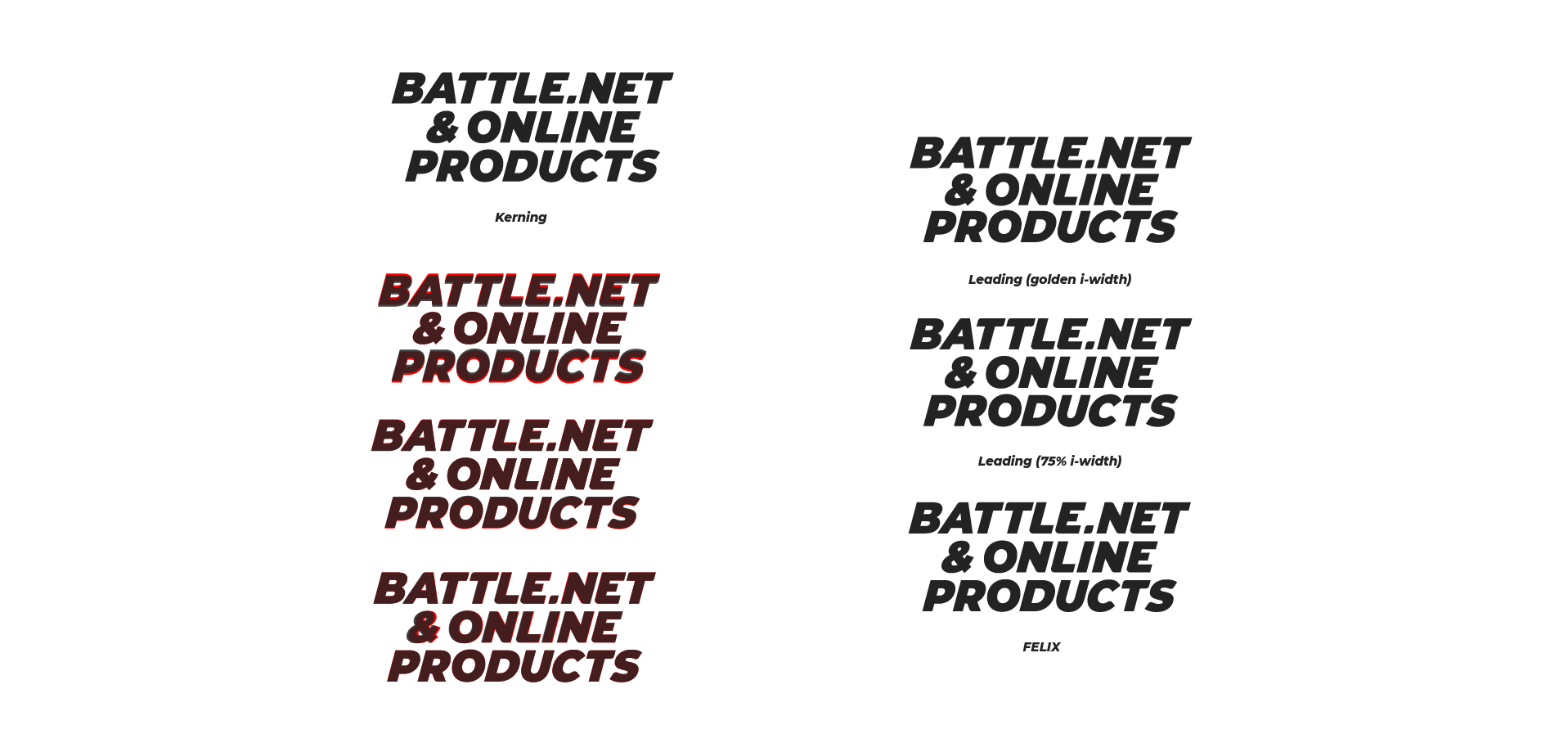
Kerning exploration
Exploring the great (un)known
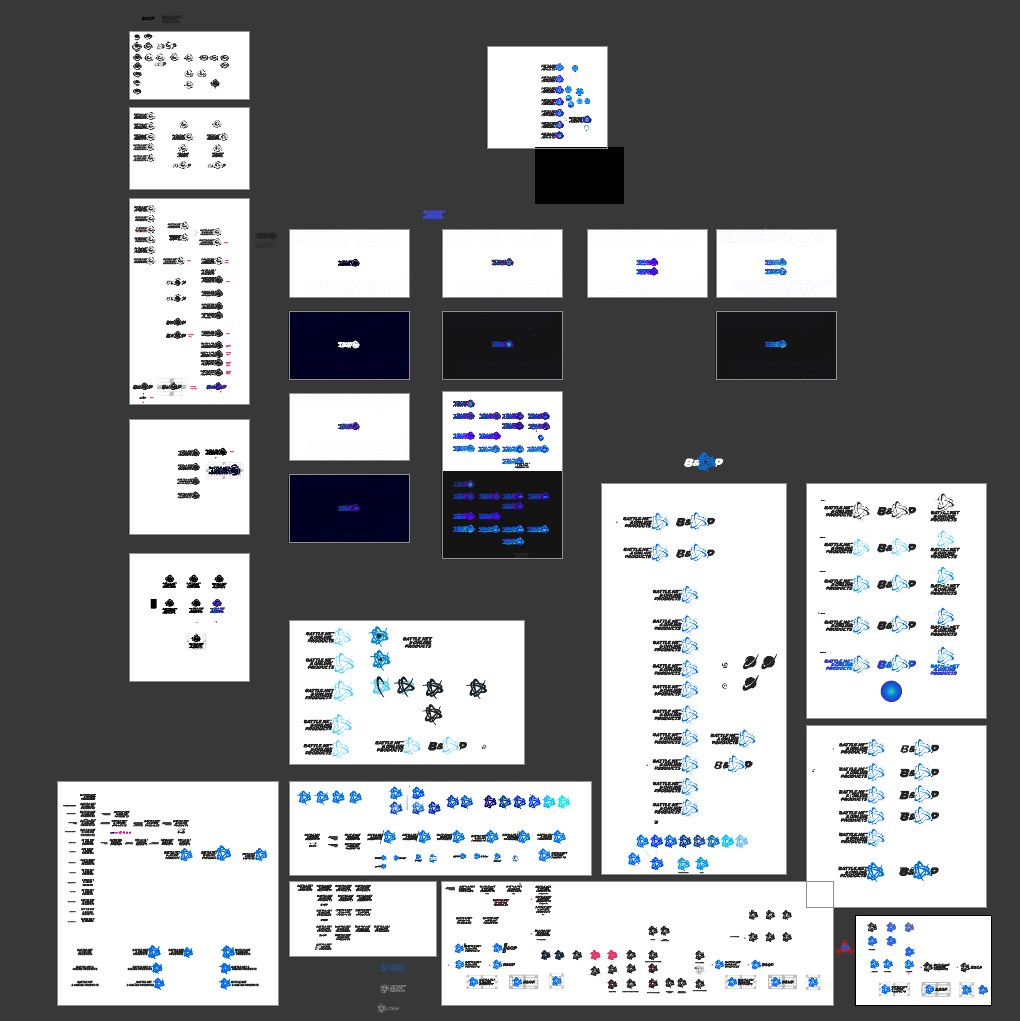
Our second round of logo exploration focused on incorporating the bloom with a modern type that would communicate the energy that powers Battle.net & Online Products. The end result might look straightforward, but our working files tell a story of lengthy iteration and polish.
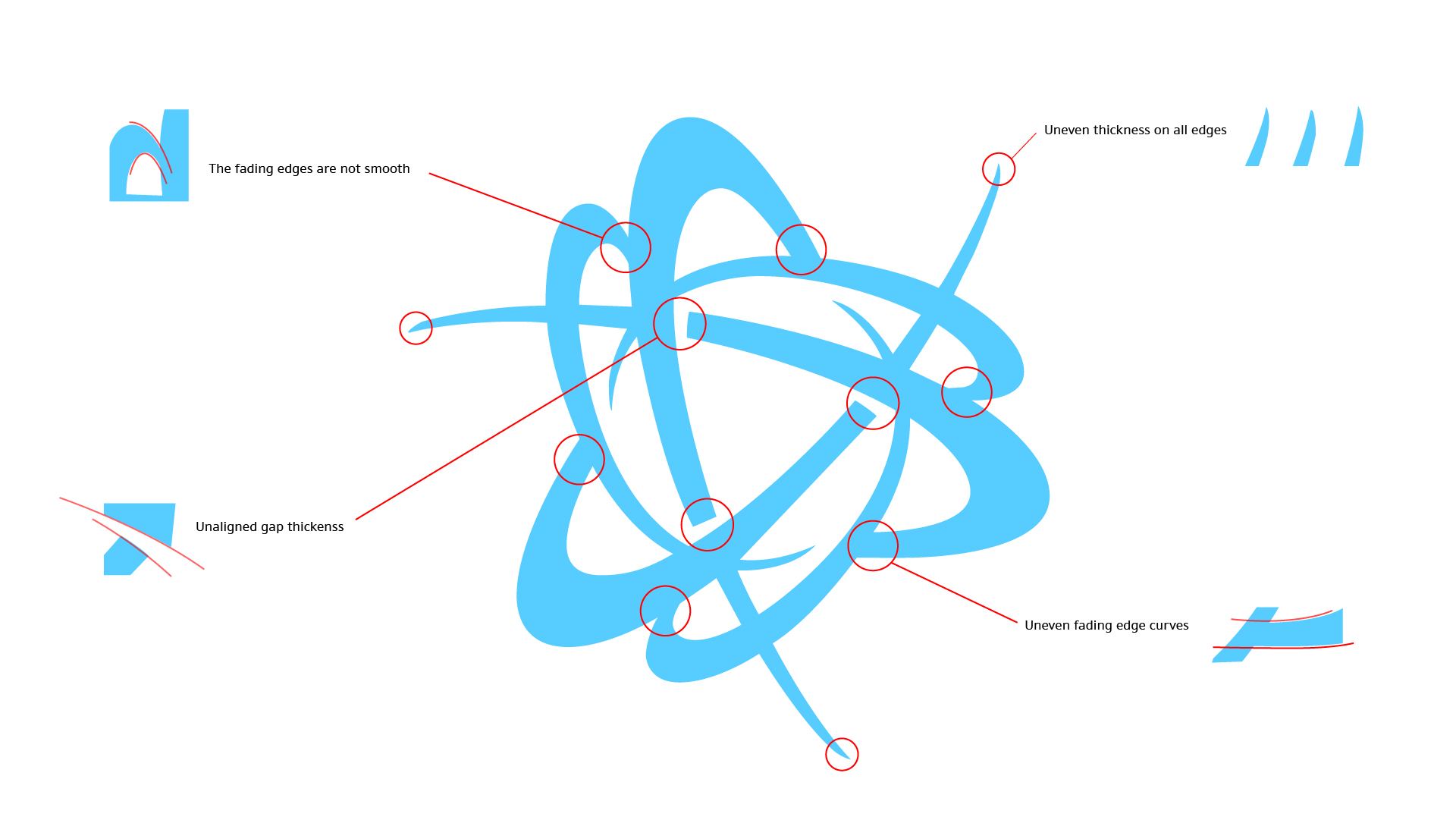
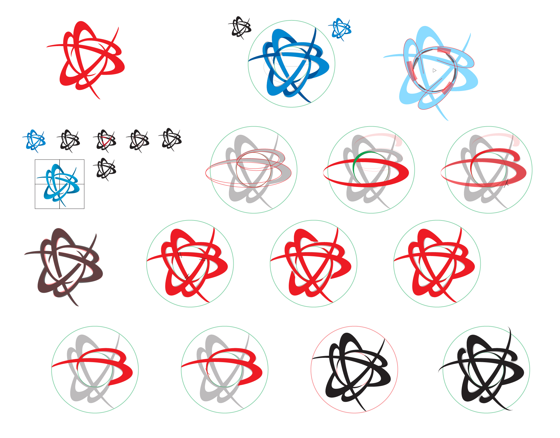
Identifying issues with the old bloom.
The flow of the original bloom lacked smooth curves.

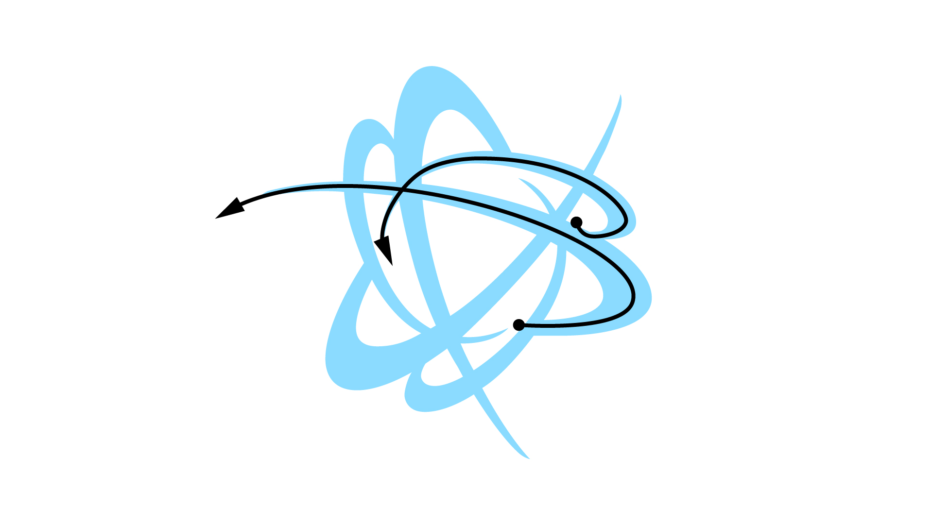
Now you can see curves that are more consistent and pleasing. The curves that form the center of the updated bloom follow more consistent rotational physics.
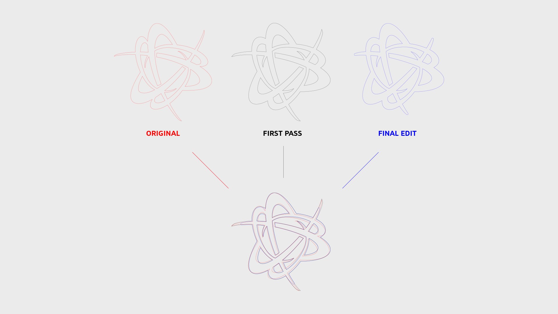
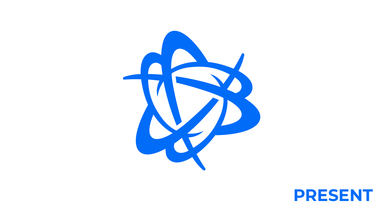
A Better Bloom
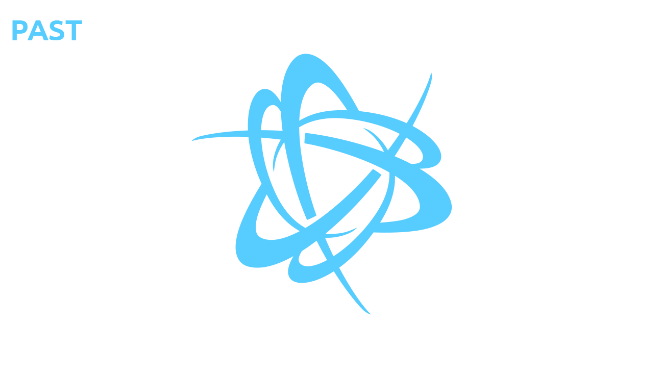
The old Battle.net bloom, still in use externally, suffered from several issues. Inconsistent curves, extraneous anchors (points used in shaping curves), and harshly terminating spokes caused the mark to struggle with smaller sizes and placement.
Felix’s initial redesign highlighted the triangular flow and added much needed weight. From there, Felix and Daniel corrected the curves to feel more natural and adjusted the weight and placement of the terminating points to allow the mark to be more flexible when locked up with the type or on its own.
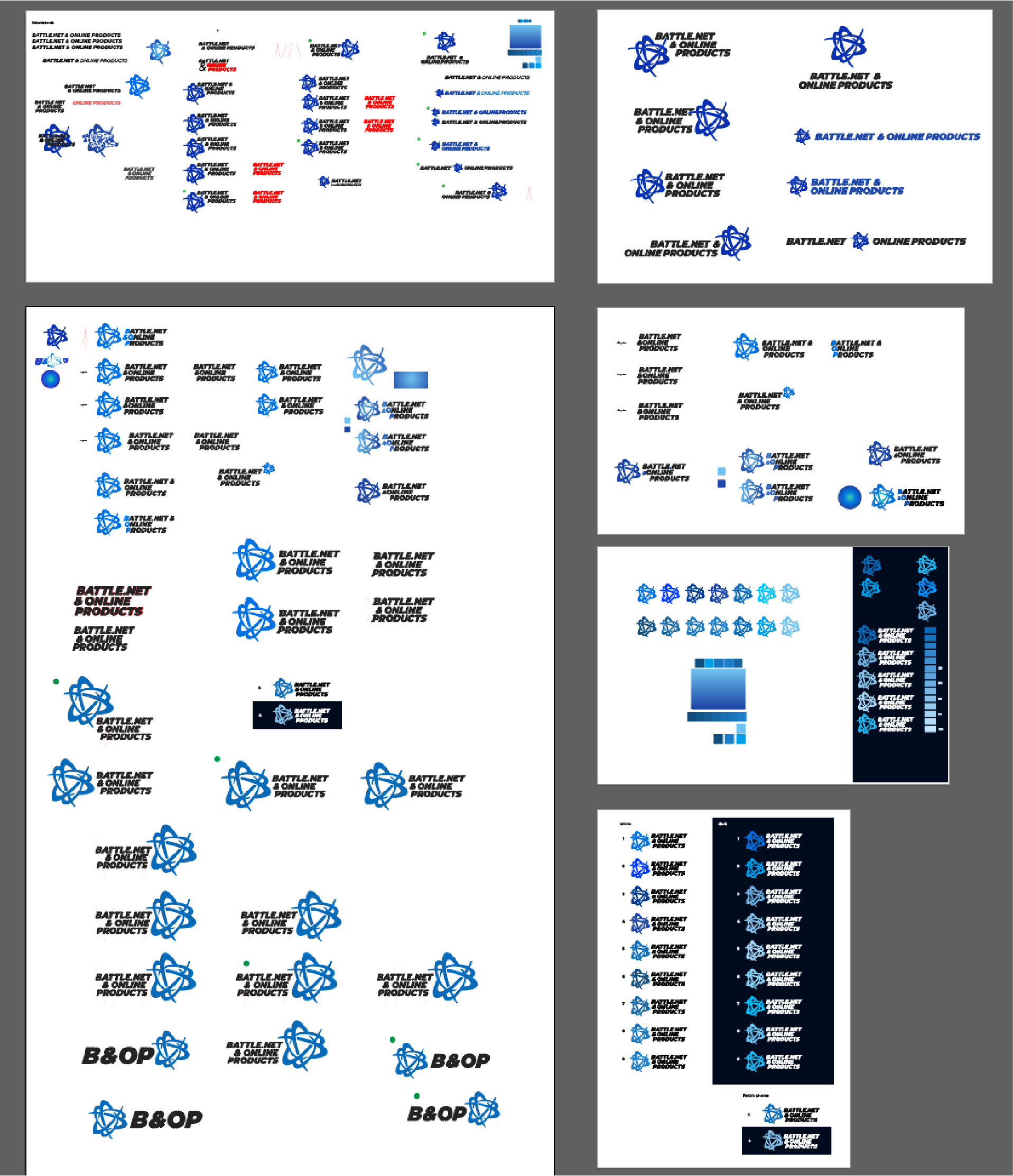
For the Type Nerds
Currently, the most commonly used Battle.net type is the Blizzard typeface, set below the blizzard logo. In the past, we have used a strong, although somewhat dated, industrial monospace type that incorporated a hefty weight, strong lines, and select rounded corners.
We wanted to incorporate that character by choosing a modern typeface that felt a bit less industrial while still communicating the energy you would expect from Blizzard.
We landed on Montserrat Black, which we then sheared, customized, and adjusted to better incorporate with the mark. Once we had the right type, we hand-kerned and tweaked the leading for the best possible read.
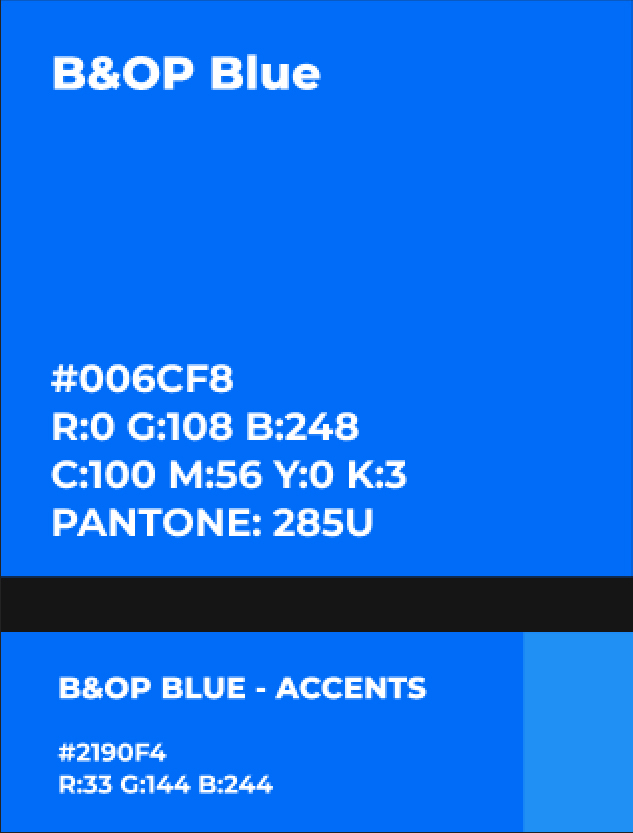
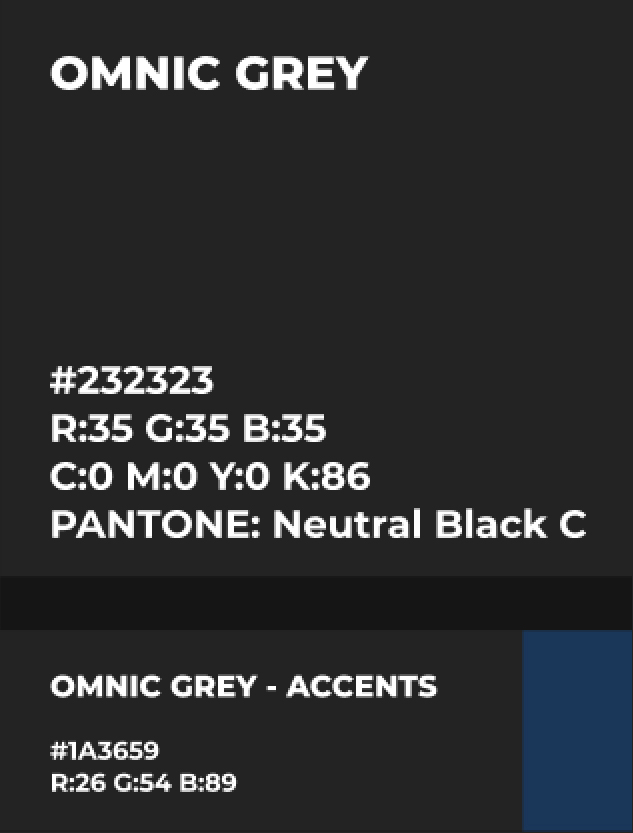
B&OP Blue was chosen for its modern feel, vibrancy, and accessibility on both dark and light backgrounds.
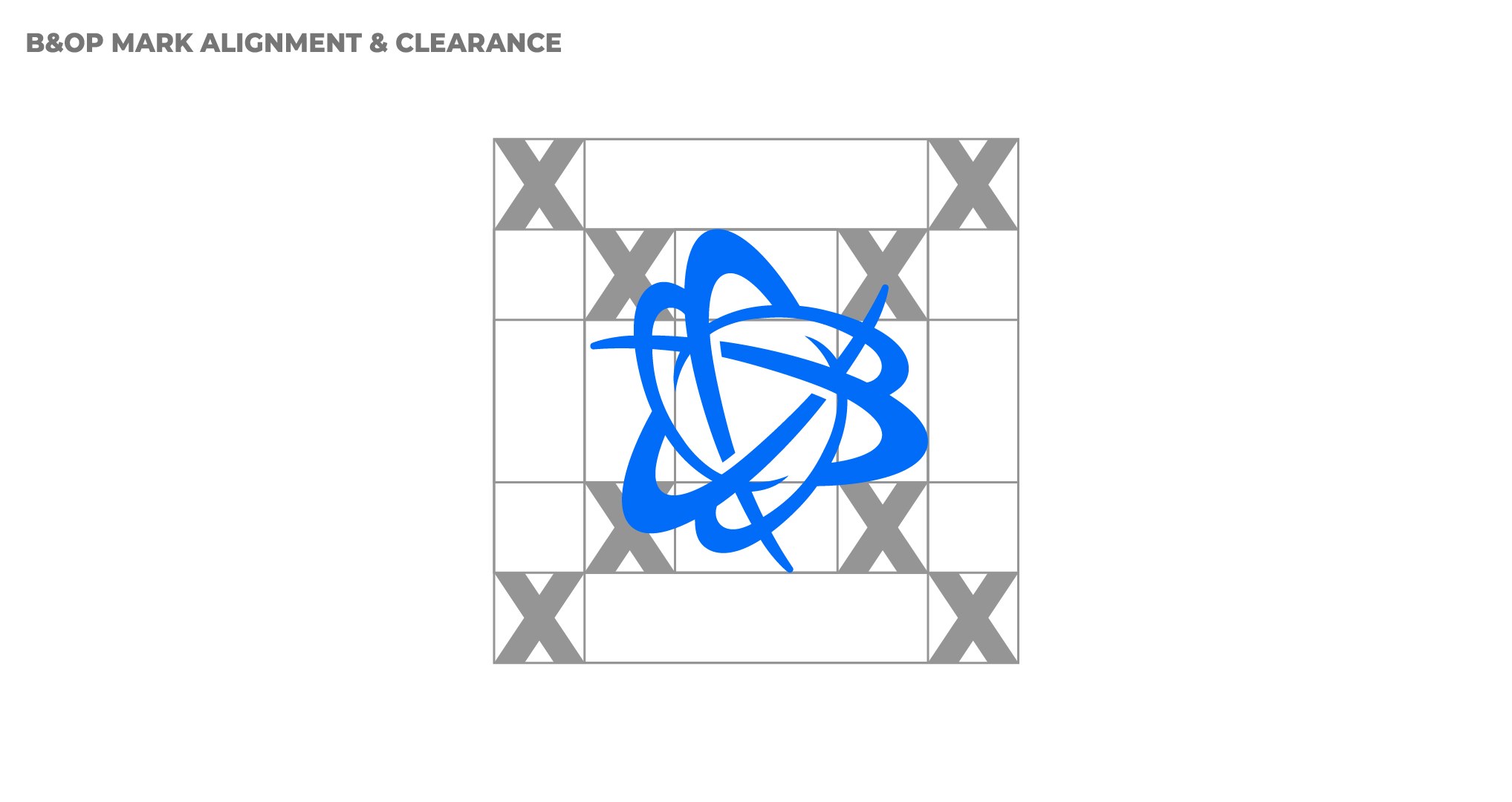
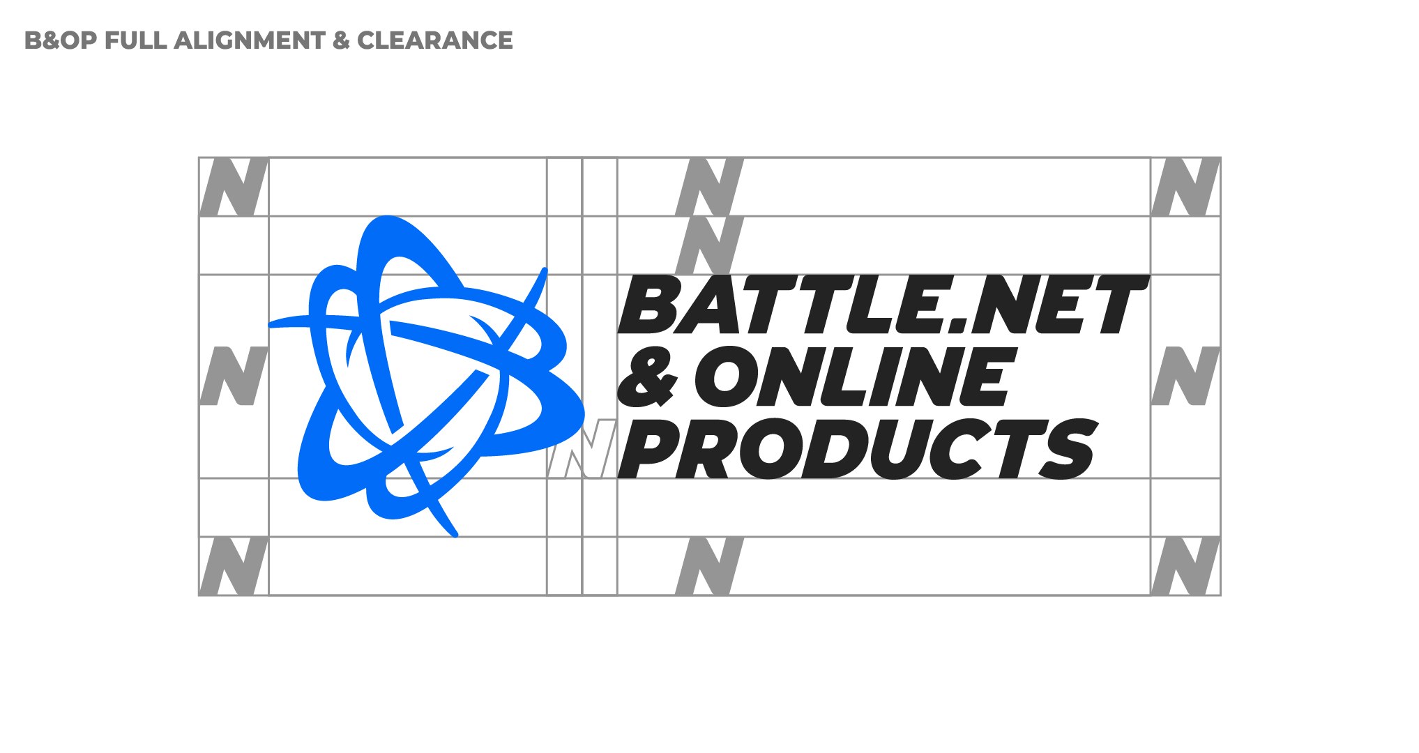
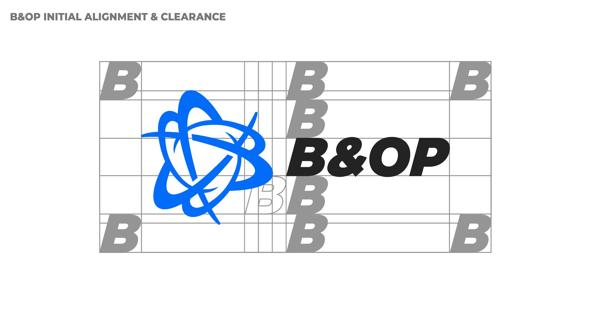
Laying it all out
Once corrections were made to the bloom, the type was finalized, and our color was chosen, we worked on a layout that was pleasant, met our needs, and was internally consistent,
We were guided by the age-old question: “Can we slap it on everything?”


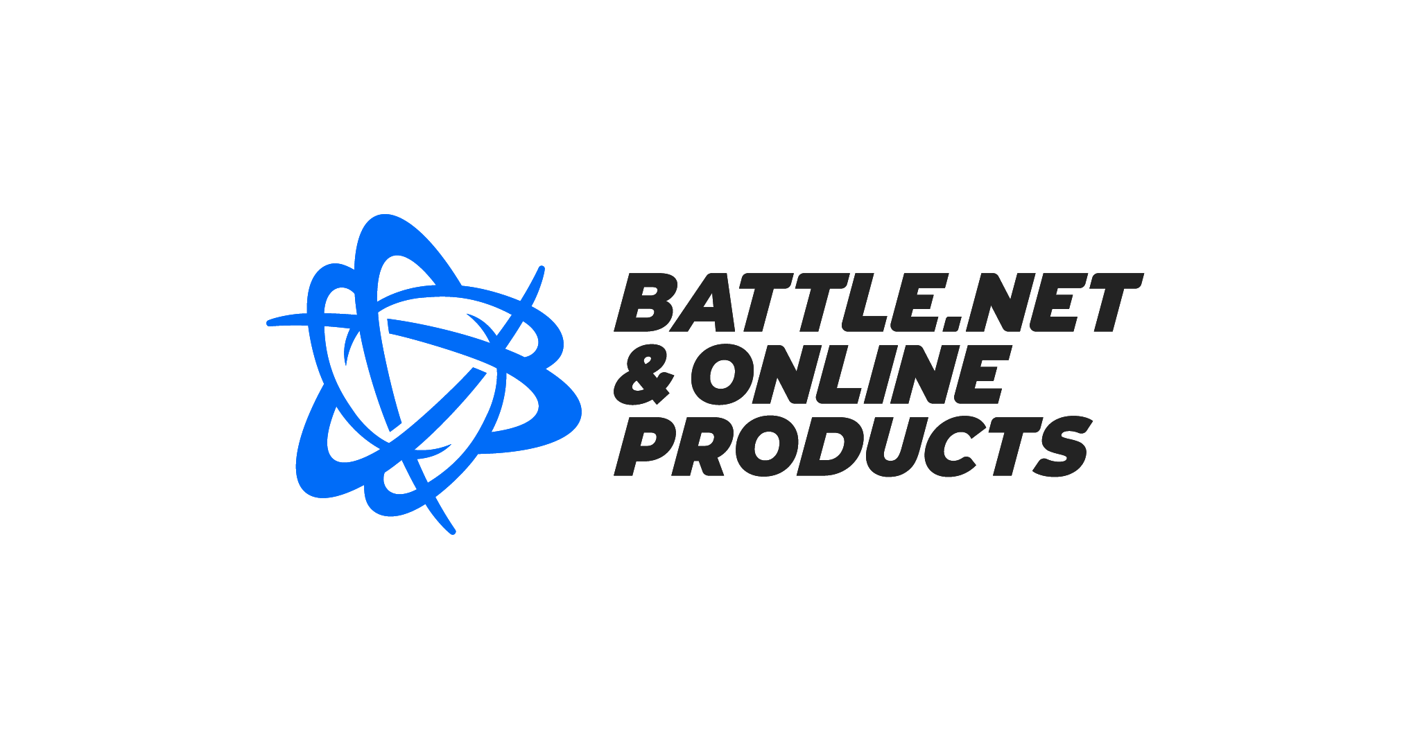

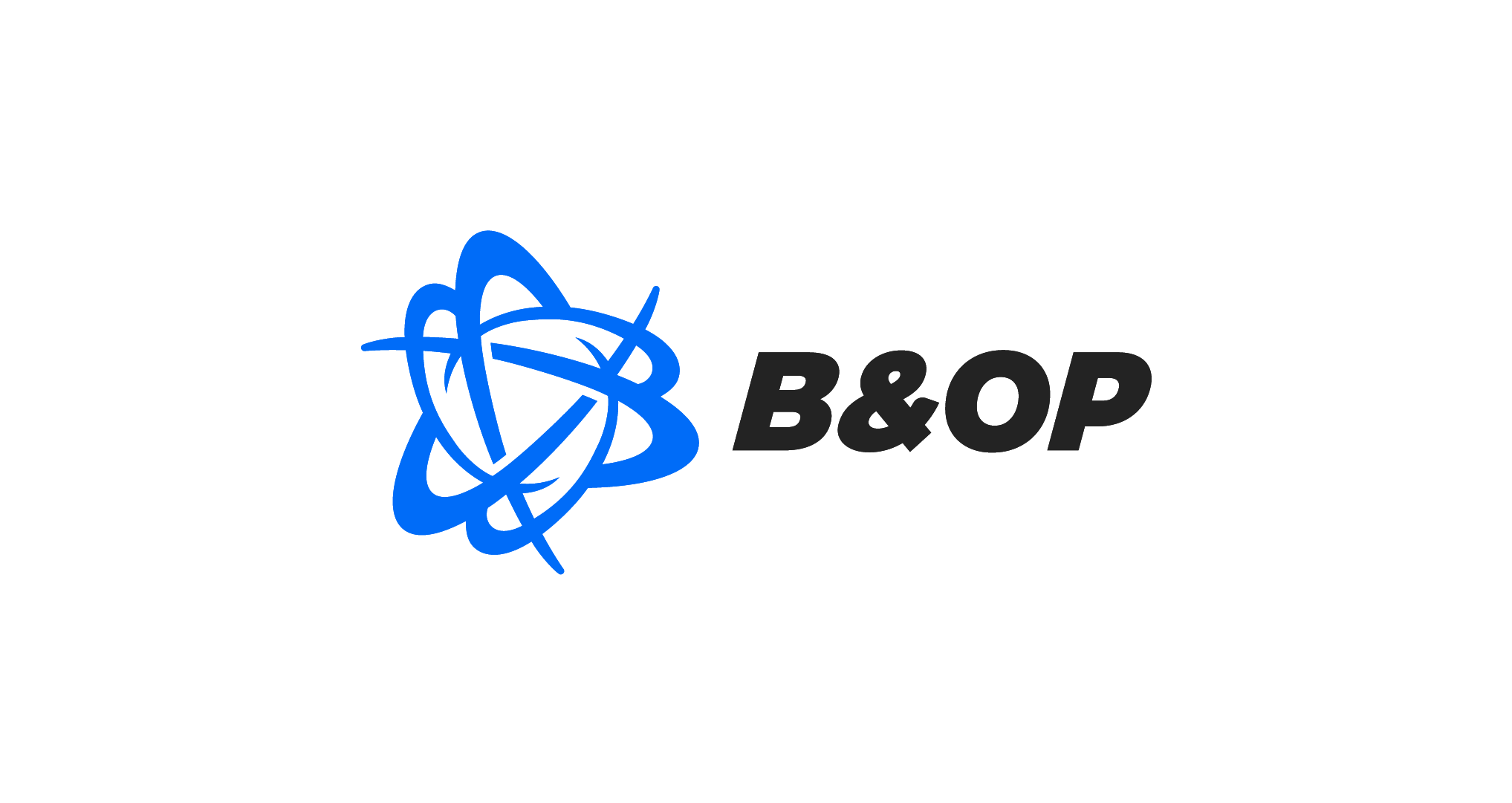
The Final Product
Check my other works too!


© 2025 Felix Junghwan Choi; All rights reserved.