Project Title
Battle.net Shop; Product Page Redesign
Project Timeline
October 2020 July 2022
ReleaseD Date
TBD
Project Detail
Redesign Shop Product Page to enhance User Experience and Business Support.
Shop Product Page is the last page users receive product information before they checkout. Therefore, it is crucial to provide correct information that informs the users with full understanding of what the product is before making a purchase.
My Role
My role is to assist the Design Lead manage the Macro research and participate in everything from foundation research to determining design priority, project planning, and managing deliverables. I worked especially close with PMs to manage the process from research to ideation.
Background
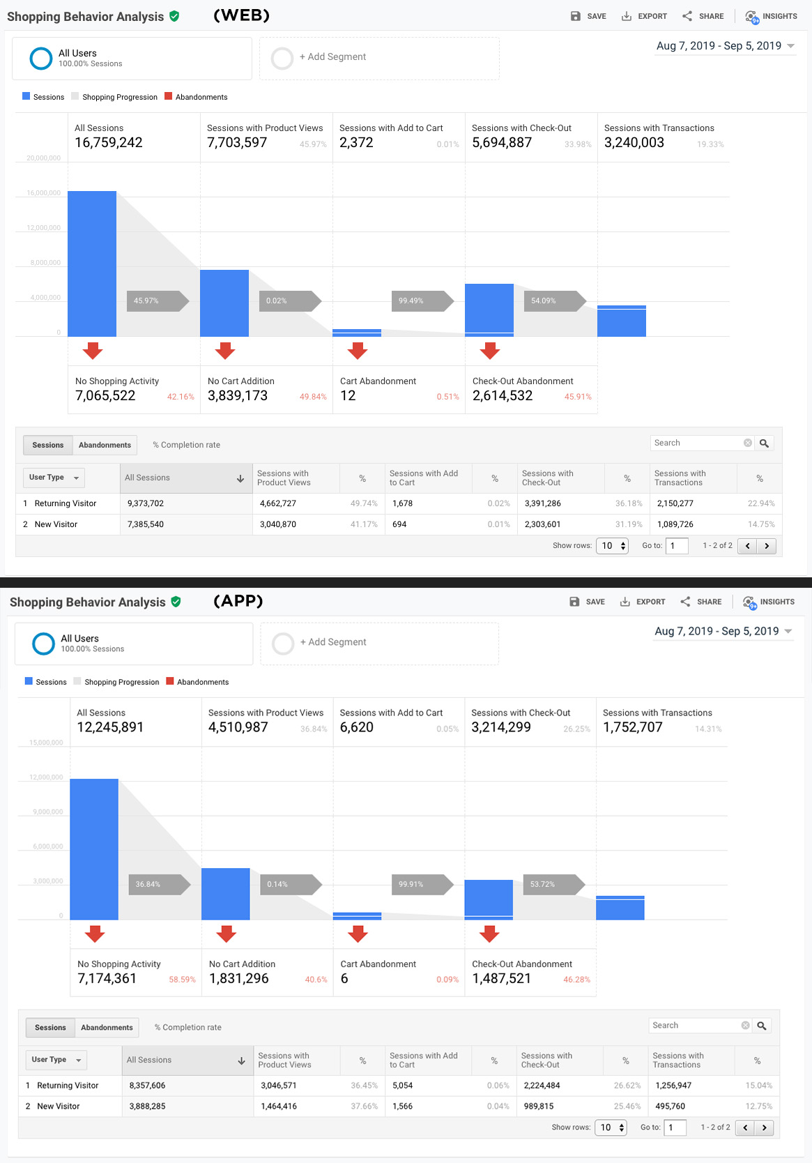
44% of the visitors enter Battle.net Shop to Product Page, 21% to Home Page, and 10% to Franchise Page. While 44% is an incredibly high number, the purchase rate was at 46%. Senior leadership saw the importance of improving the Product Page and gave our team a mission: ‘How can we increase the purchase conversion rate?’.
STEP 1
Understand Product and Surroundings
What is Product Page?
Product Page is the last page to learn about the product in Battle.net Shop before check out. Currently, there are over 11 different sales cases and more products are expected to be added to the platform soon. The 11 different sale types are: Box Products, Single Products, Free Games, Partial Free Games, Multi Quantity Products, Virtual Currency Purchases, Battle.net Balance Purchases, Subscriptions, In-game Item Purchases, Mobile Products, and Mobile & PC Cross Platform Products.
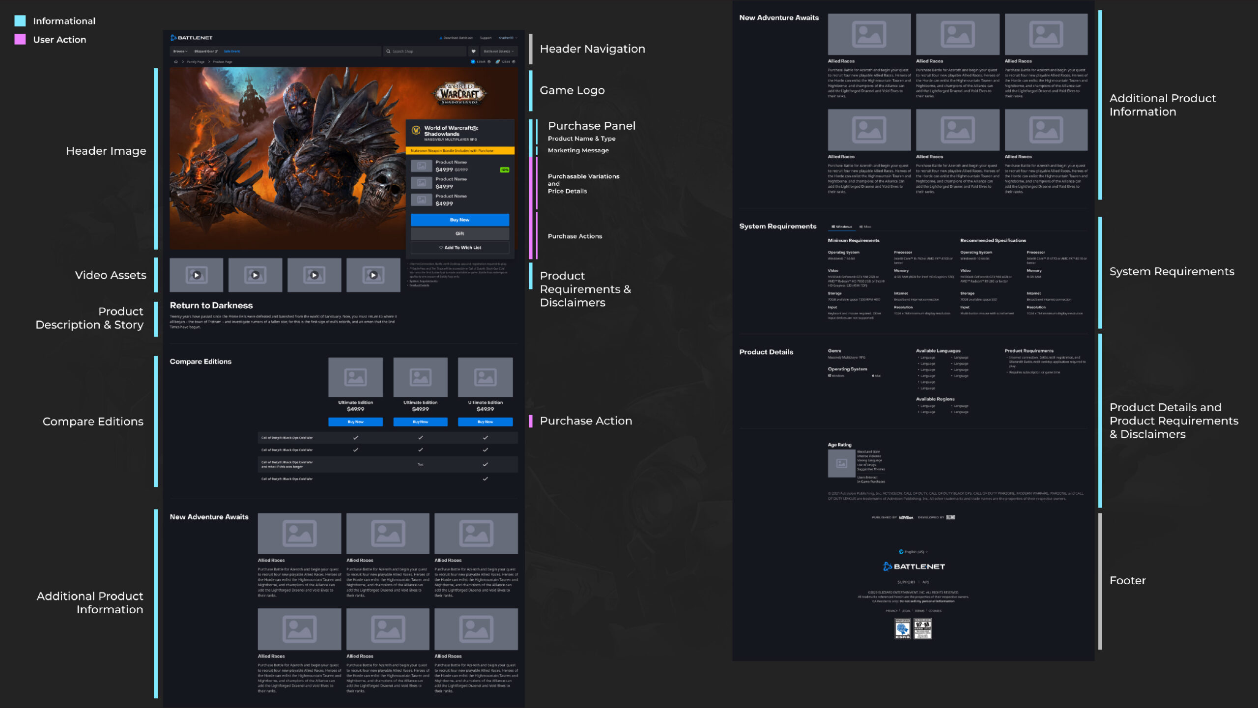
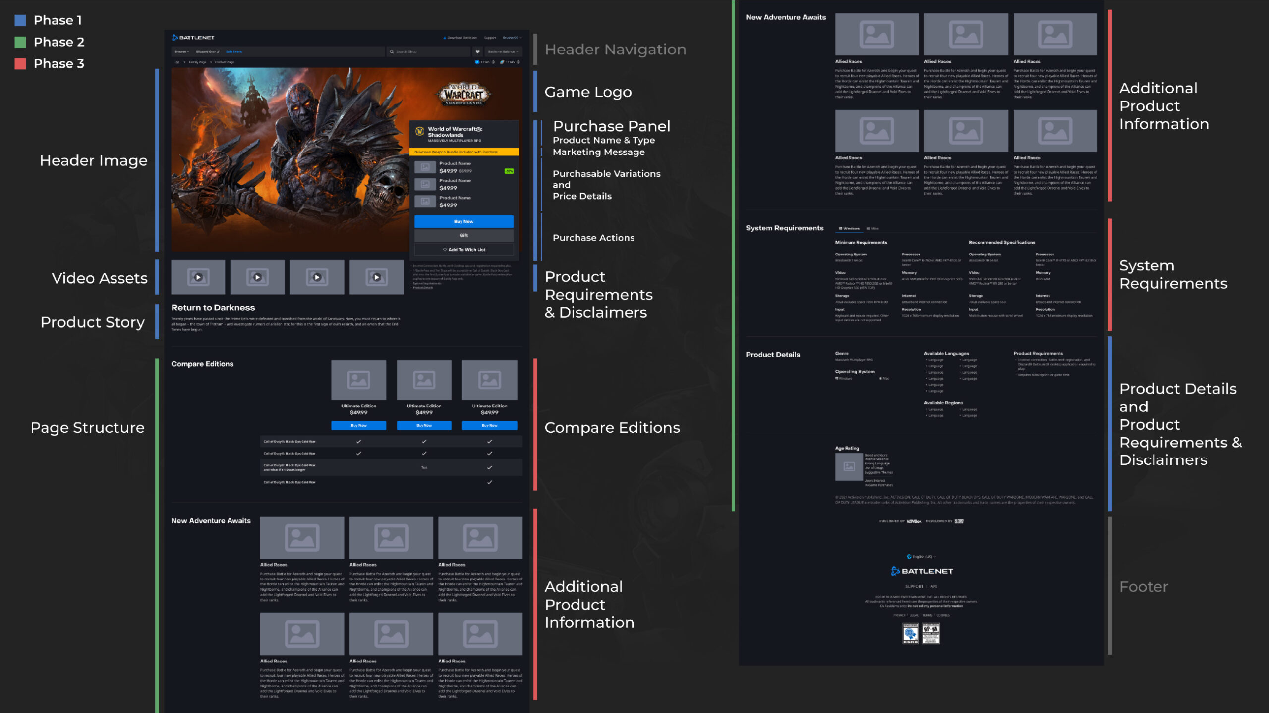
The Product Page consists of several components: Background Image, Videos, Purchase Panel, Product Details, Title & Descriptions, and Modules.
It was challenging to decide what information should be prioritized and included for the User. There are other websites that show game information besides Battle.net such as Game sites, Mobile apps, and Blizzard.com. It was necessary to clarify what information was to be displayed on the Product Page vs other websites.
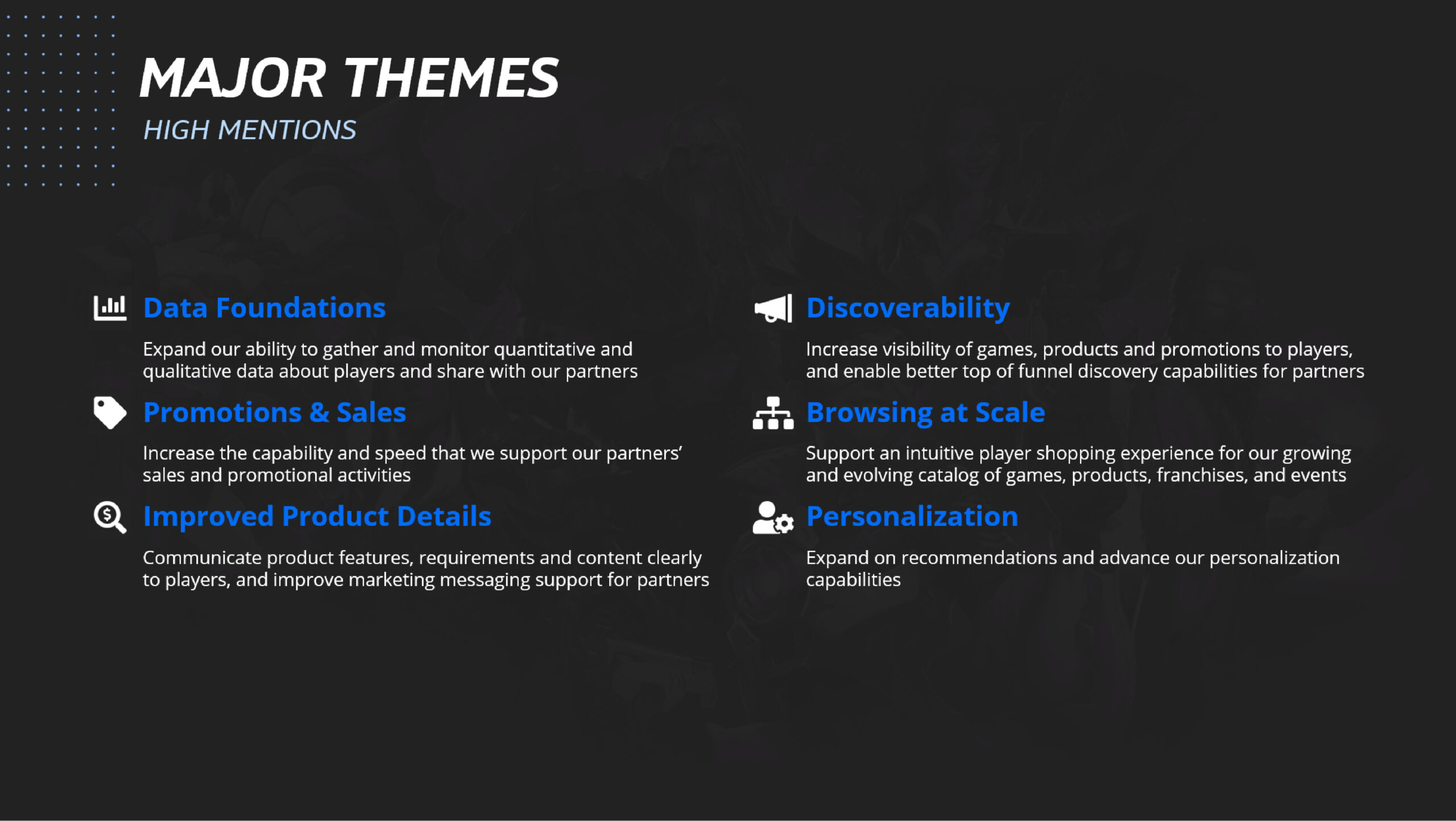
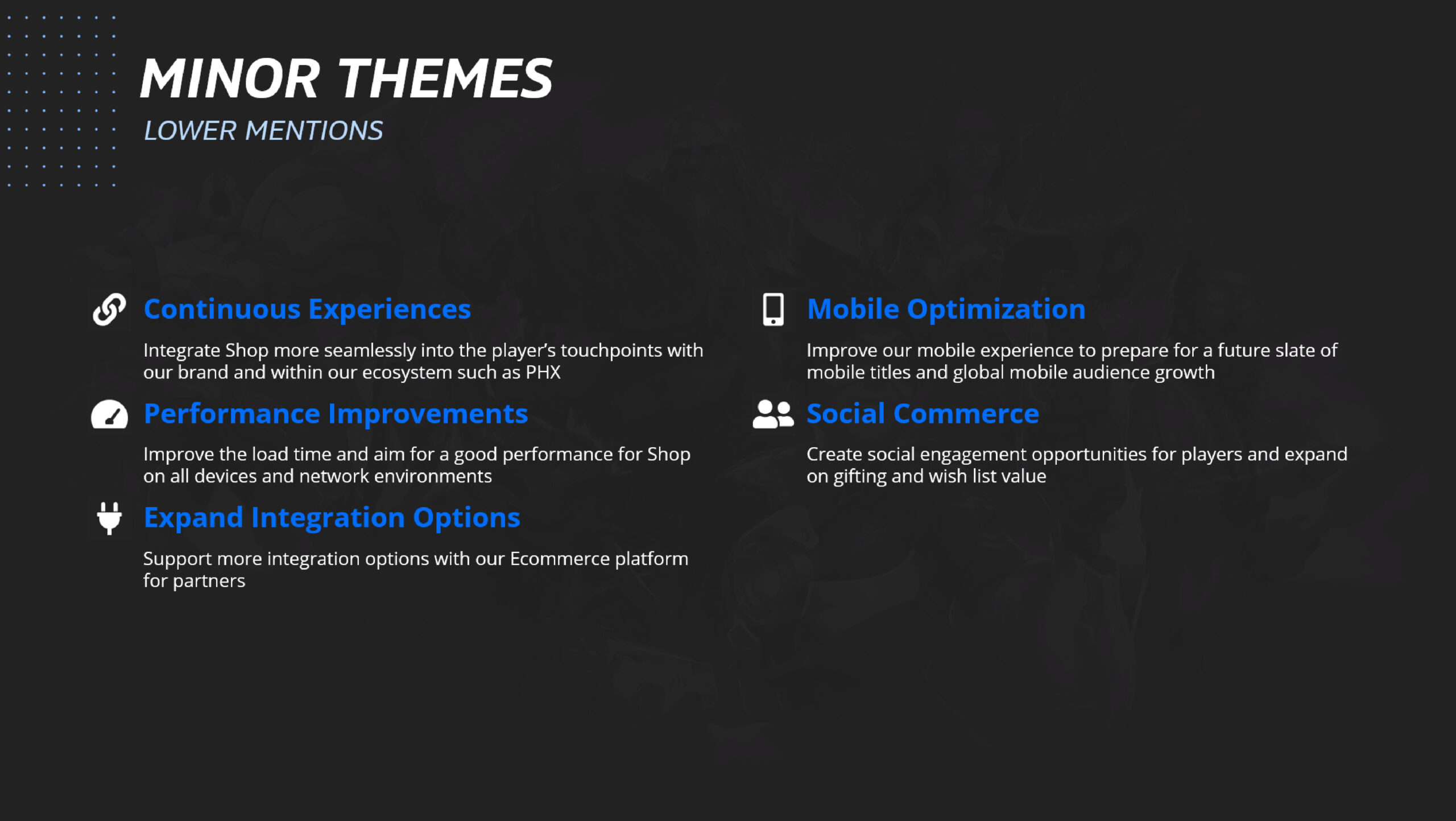

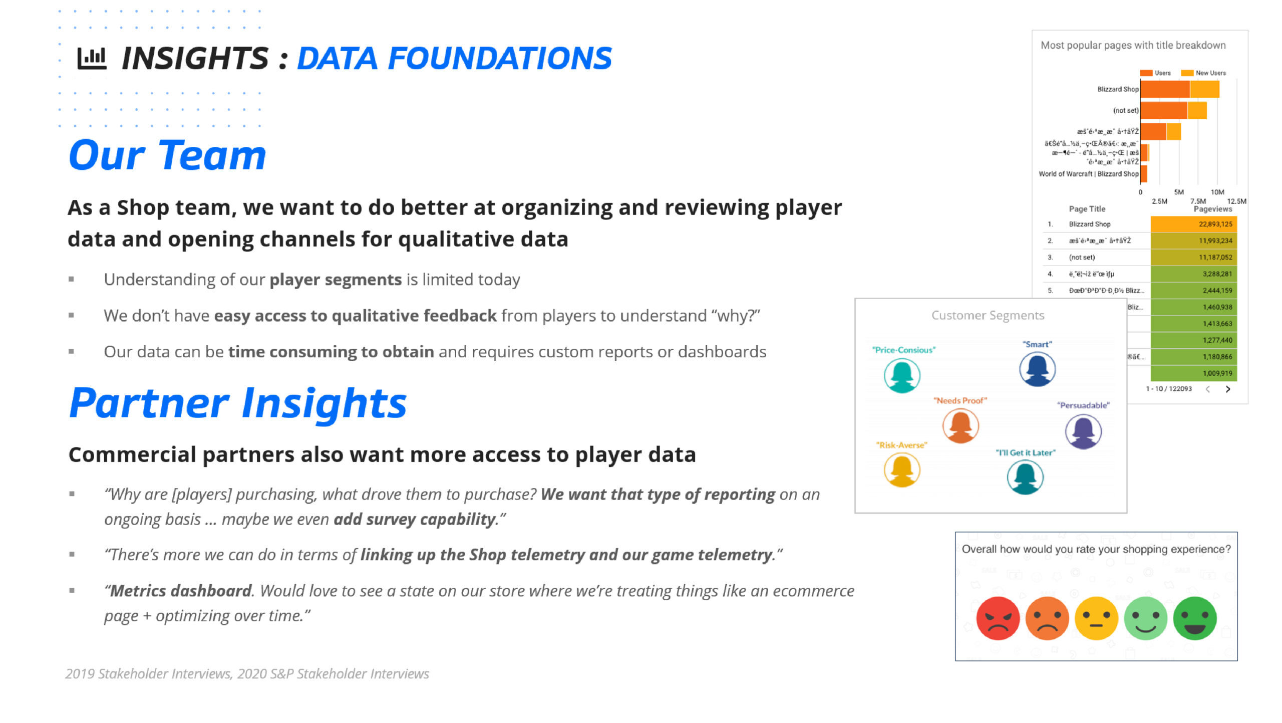
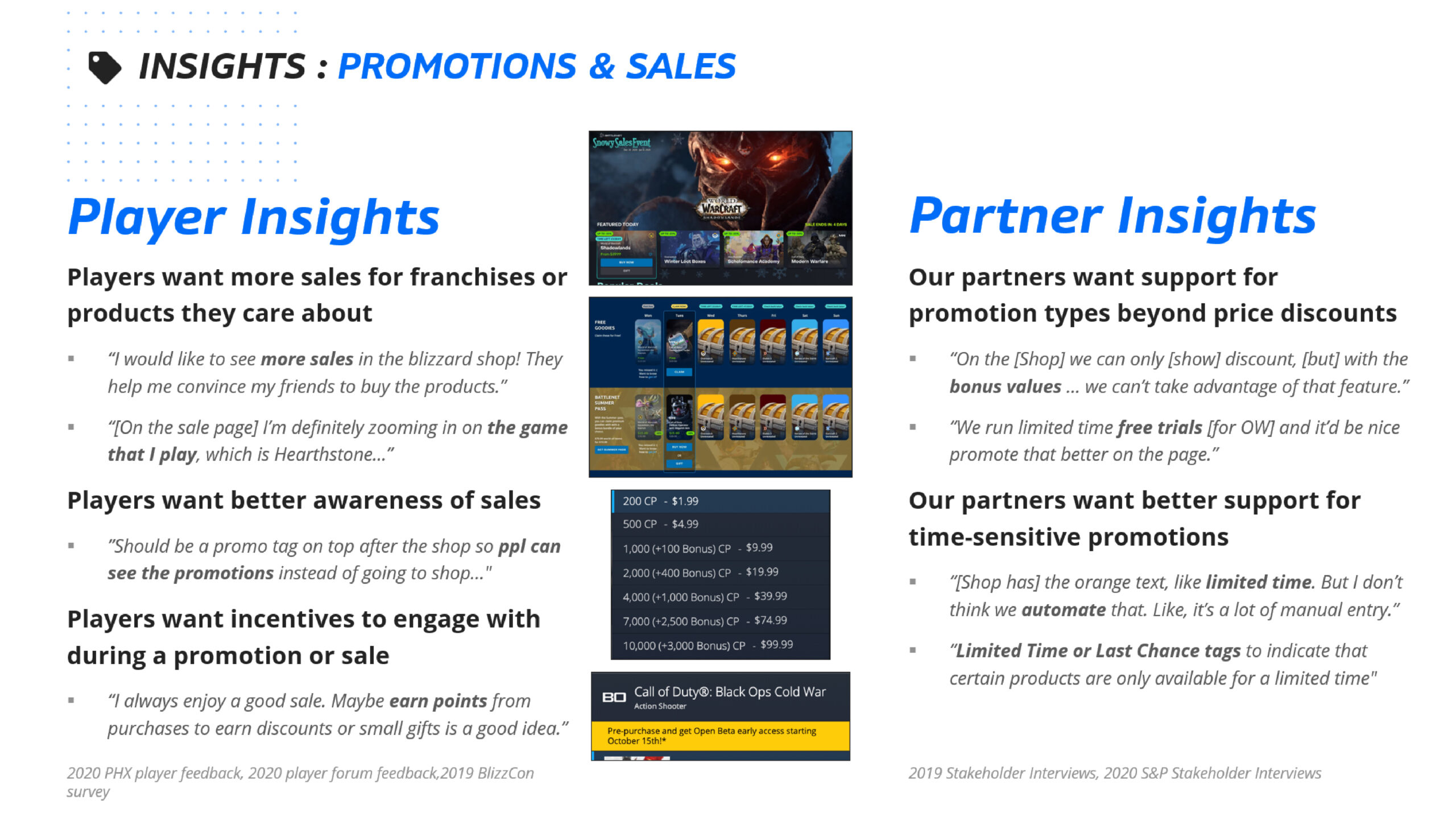
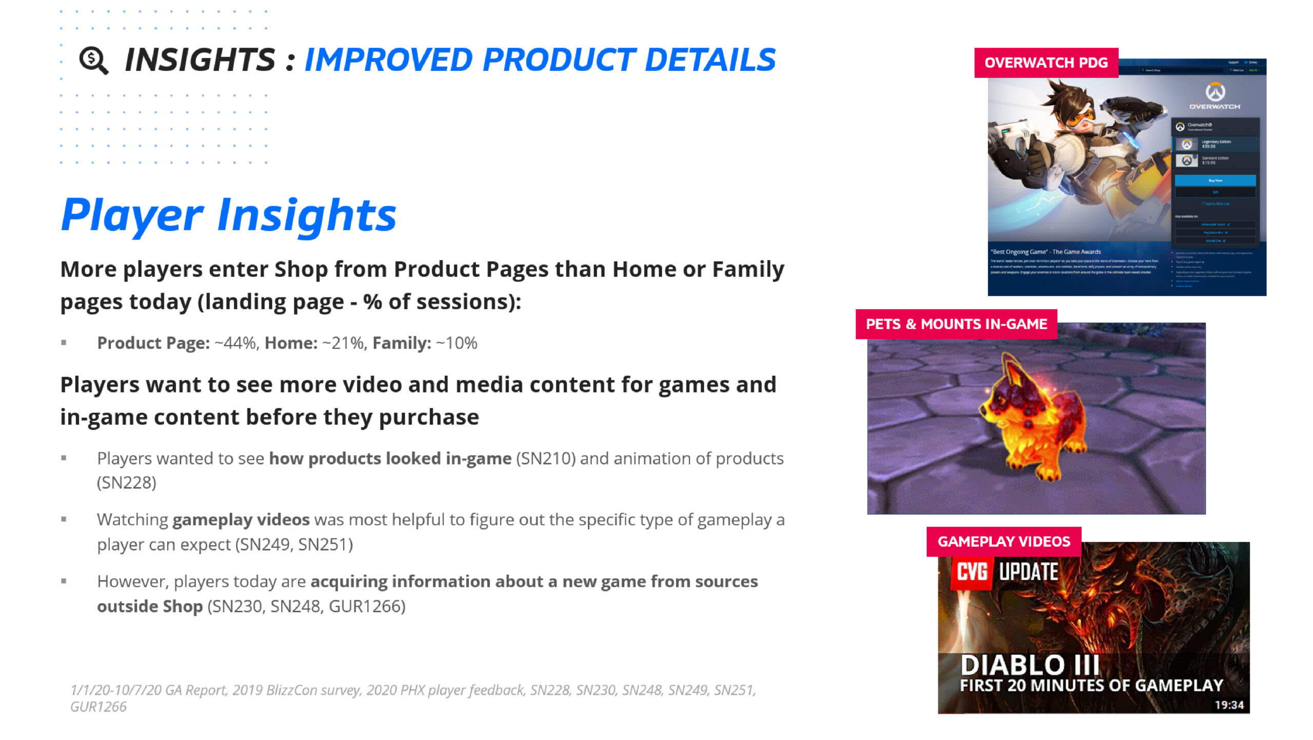
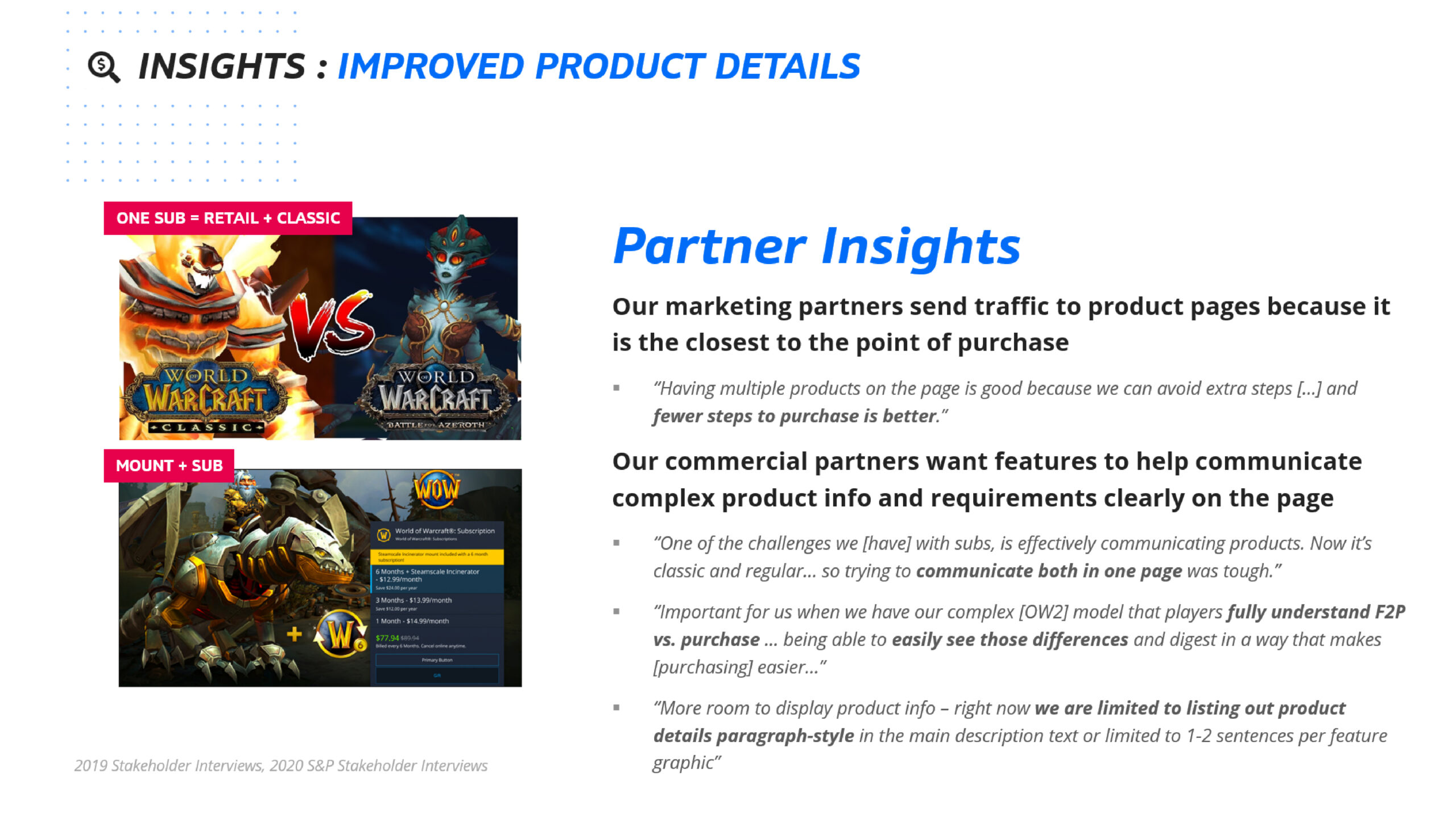
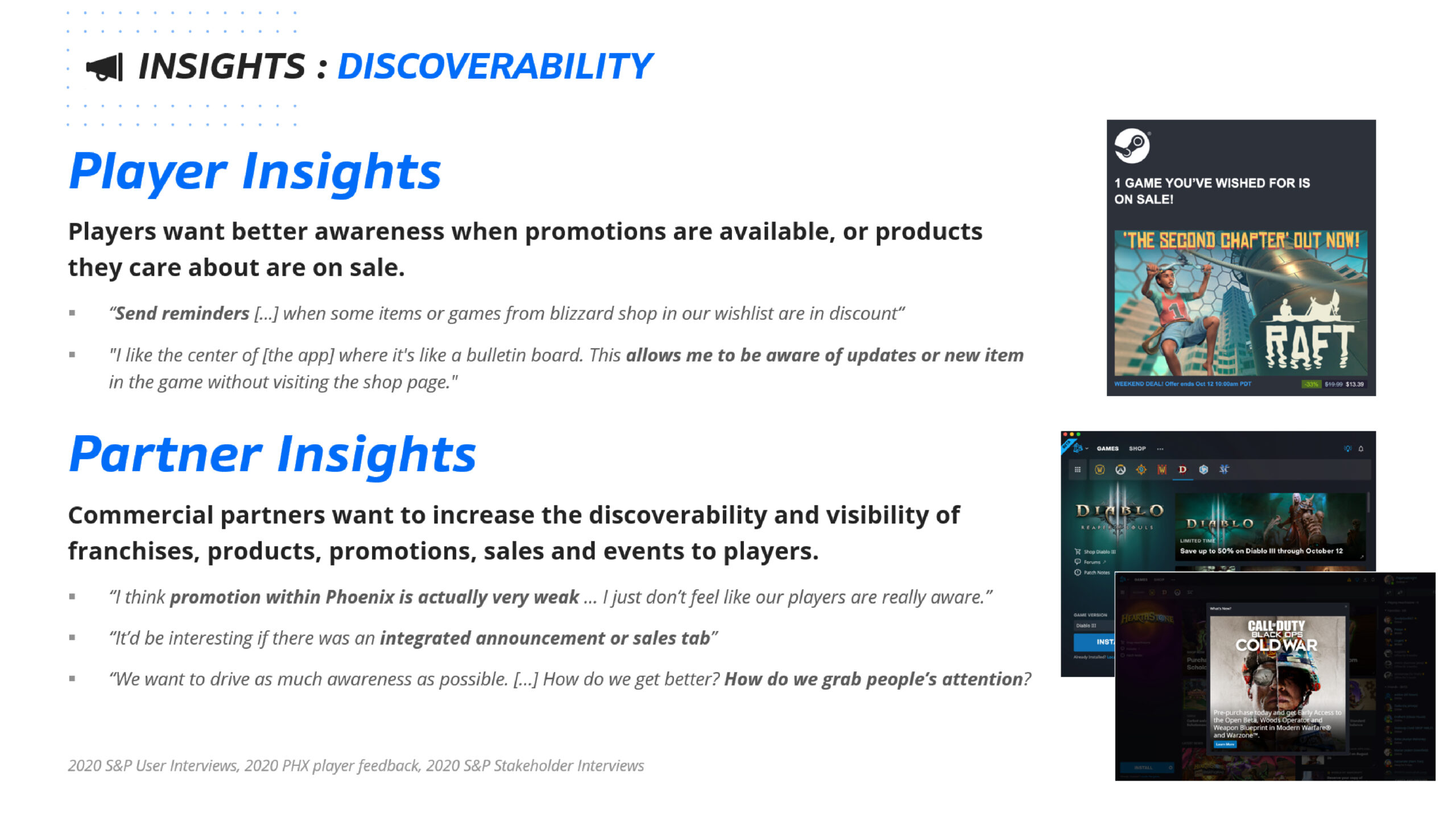
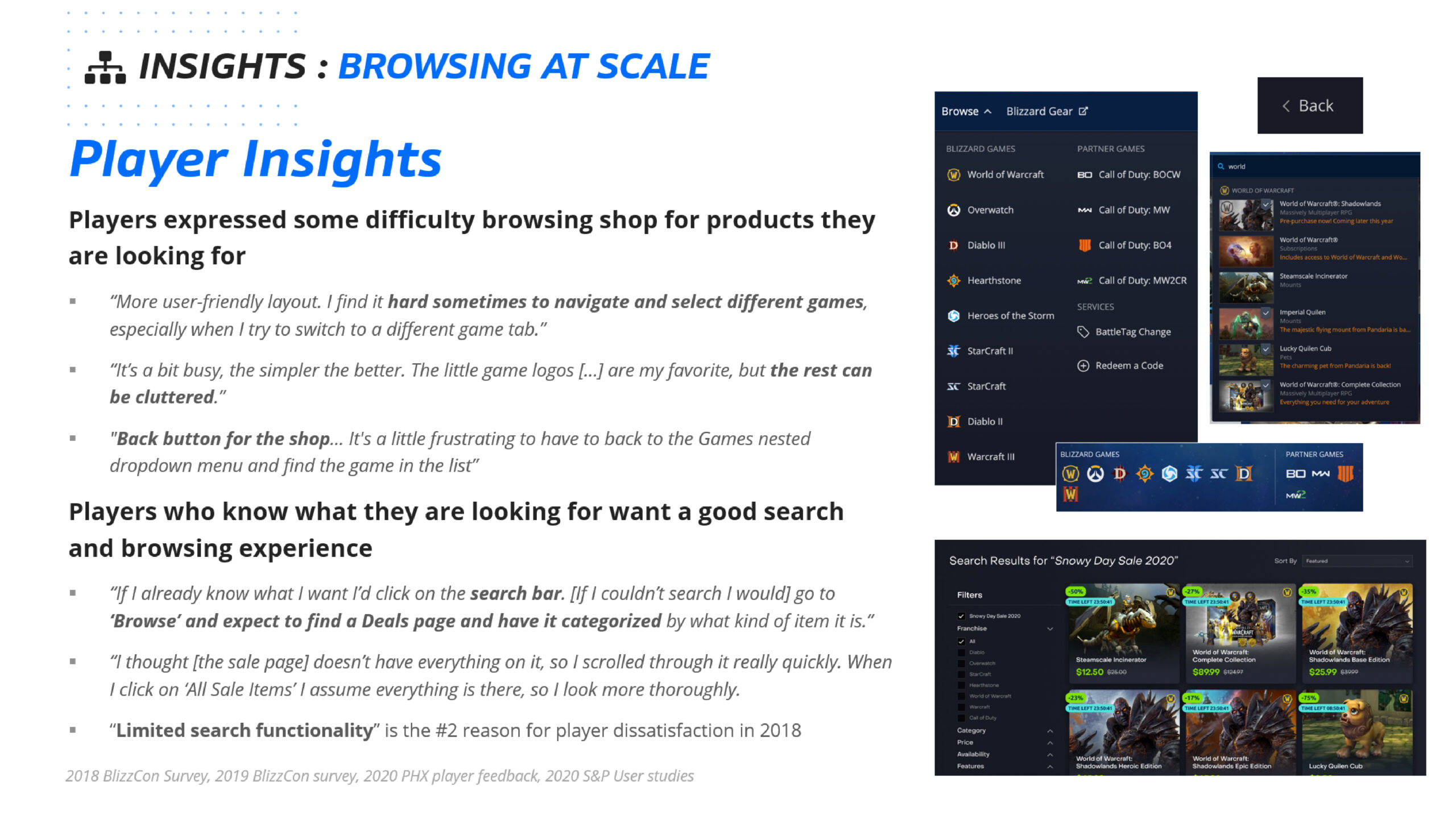
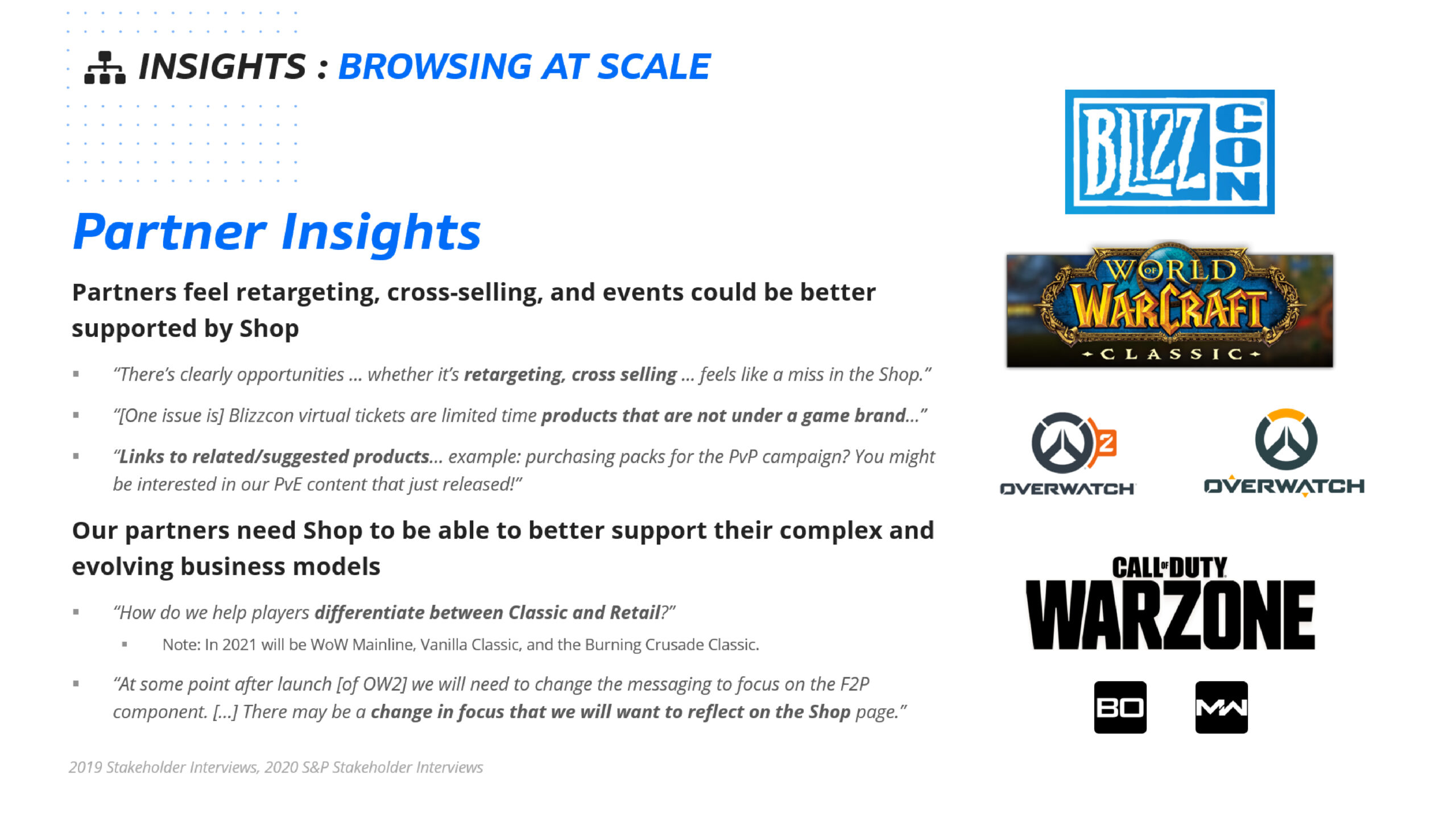
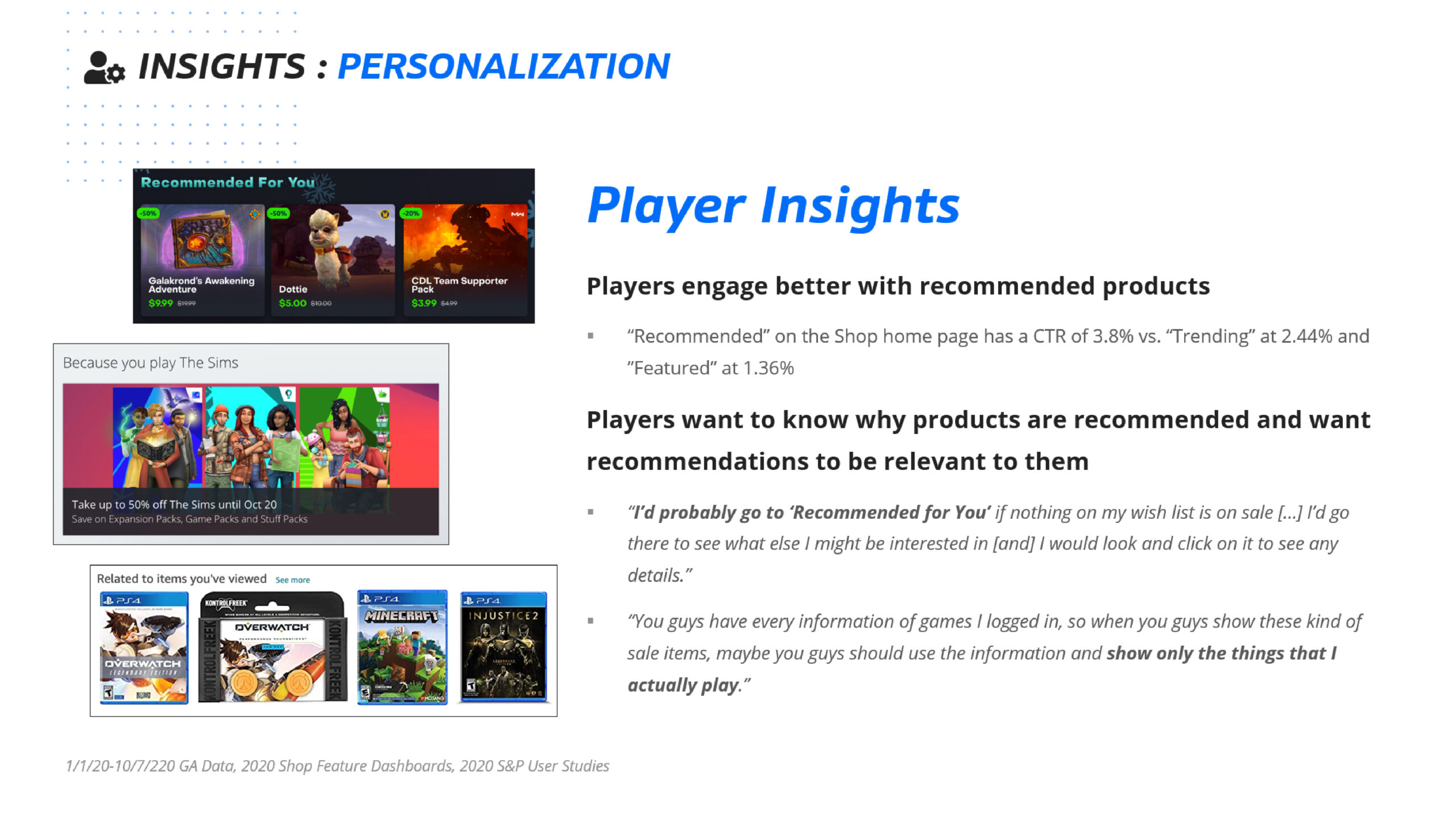
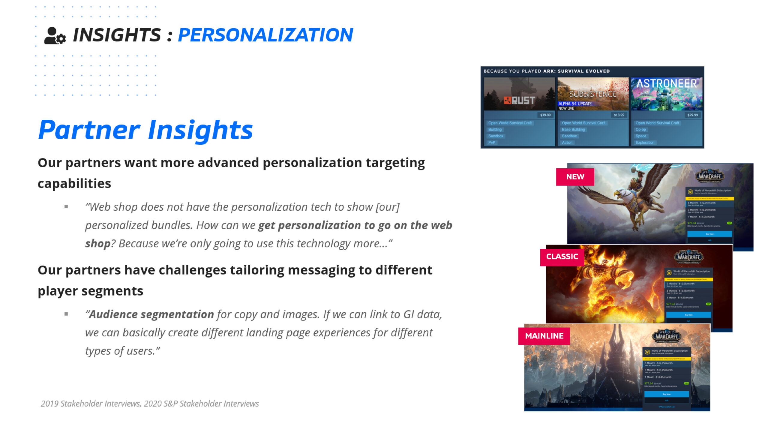
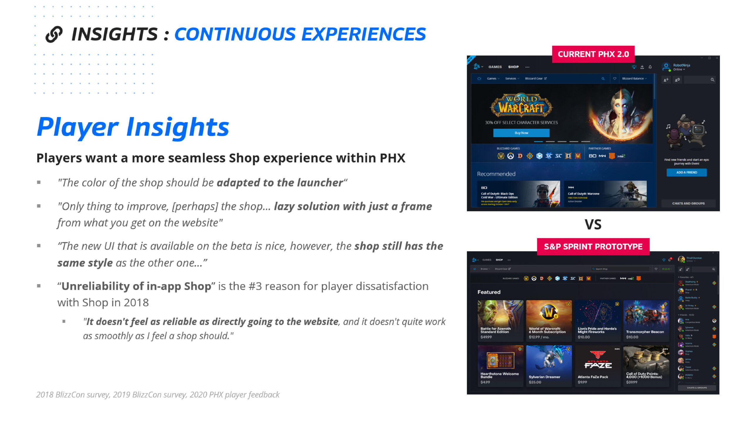
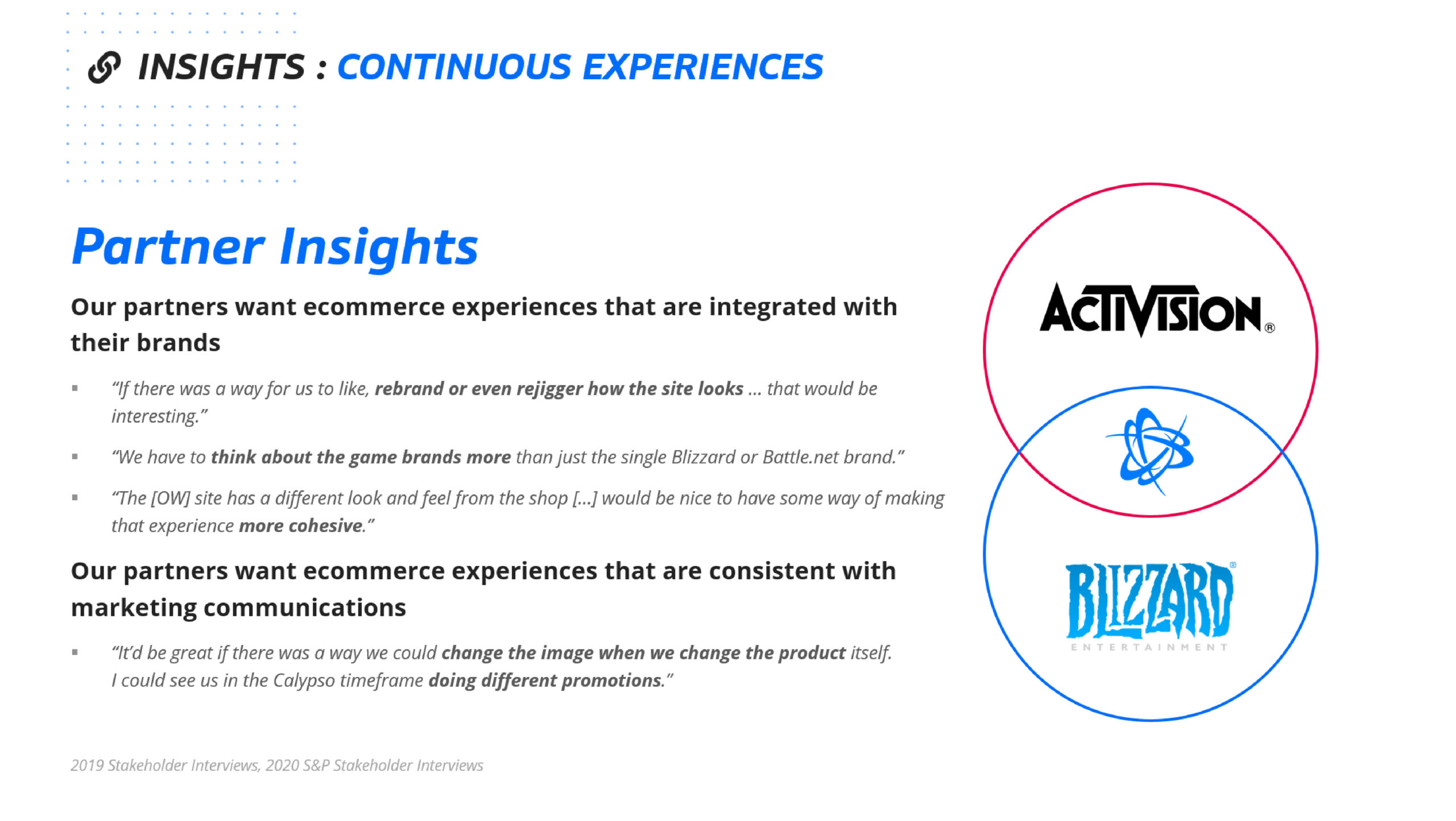
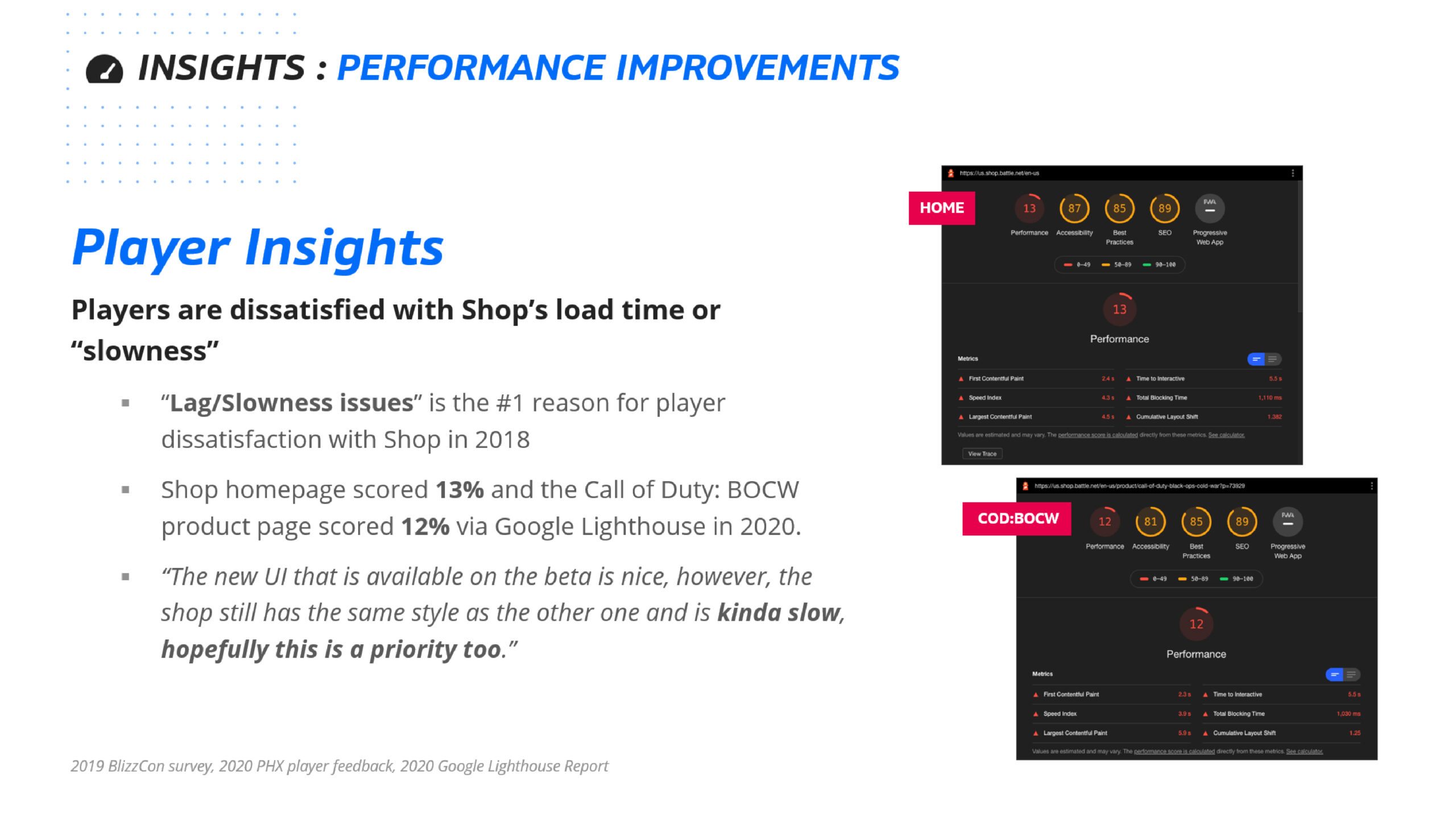

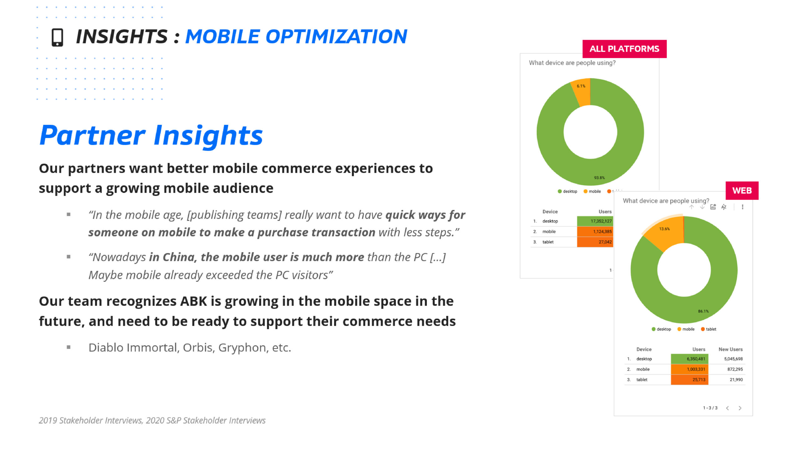
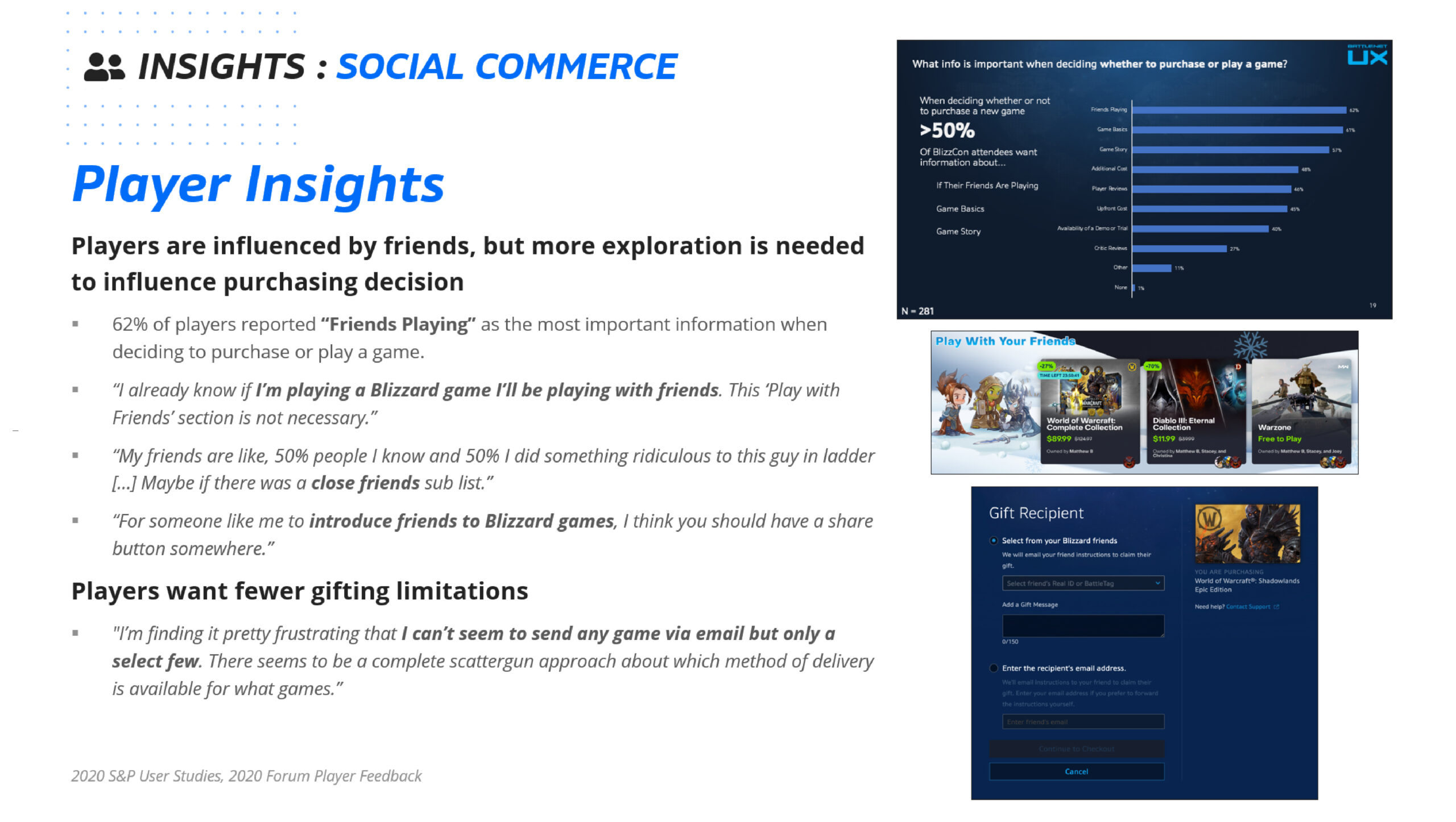
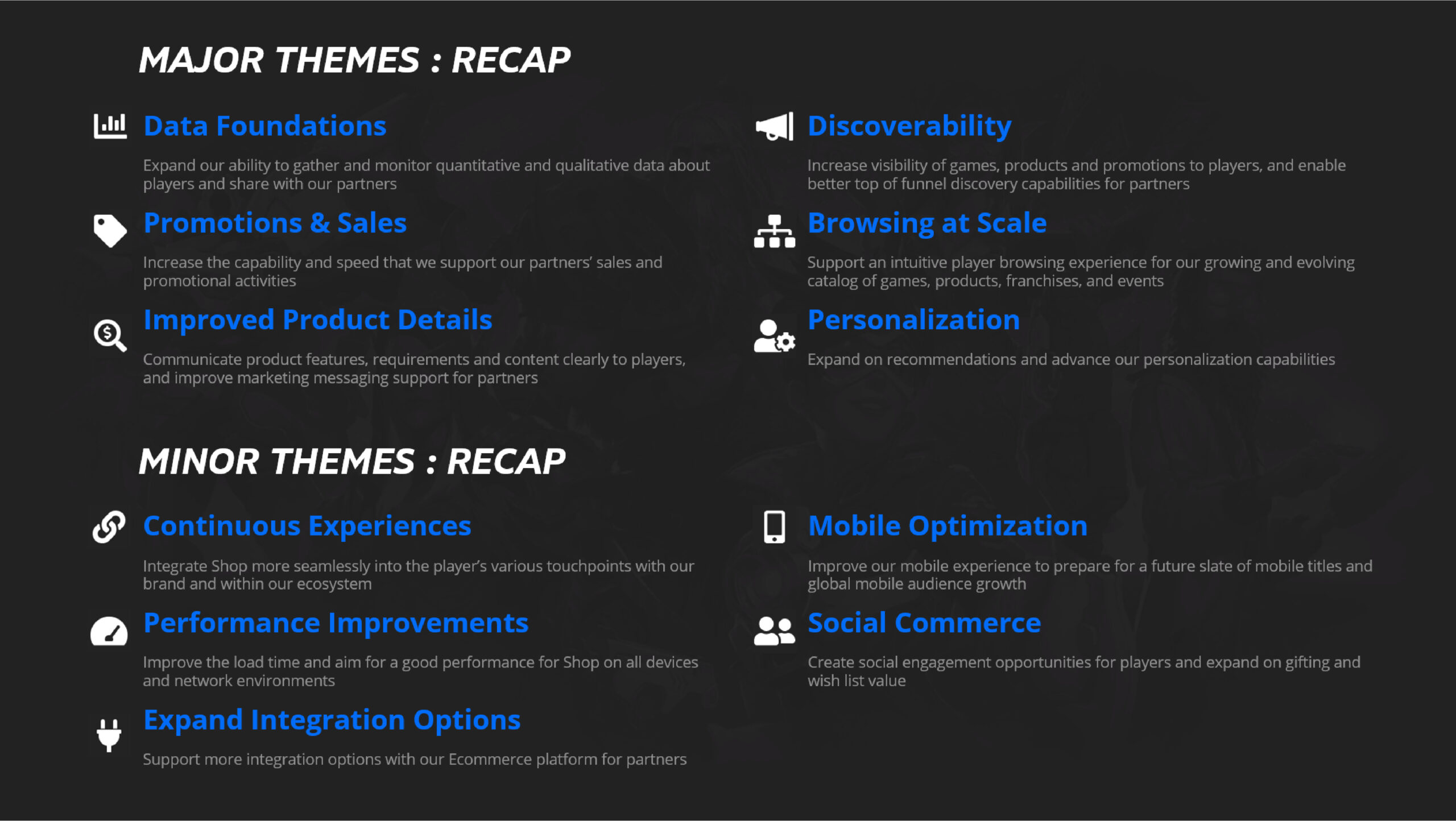
Macro Research; Improve Product Detail
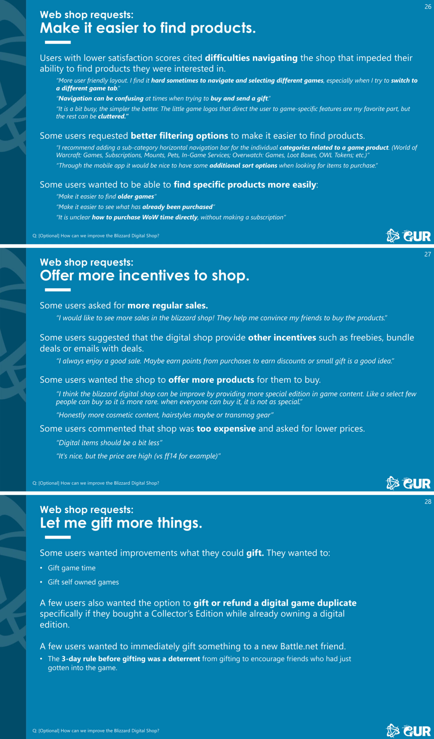
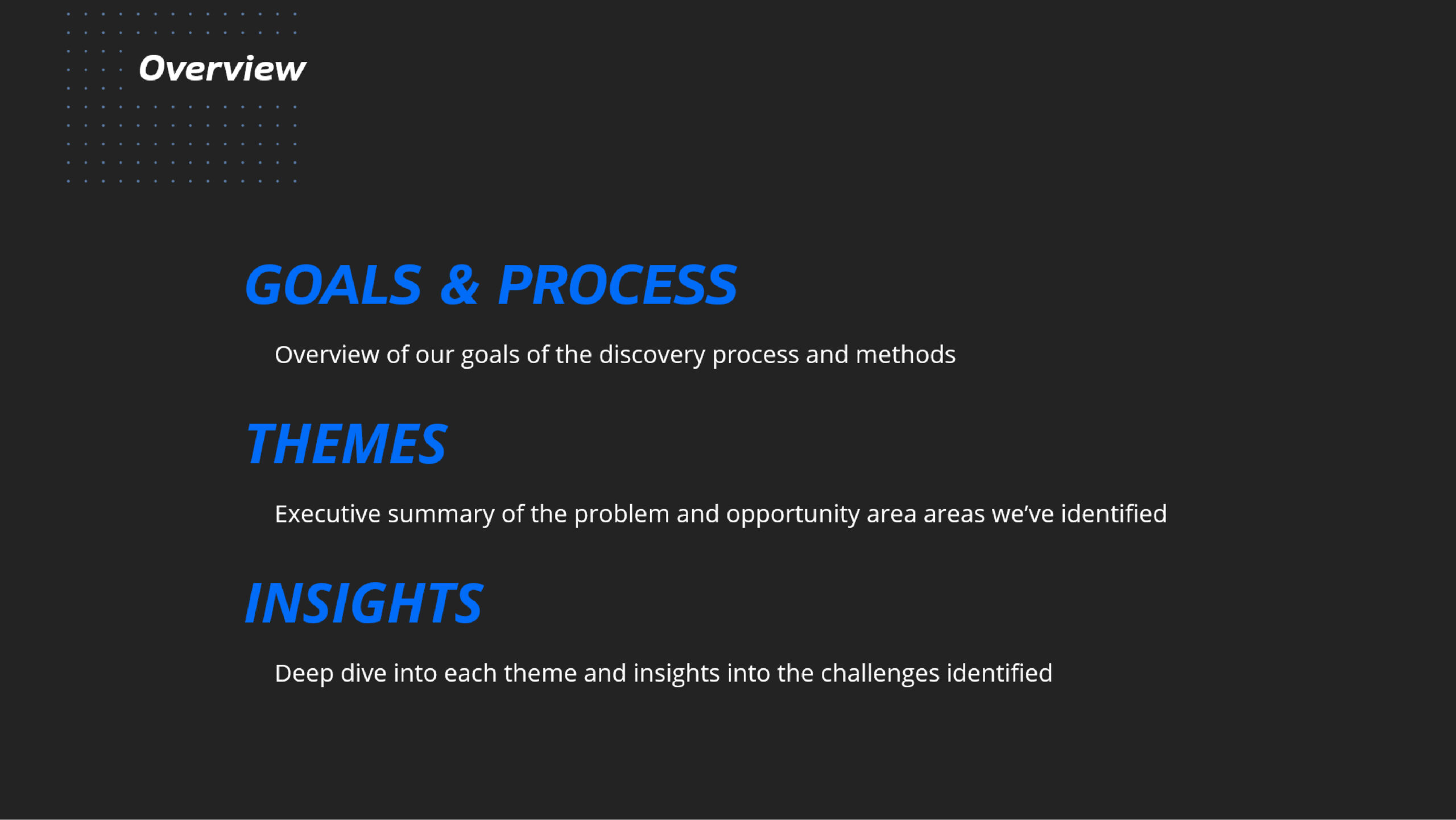
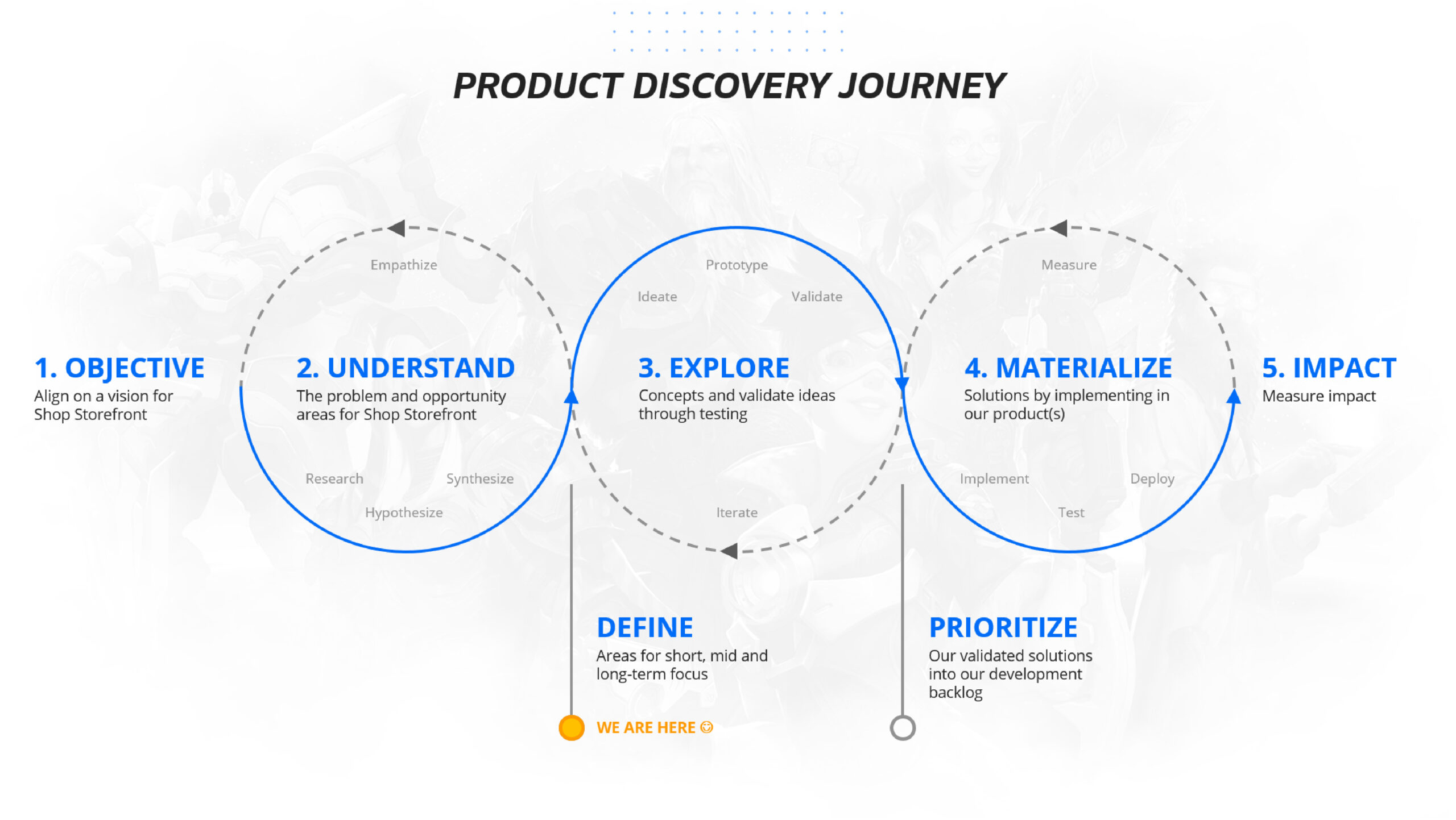
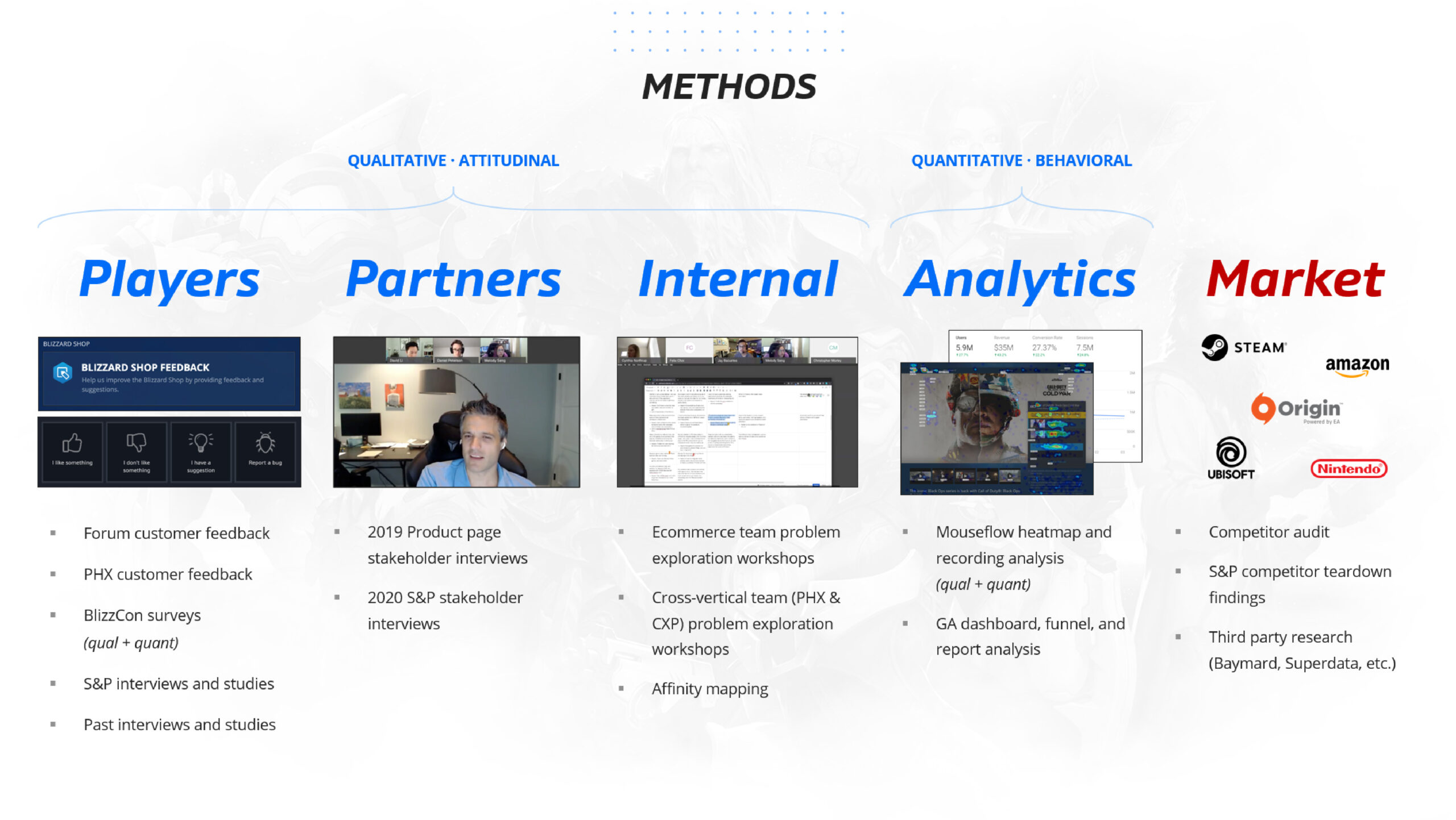
In 2020, there was a macro research initiative to discover high level Battle.net Shop problems before this Product Page Redesign project began. The purpose of this research was to inspire Senior leadership with design direction.
Product Page Redesign (also known as ‘Improve Product Detail’) was one of the major problems discovered during the research, which led to the launch of the Product Page Redesign project.
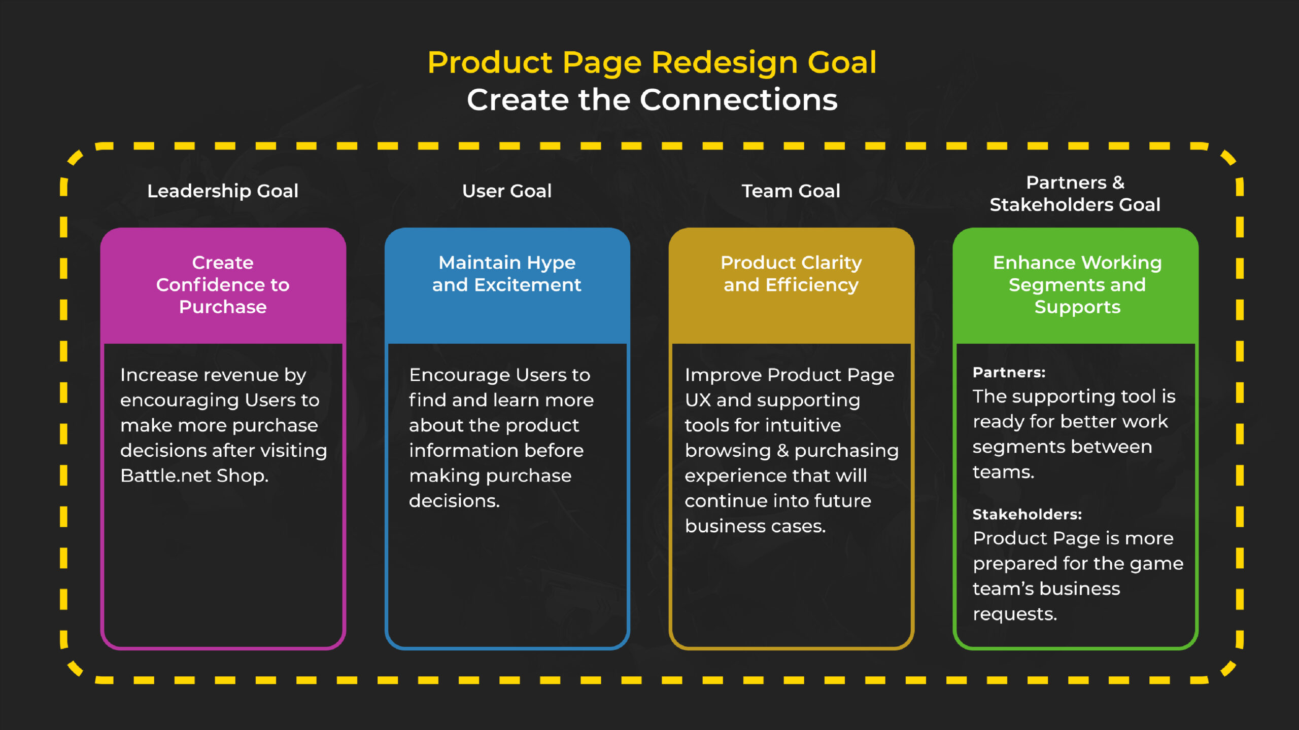
Organization, Flow and Structure
I started the project by analyzing the existing research and running a comparative analysis with other examples. I worked directly with my Design Lead and PMs in order to figure out the priorities and what the project required.
The conclusion is that it is too challenging to approach the Product Page as a single item. The reasons are:
- The scale of the Product Page is too gigantic and the different roots of the problems were intertwined with one another.
- There are 11 variations of sale types, and the target user behaviors of each sale type vary.
- Each module is supported by different tools, and the ownership of each tool belongs to different partners/stakeholders.
We needed a new plan.


Project Planning
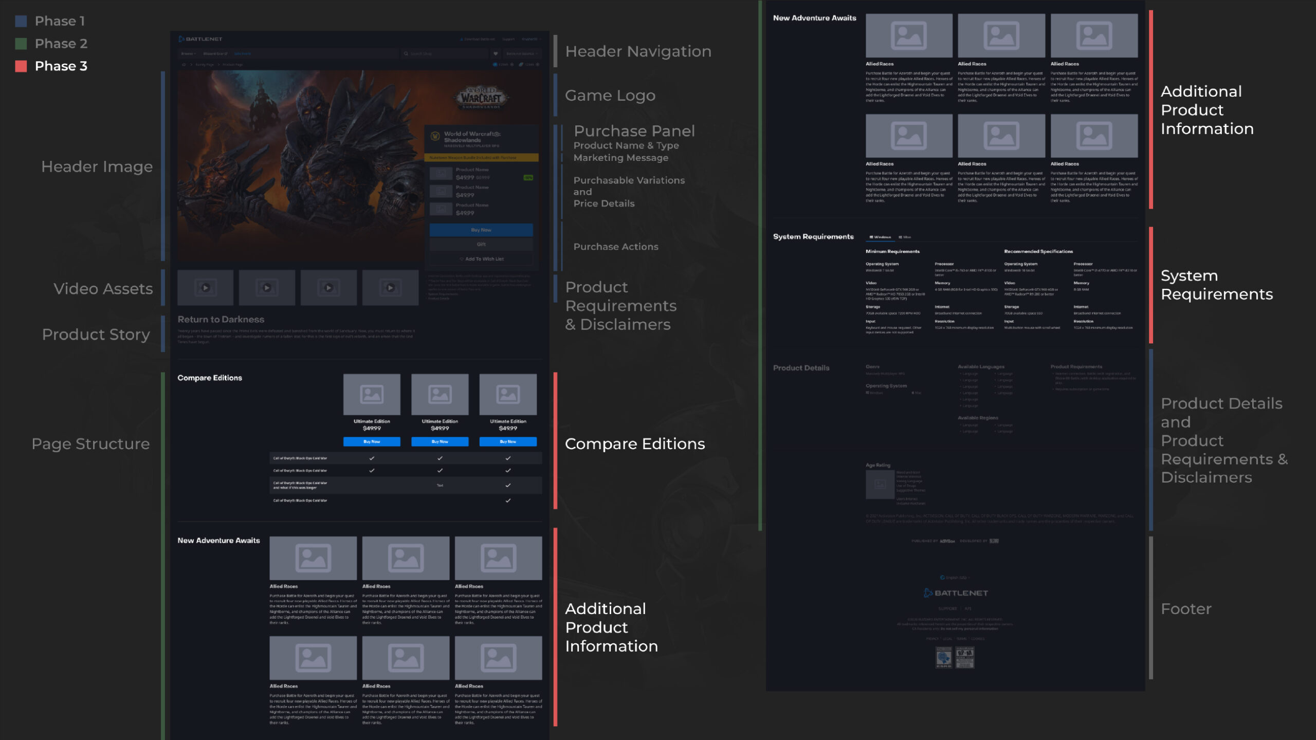
Product Page was a large scale project with both design and development. The team decided to break down the design aspect into different phases.
Phase 1: Improve Purchasing Experience
- Product Page Header Structure
- Image Display
- Purchase Panel
- Legal Information
Phase 2: Improve Browsing Experience
- Redesign Product Page Flow
- Create Product Page Navigation
Phase 3: Improve Learning Experience
- Discover & Improve Contents
- Module UX Improvement
This portfolio only includes Phase 1.
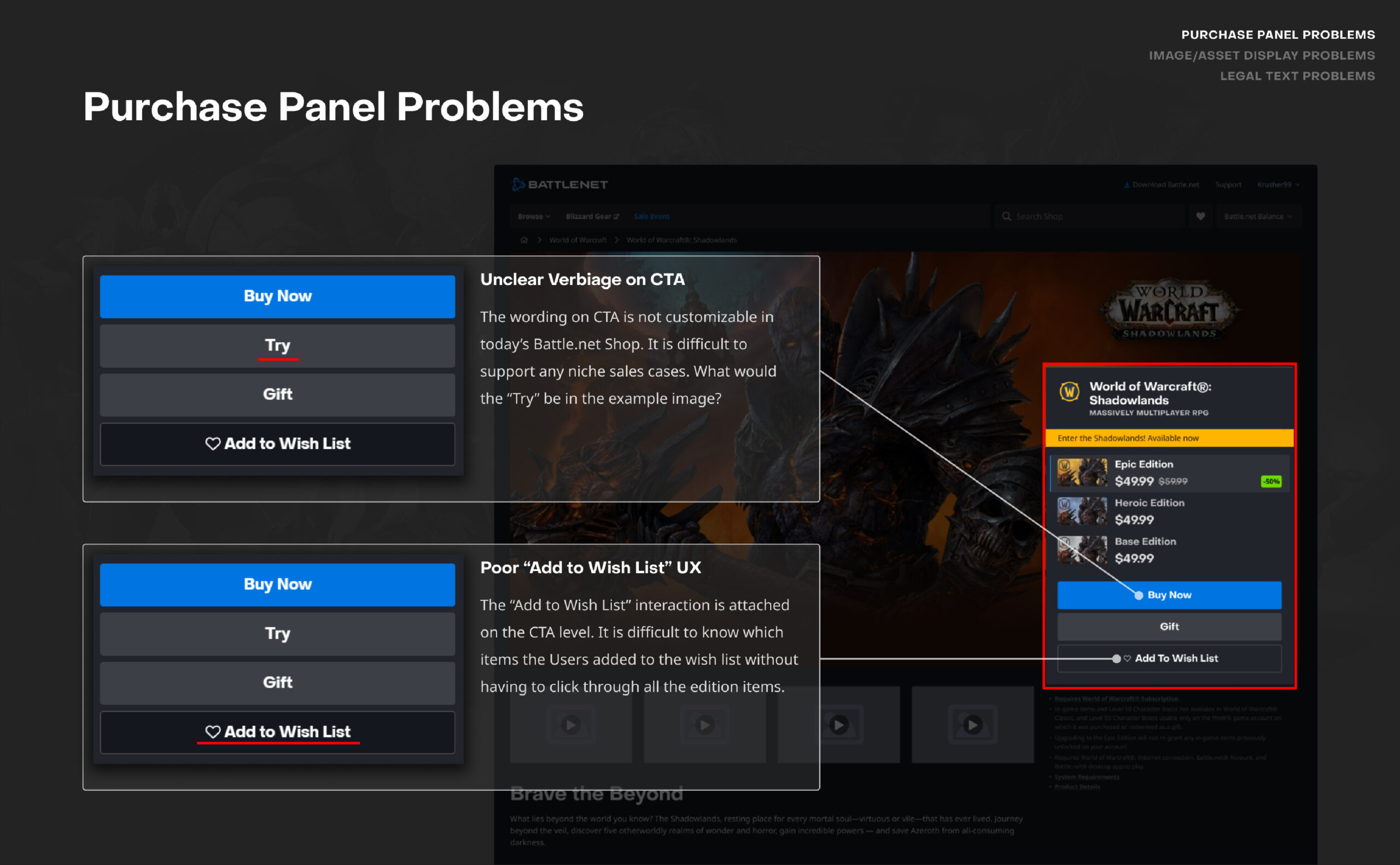
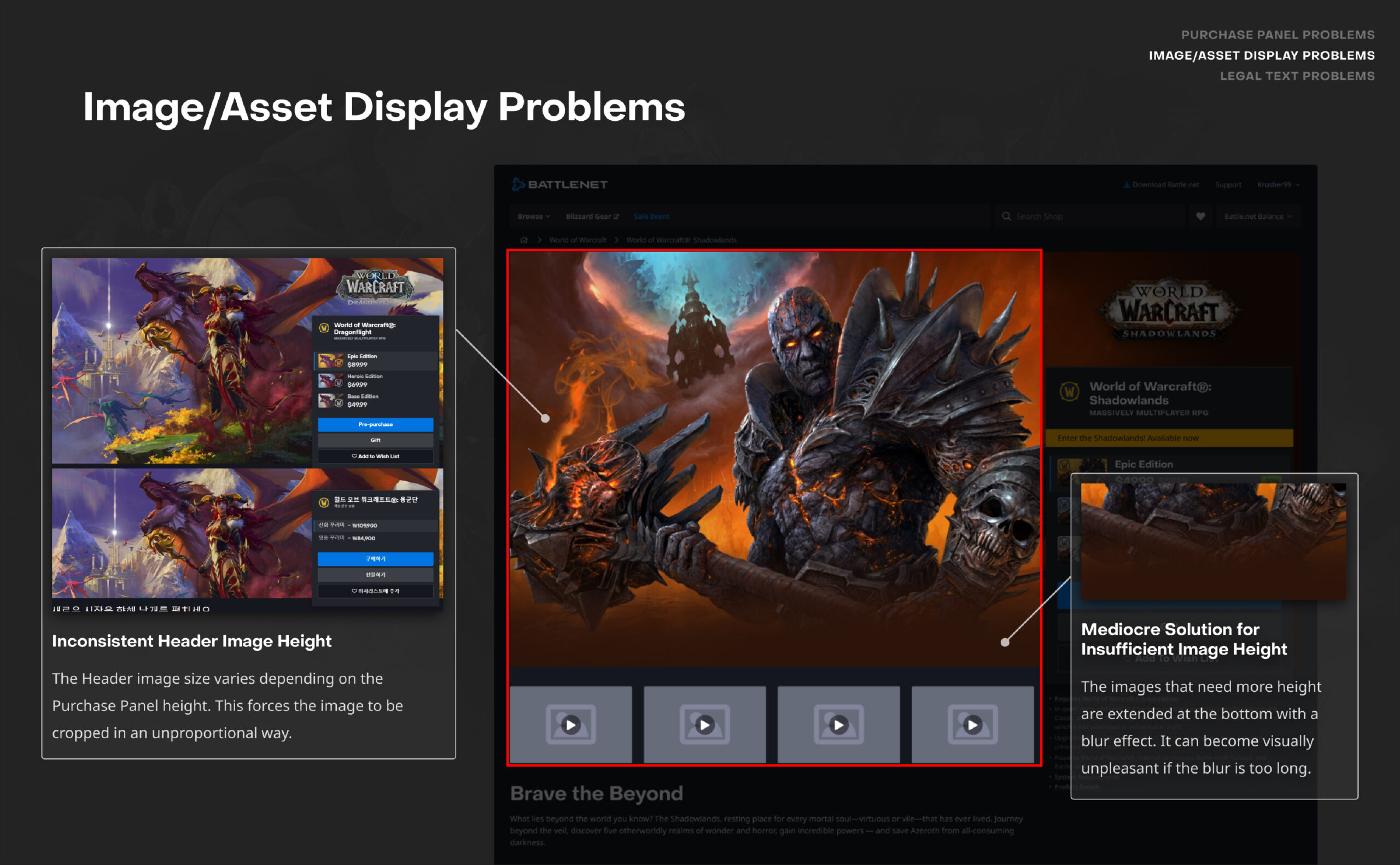
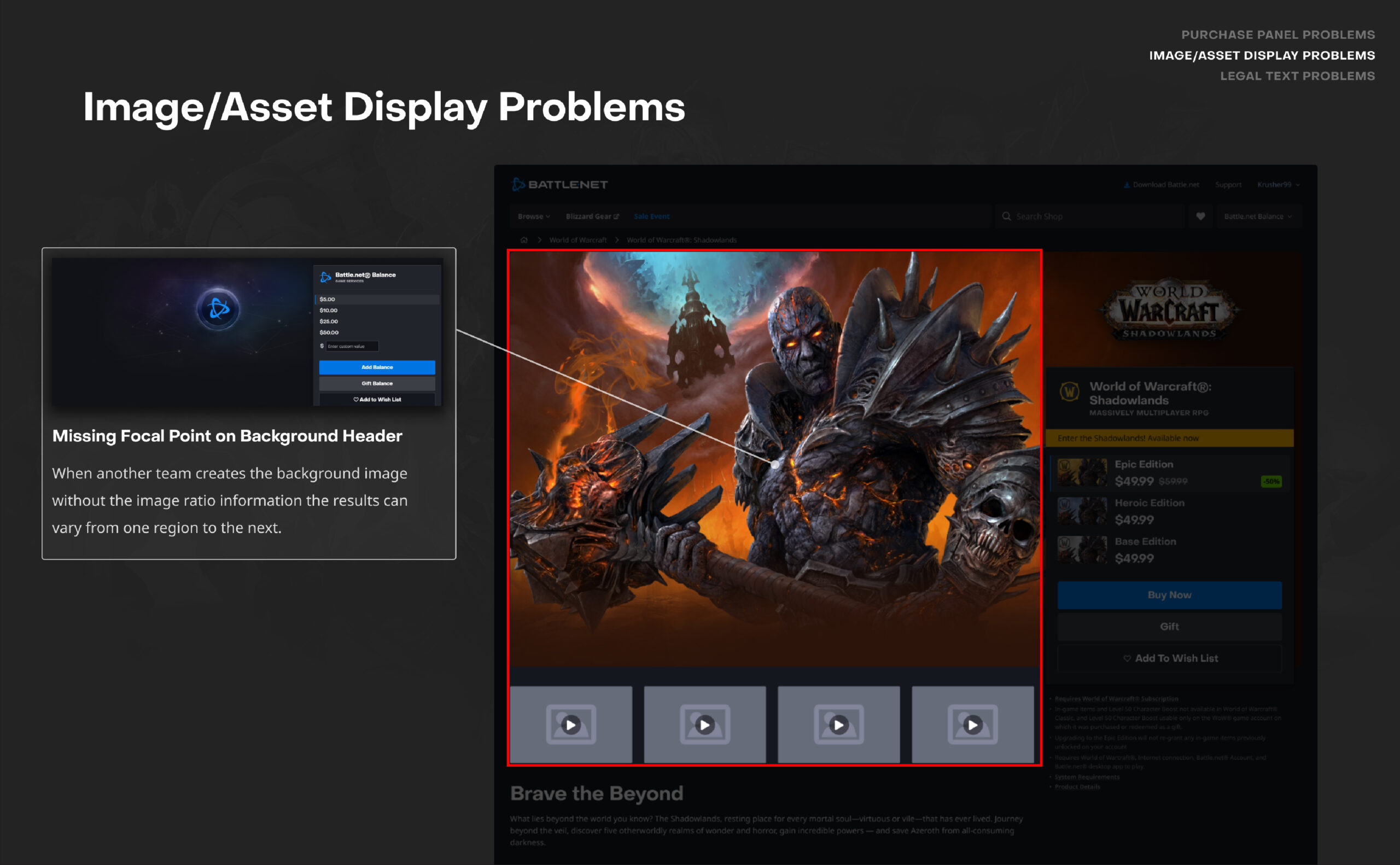
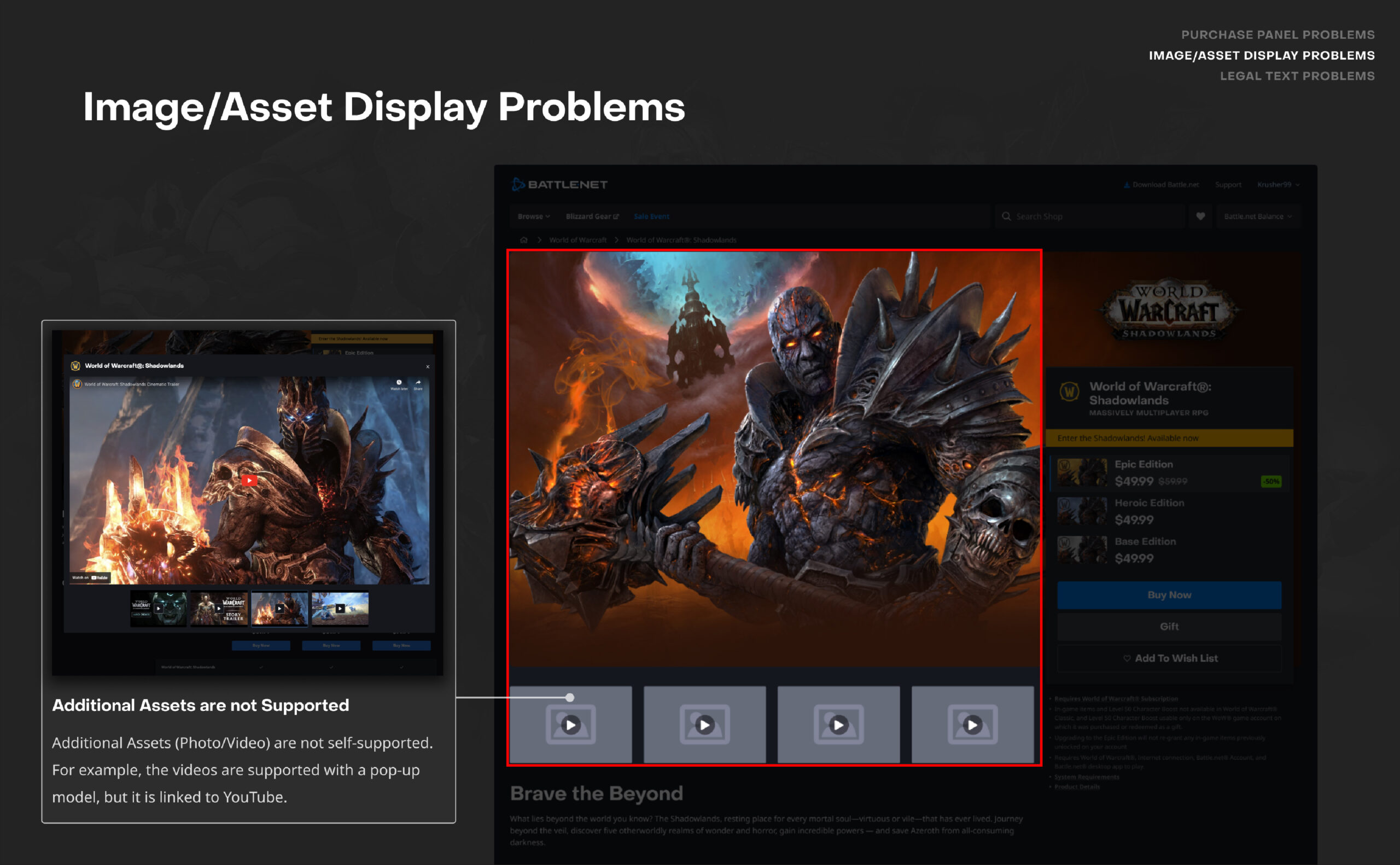
Purchase Panel Problems & Insights
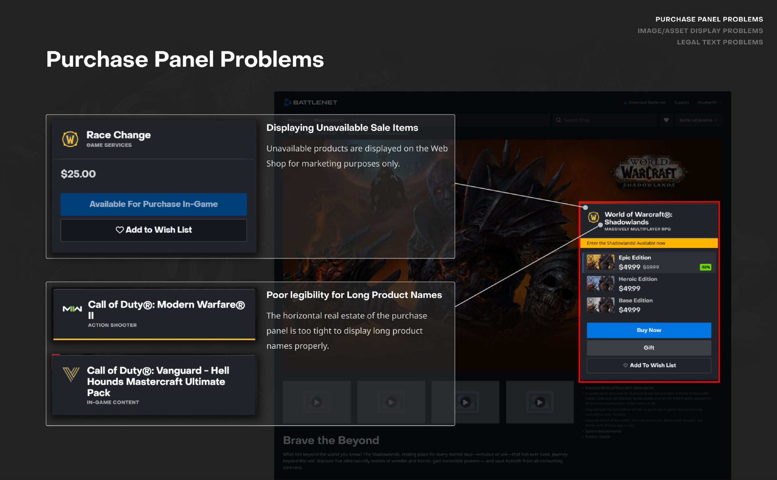
Real Estate on Purchase Panel
- There are over 11 different sales cases on the Shop and due to the fixed structure of the purchase panel, not all the usabilities can function smoothly within the template.
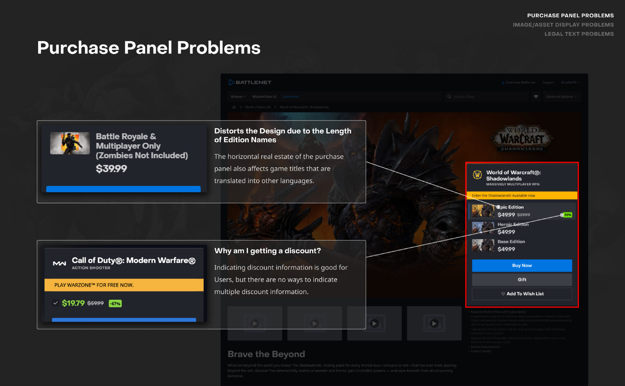
Information Hierarchy and Storytelling
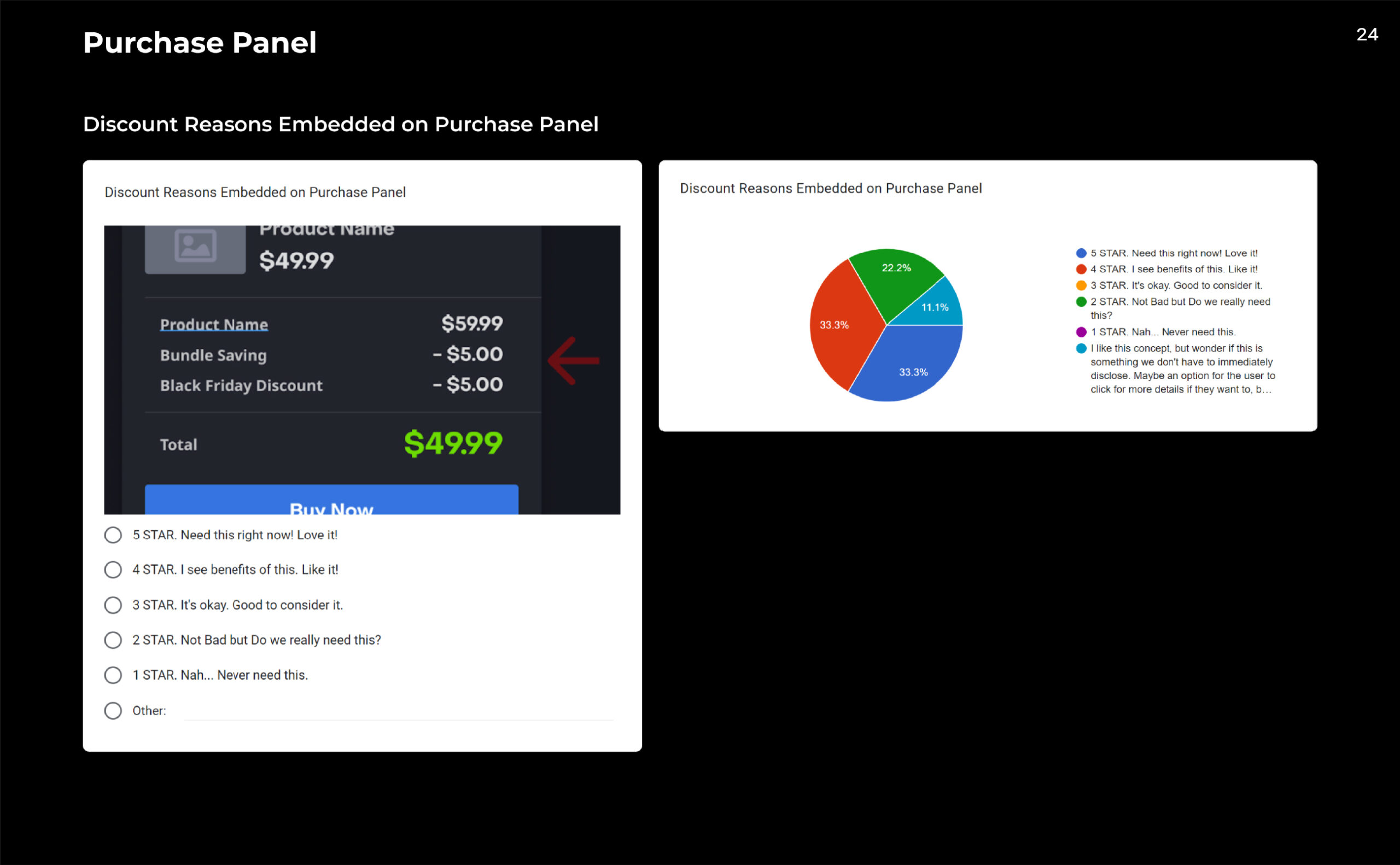
It does not provide clear information about sales and promotions such as: Bundle discount, Sales discount/bonus, Free items promotions, and Subscription savings.
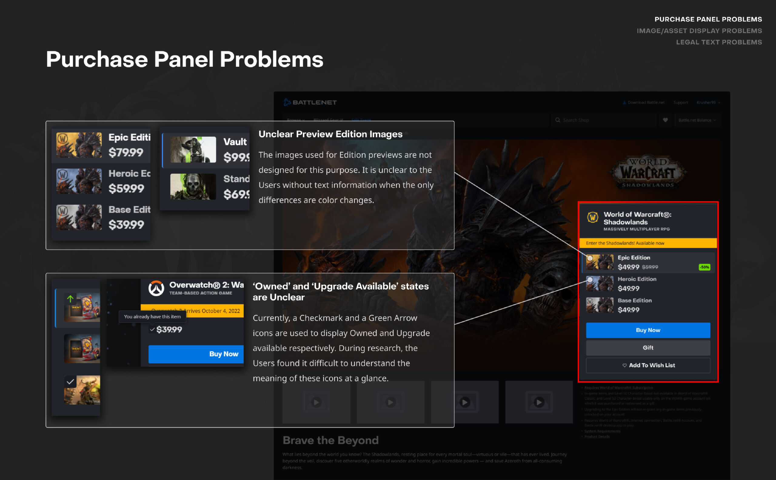
- It is difficult to know the difference between the 'Editions' inside the purchase panel at a glance (i.e. Game Products). The accessibility to the product comparisons page is not user friendly.
- There are some design elements that are not meeting its originally intended purposes.
Lack of Flexibility on the Current Design and Tool
- Shop expects more hybrid and unique sales cases in the near future. The current design has high limitations to support these needs.
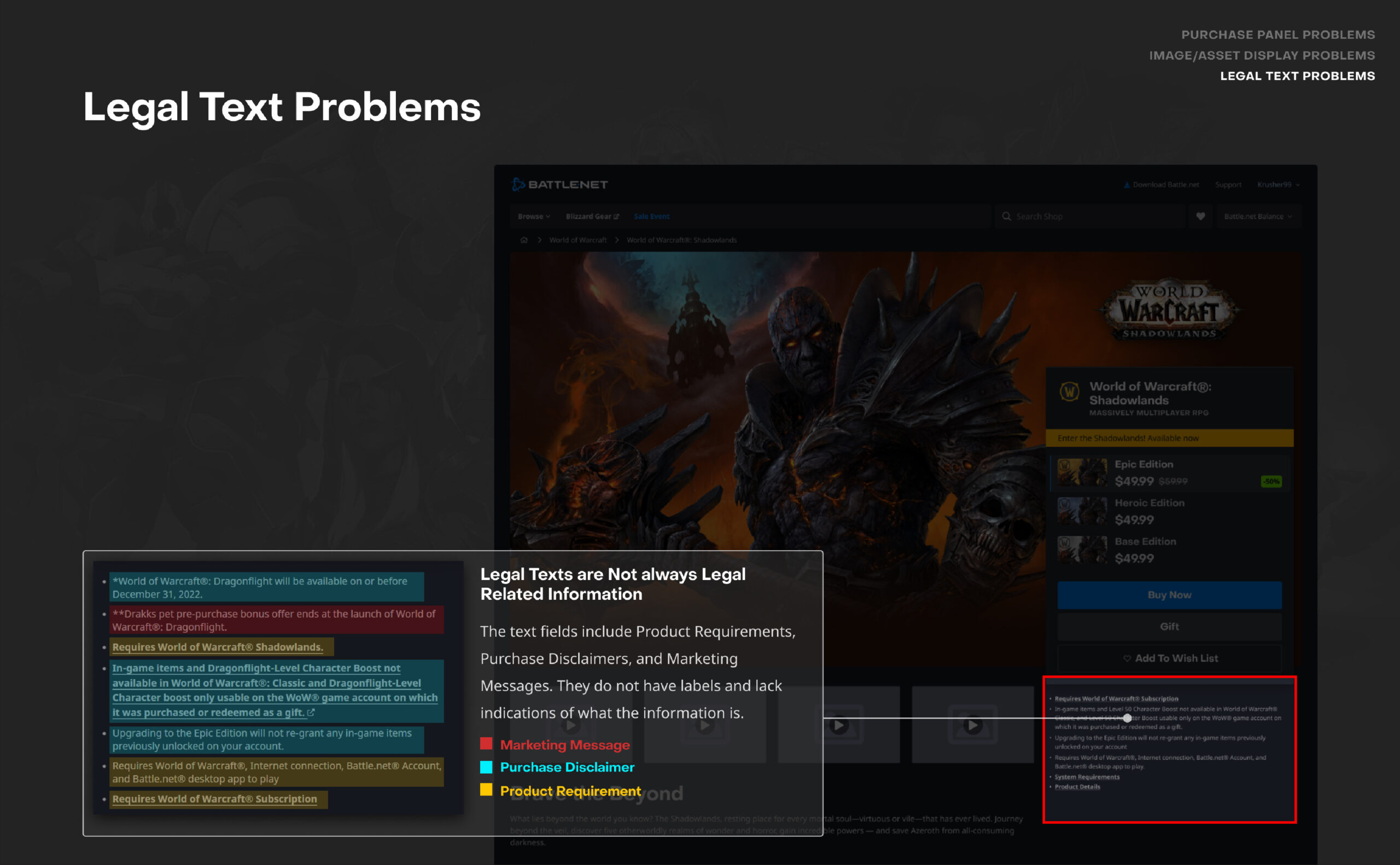
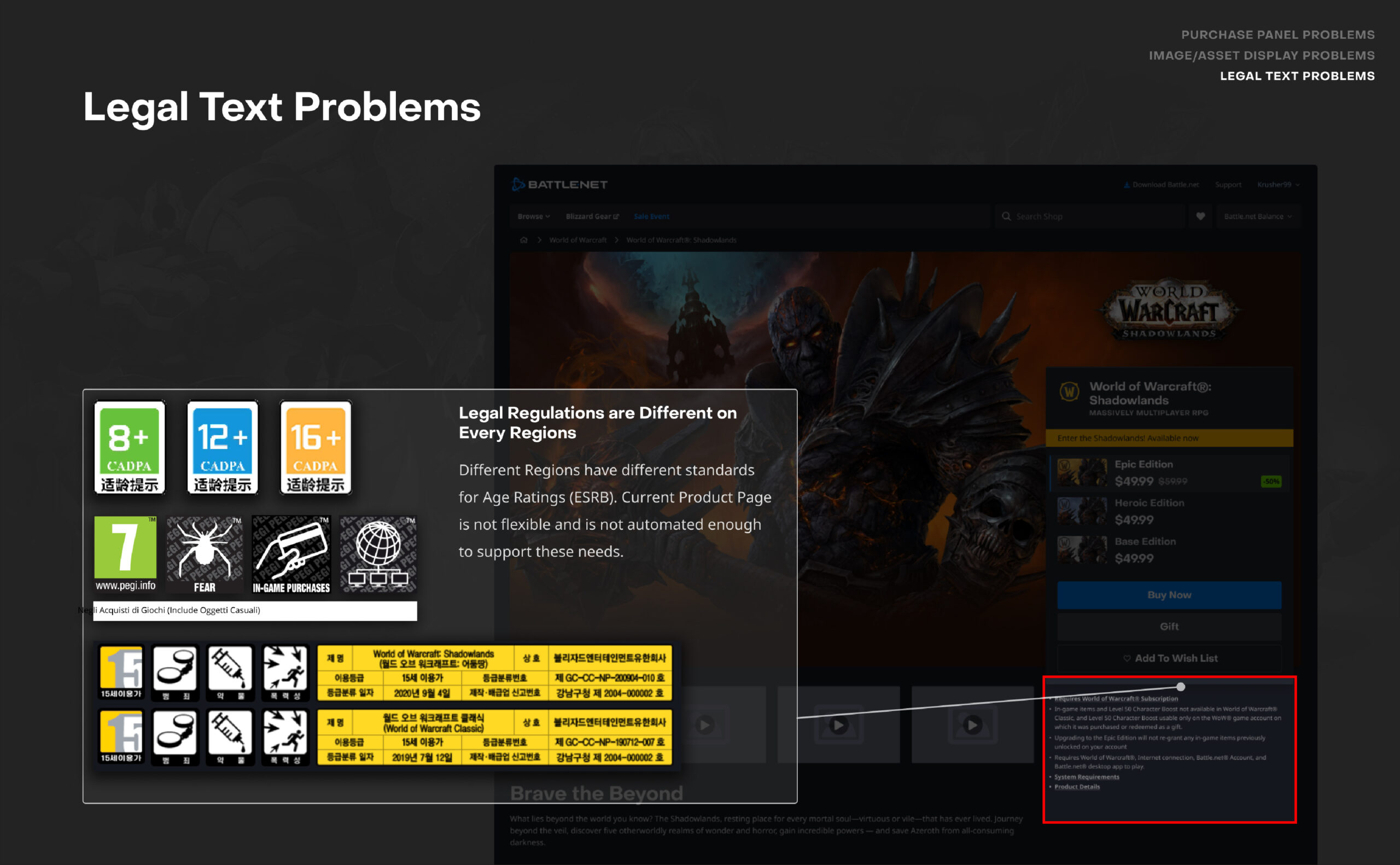
Product Requirements & Legal Disclaimers Problems & Insights
Information Hierarchy and Real Estate
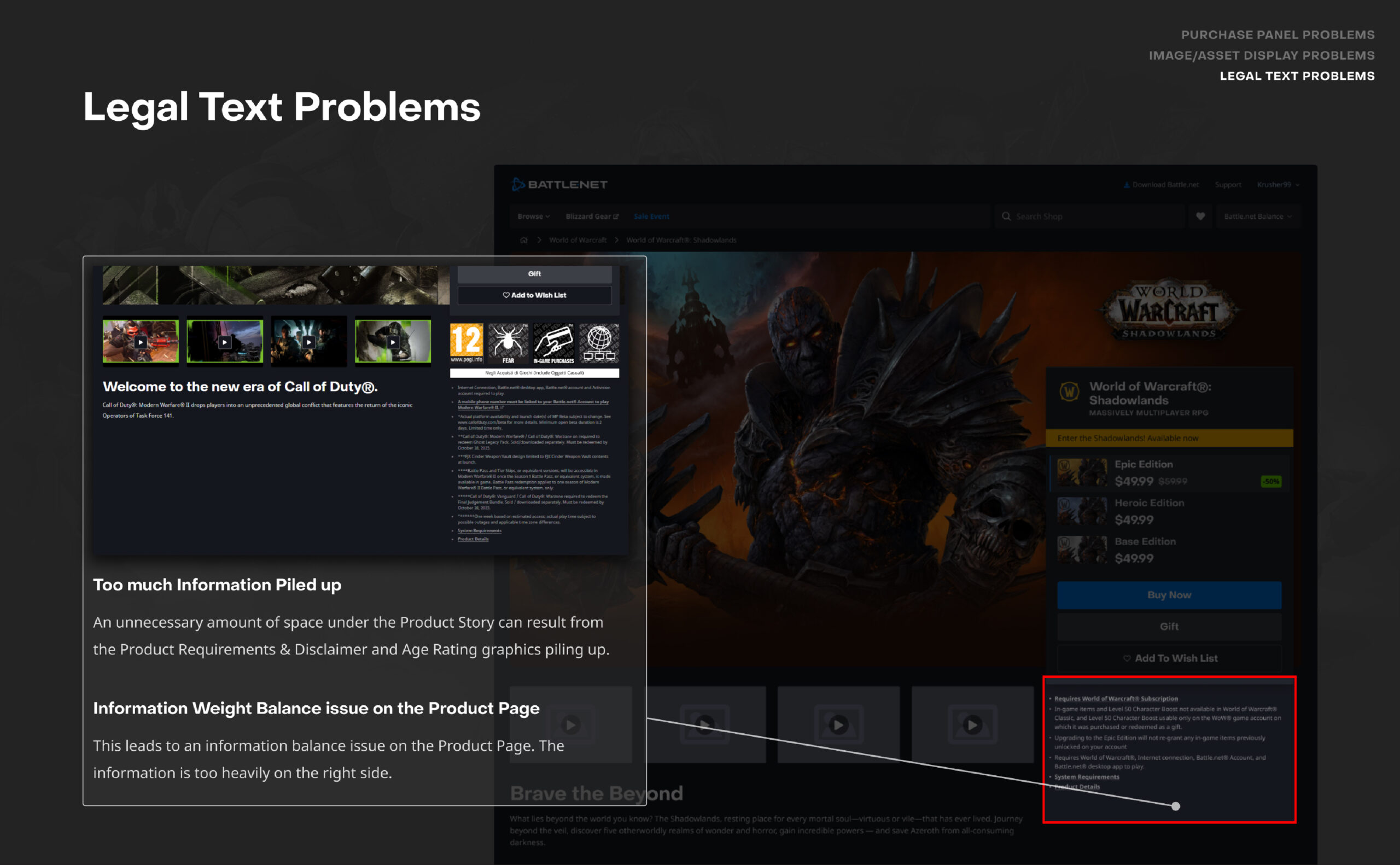
- Product Requirements and Purchase disclaimers overload valuable real estate under the purchase panel.
- The Product Requirements and Purchase Disclaimers information may not be accurate because they are not located under each individual product.
- Product Requirements & Purchase Disclaimers are unorganized and mixed up.
- Current Product Page lacks the real estate to separate Product Requirements and Purchase Disclaimers, especially in other regions where they require more complex legal standing.
High Potential Human Errors when set up
- All Product Requirements and Purchase Disclaimers are manually set up.
High potential for human errors lead to inconsistency.
Product Page Problems & Insights
Information Hierarchy and Storytelling
- Users are not informed about the product fully before a purchase.
- Expansions and Users’ relation to the base game result in preconceived notions for how one should return playing WoW that may not exist anymore.
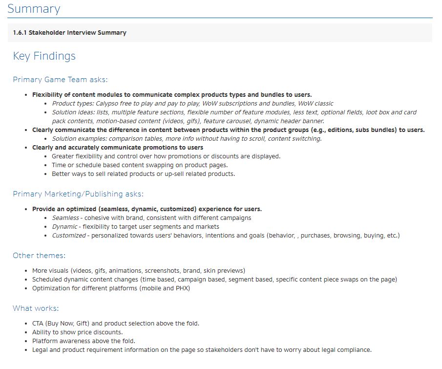
- Stakeholders on each team have different challenges and goals for communicating their product information because the current one-size product page template does not support flexibility.
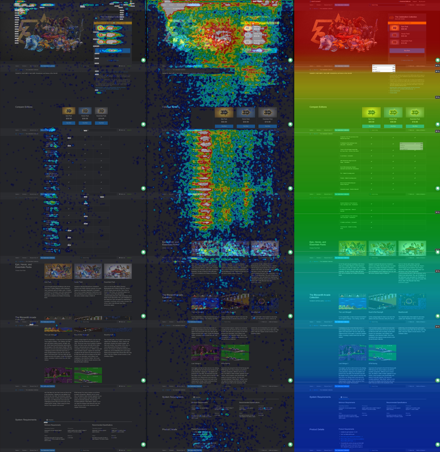
- Users do not engage with blocks of text in the shop pages, and prefer visual information.
Improve Support for Sales and Promotions
- Stakeholders want an easier and more automated system to communicate promotional details beyond price discounts on the product page.
- Stakeholders want to communicate time-sensitive information and marketing about their products to the Users.
Lack of Flexibility on the Current Tool
- Stakeholders want an easier product page set up, require less time and resources, and the ability to adapt to the changing variables.
Although there are many issues, I wanted to prioritize and present the most important topics per category.
How Might We...
Help Users Learn About Products
How might we create a product page that is capable of communicating the vital information in a logical, intuitive way to the Users to assist in making a decision?
Increase Flexibility to Support All Product Types
How might we create flexible and scalable product page templates that offer consistent shopping experiences for the Users that can support current product types and support future business cases?
Improve Utilization of Page Real-estate
How might we create product page templates that optimize page real estate and clearly display product information?
STEP 2
Product Page Ideations and Design Explorations

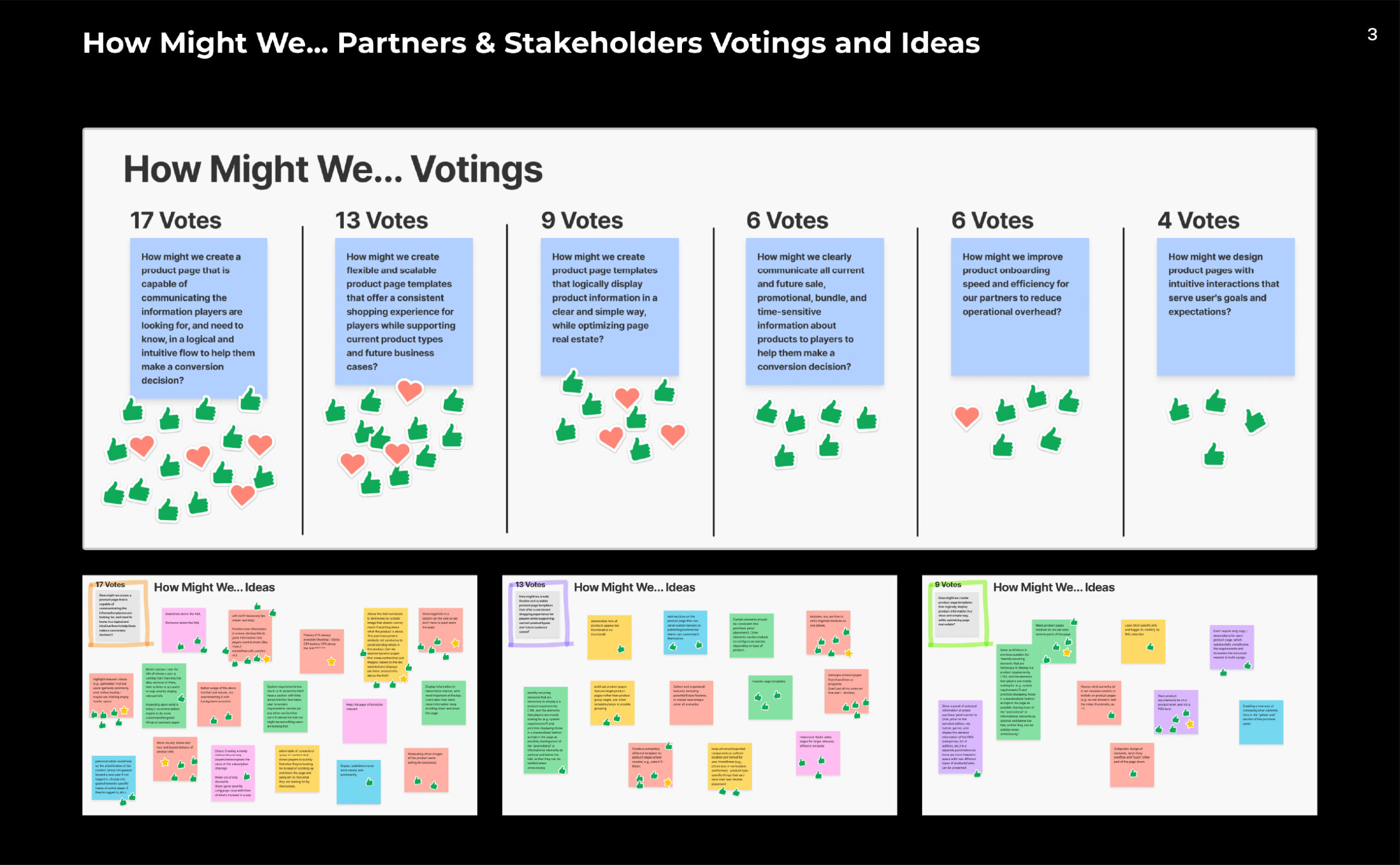
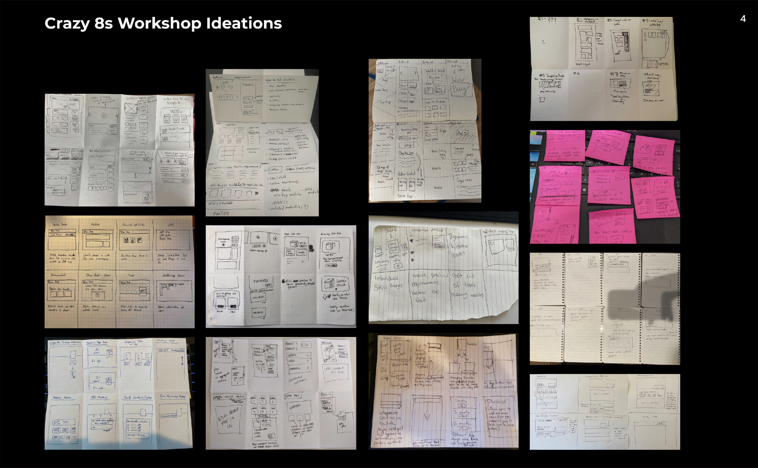
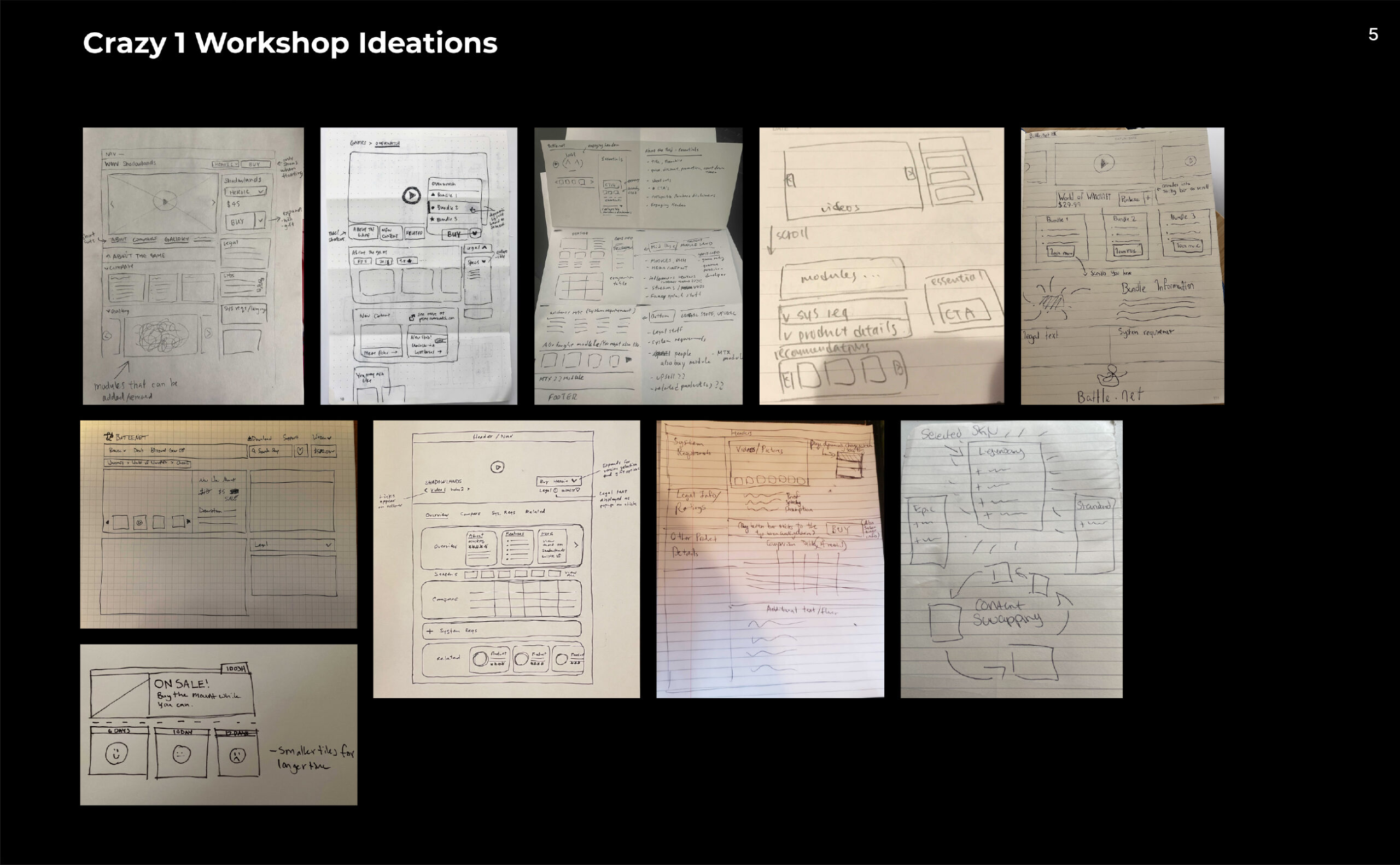
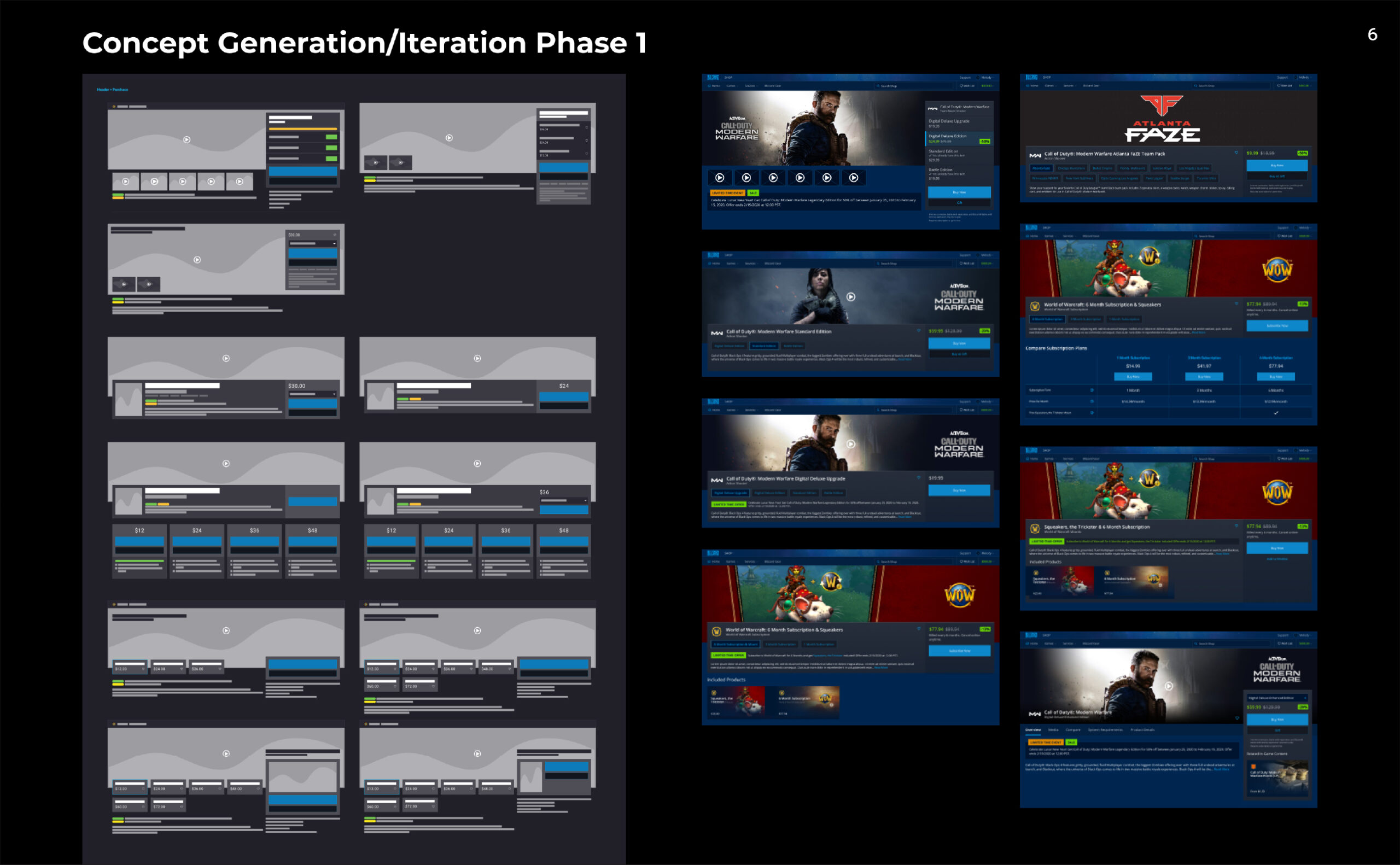
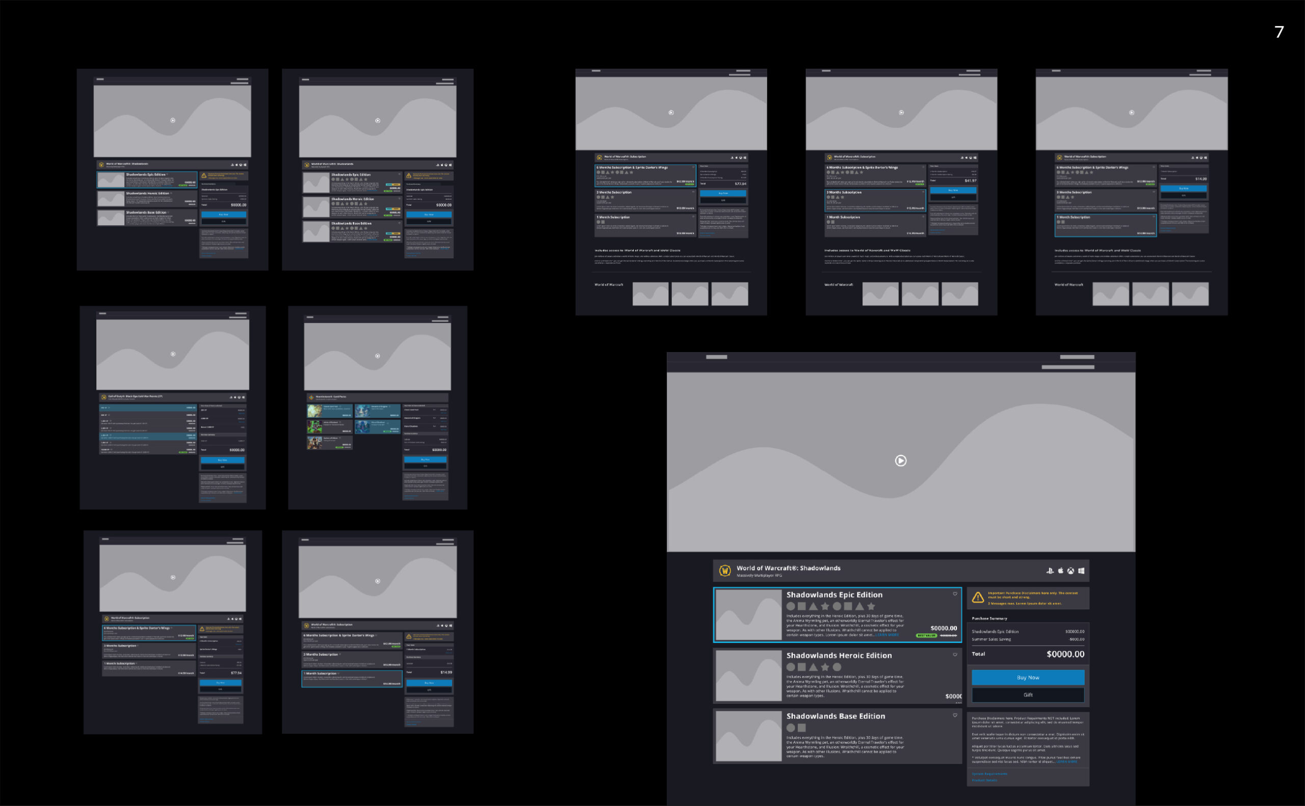
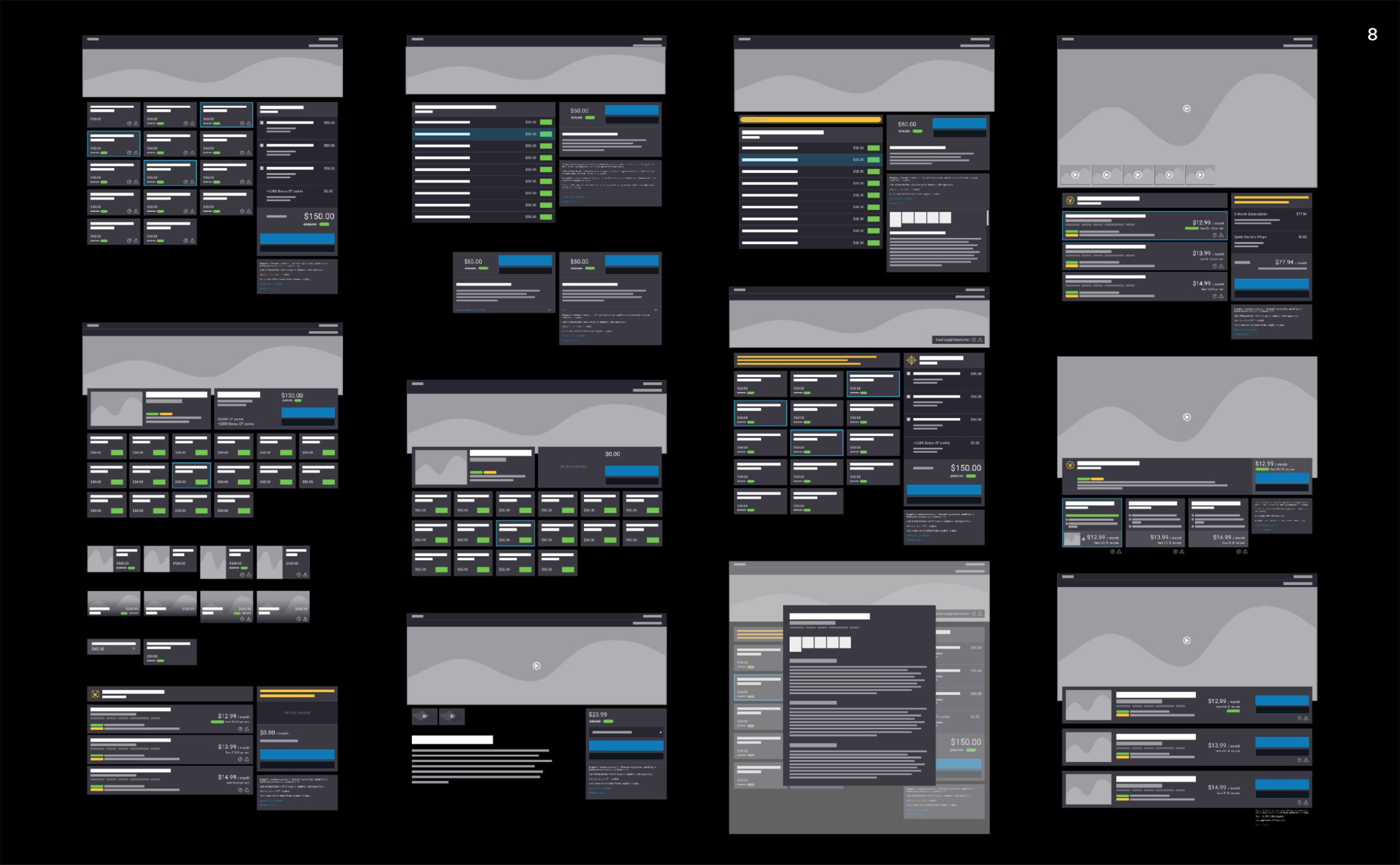
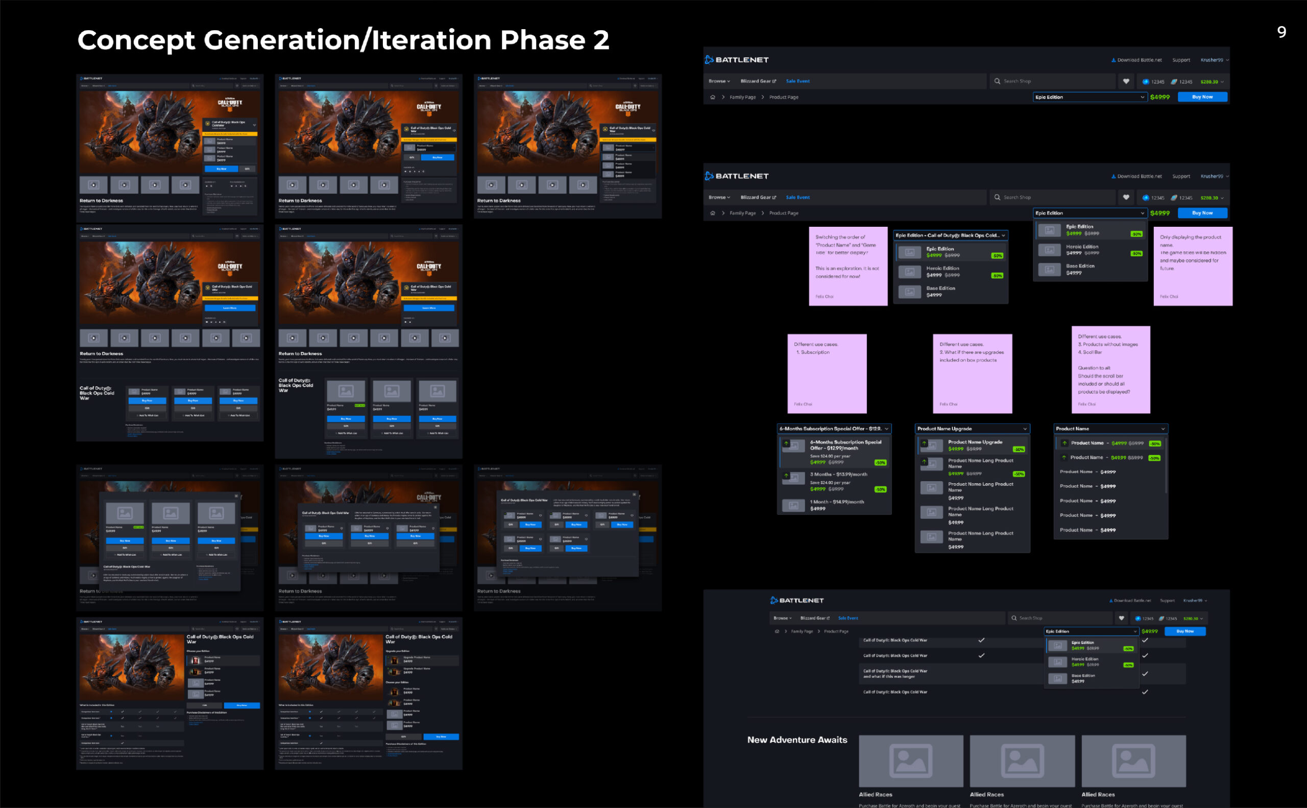
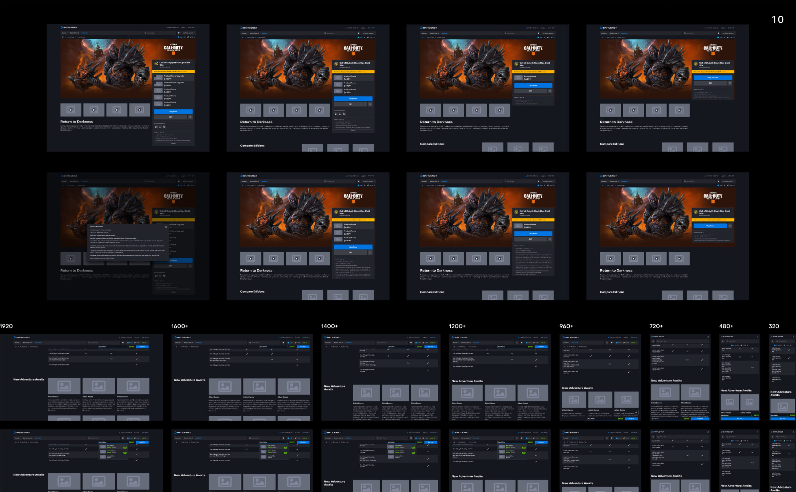
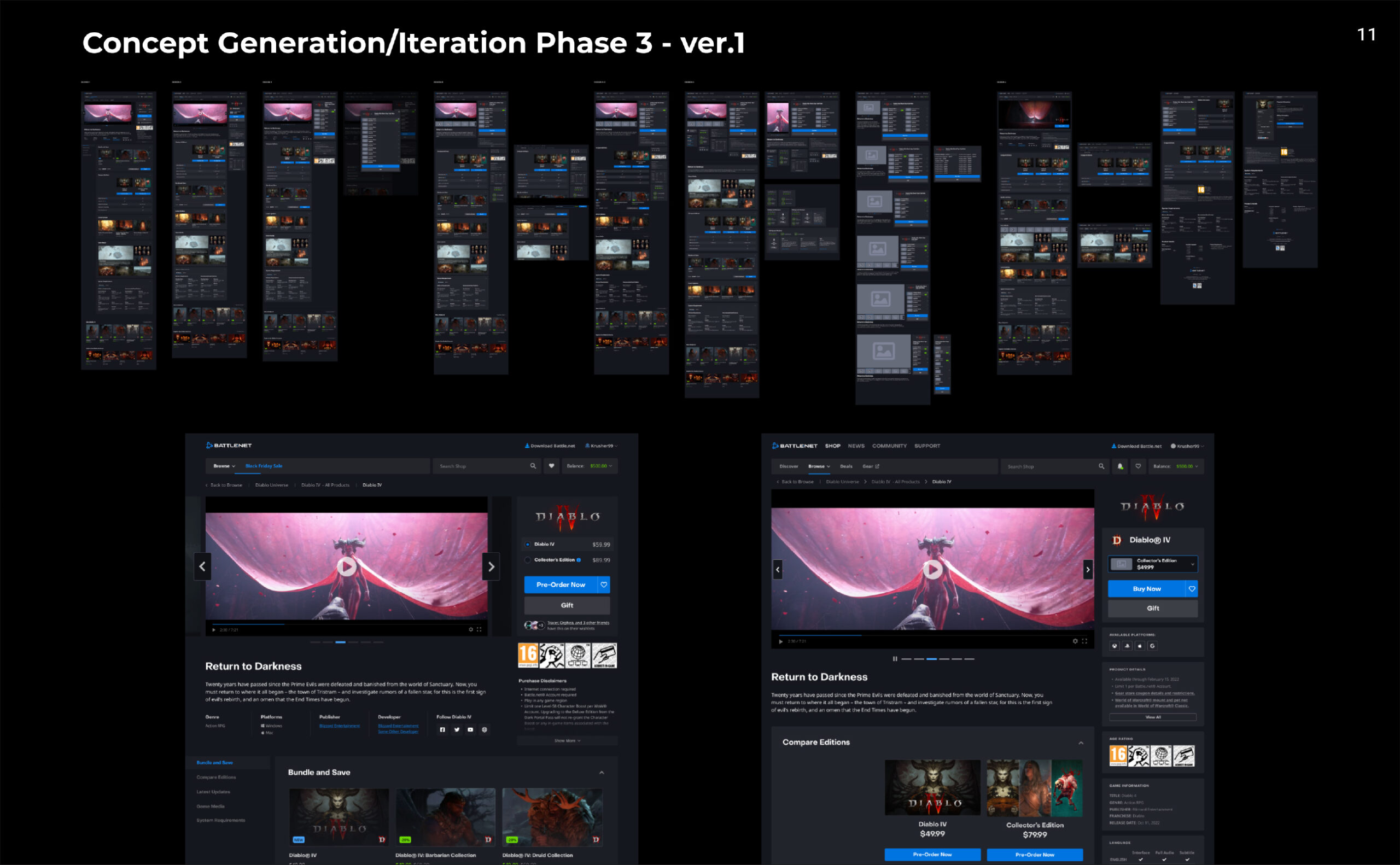
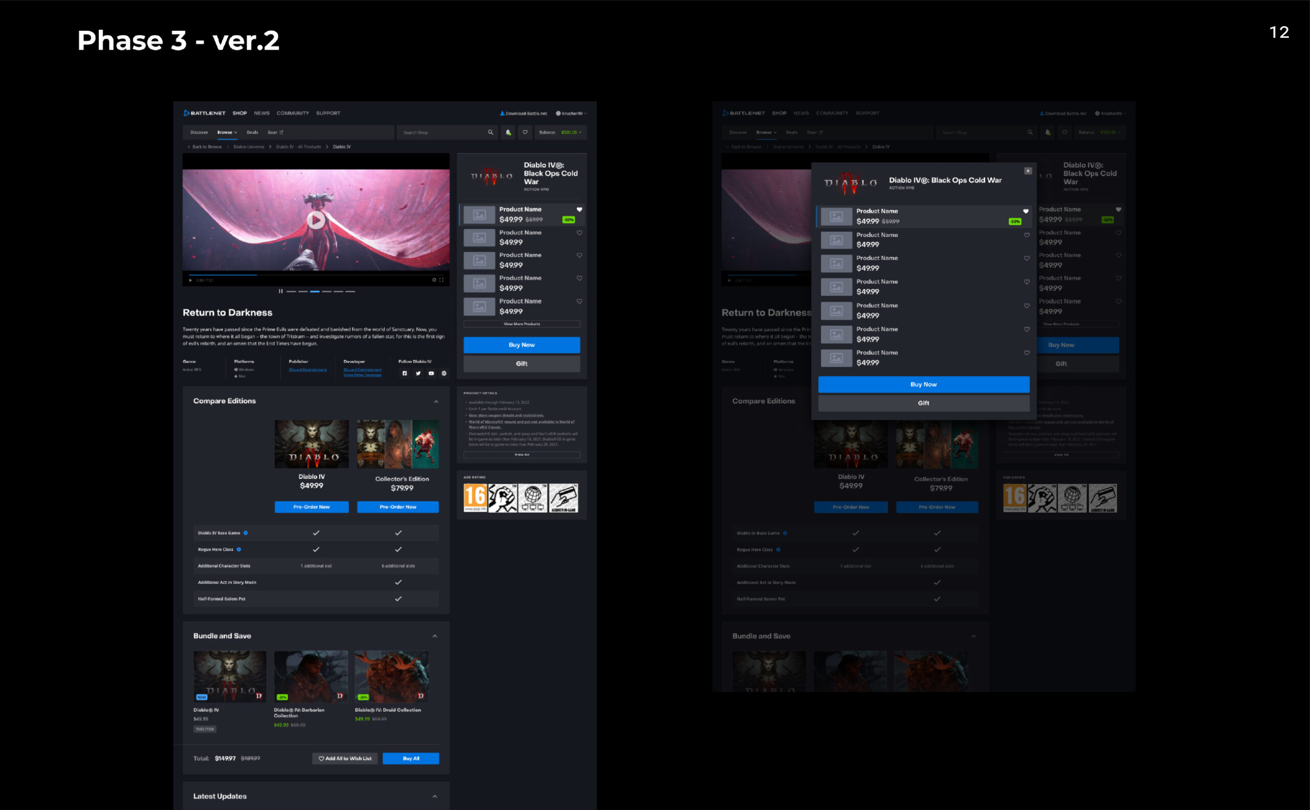
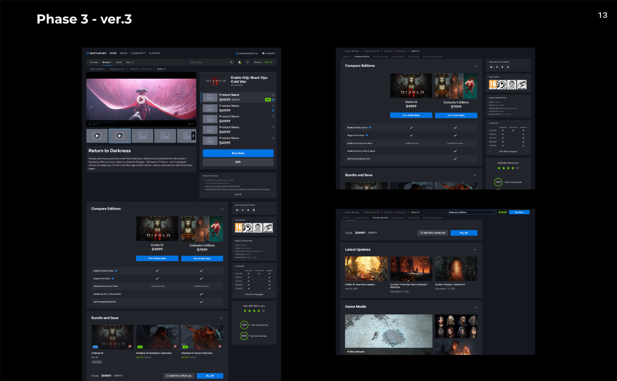
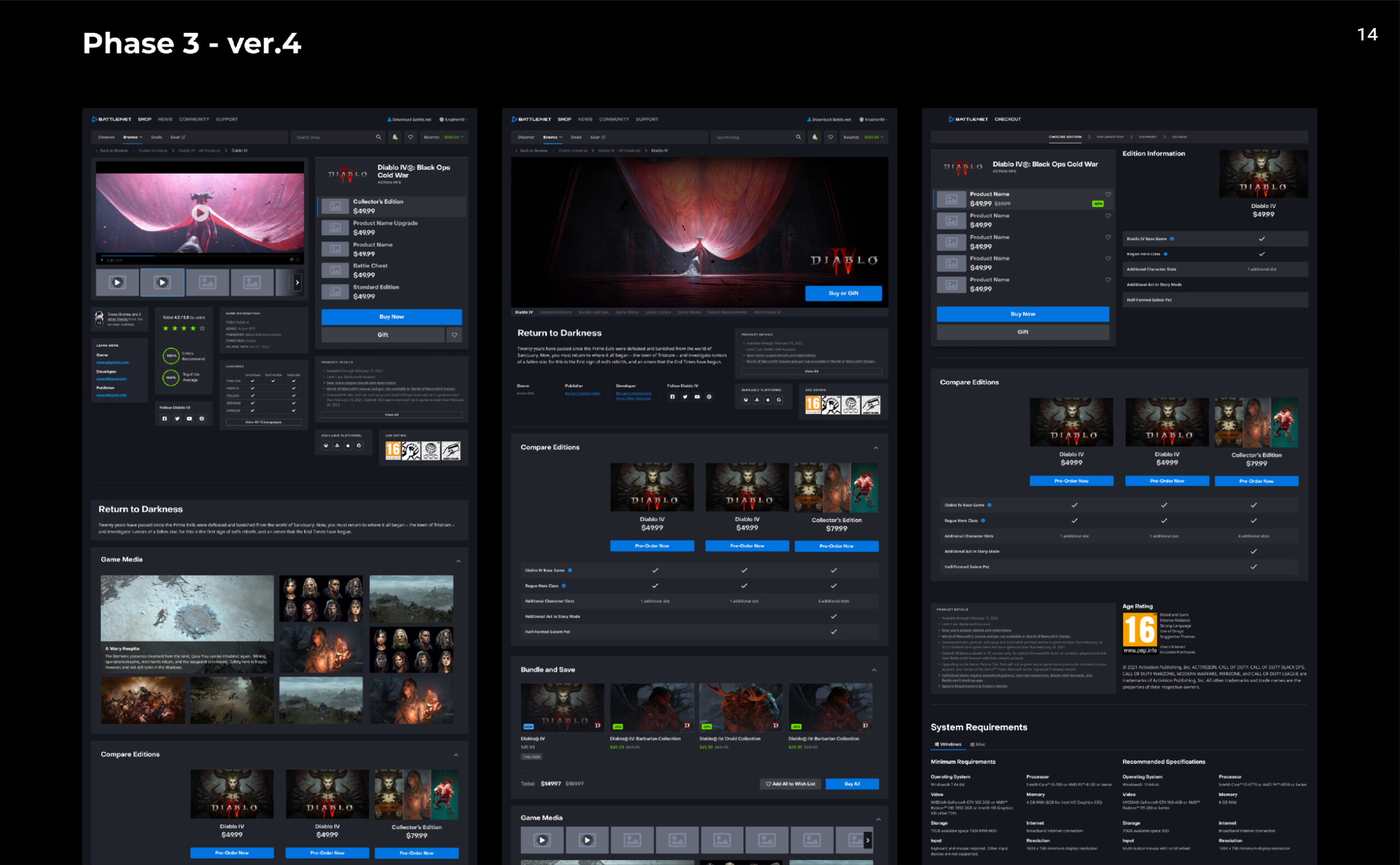
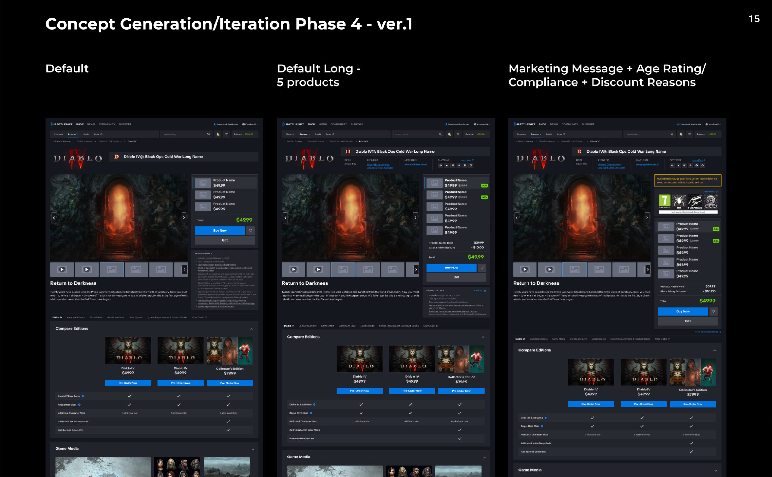
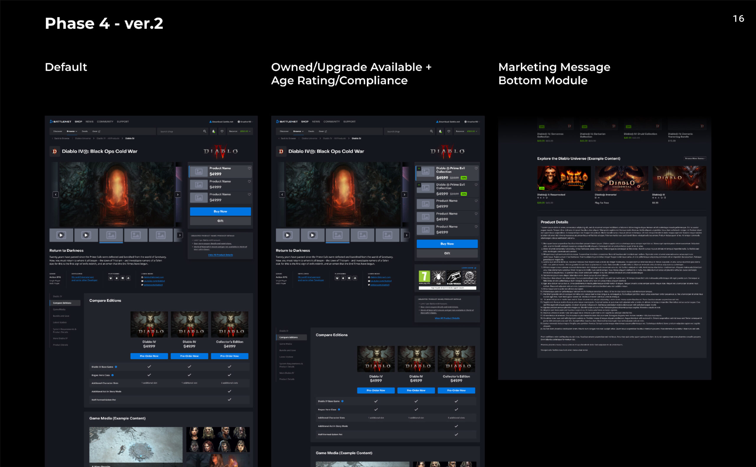
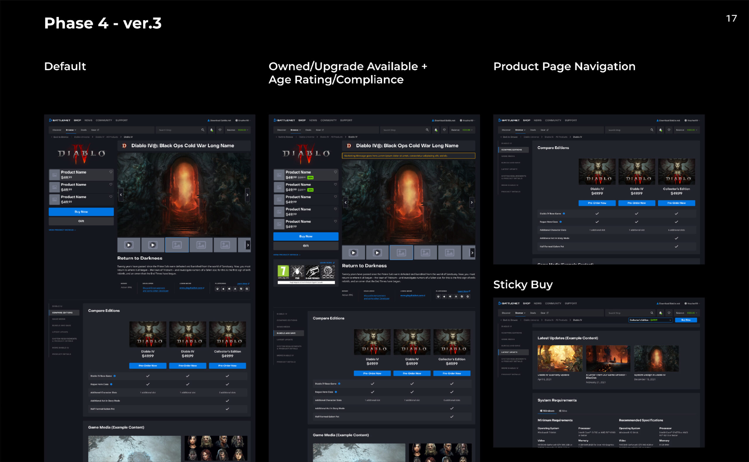
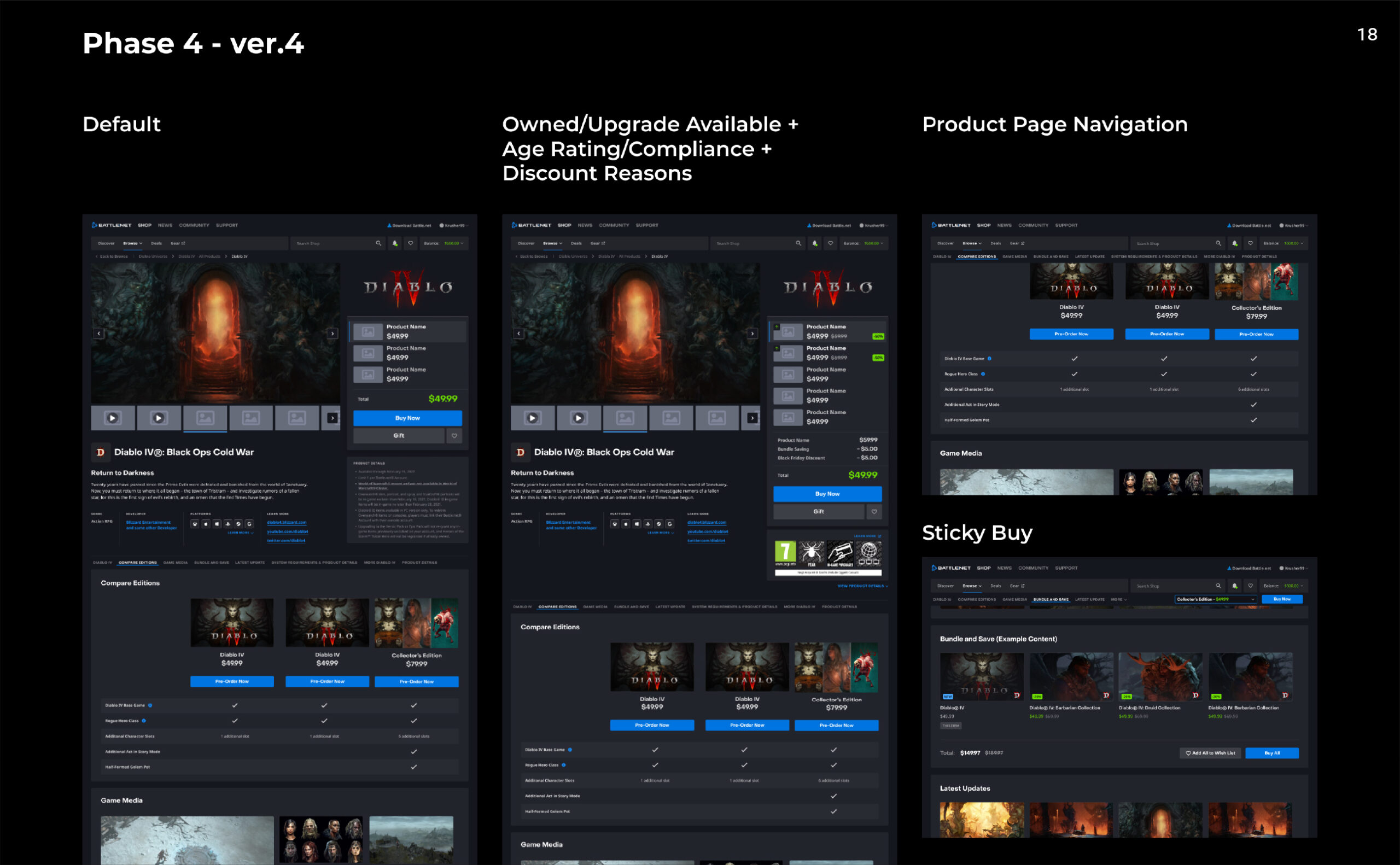
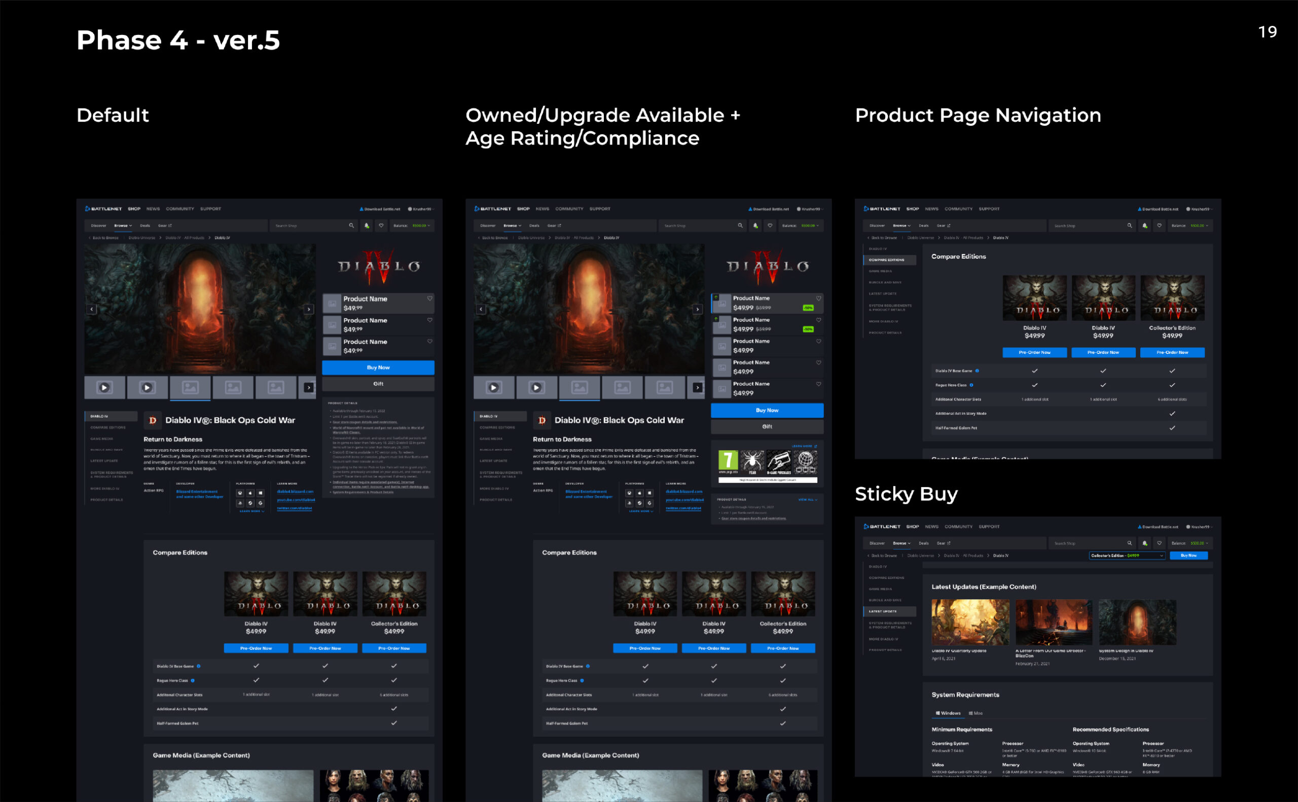
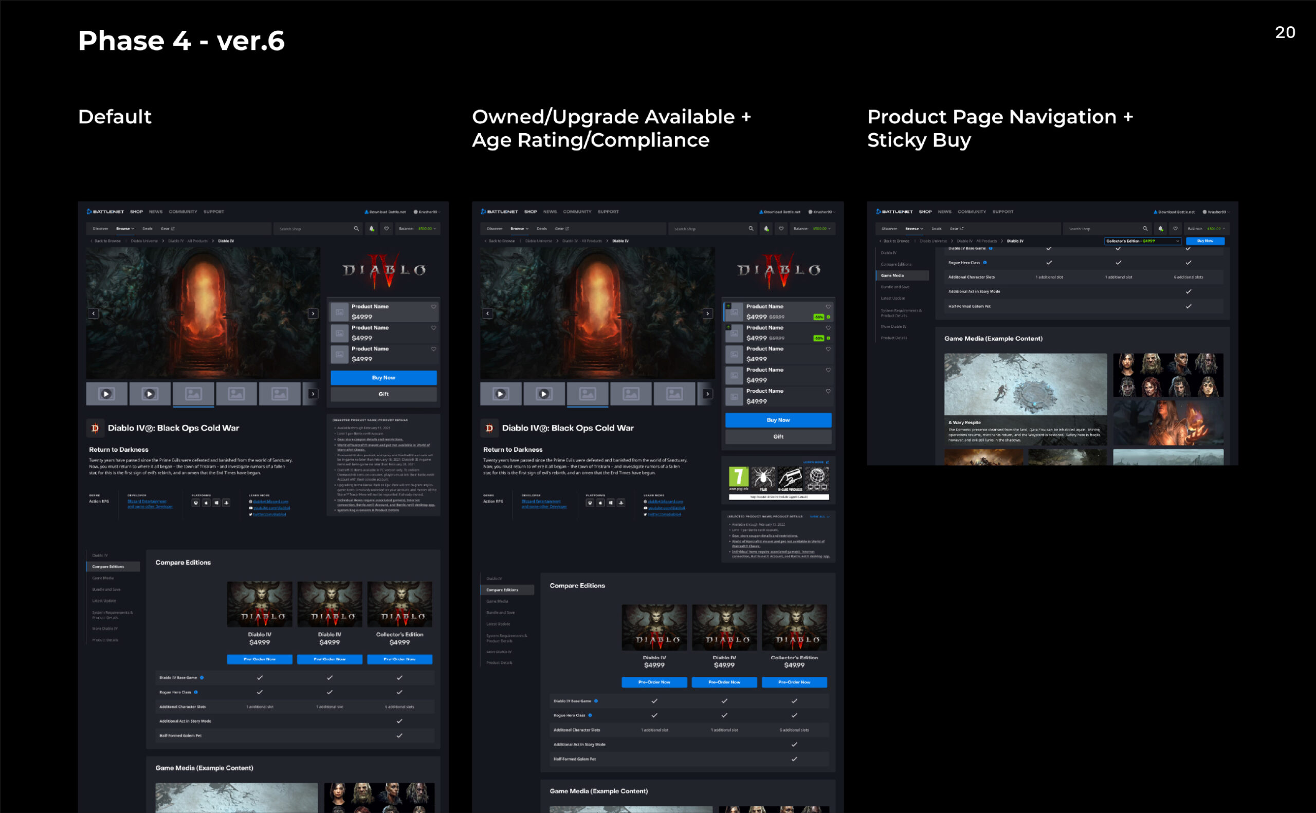
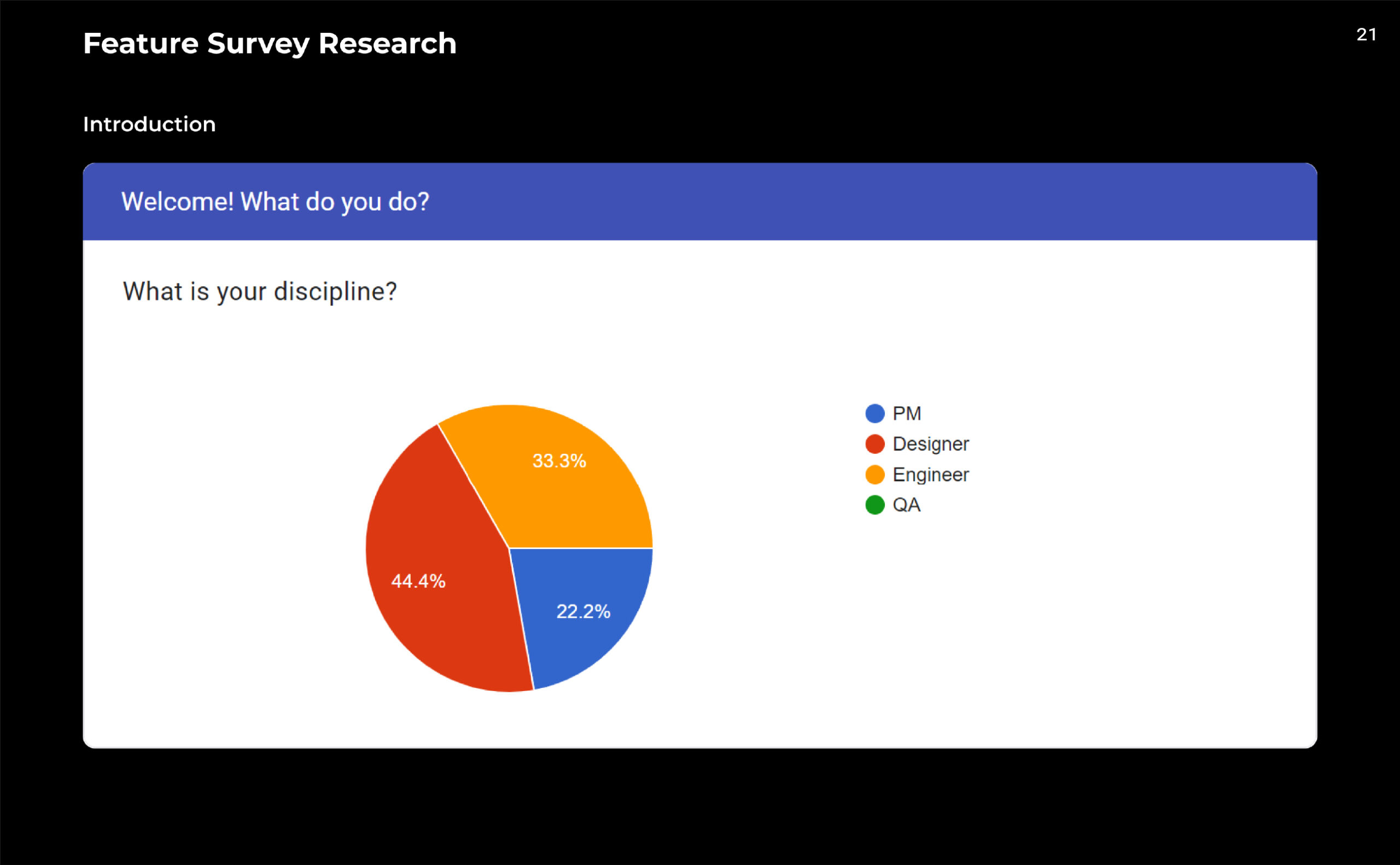
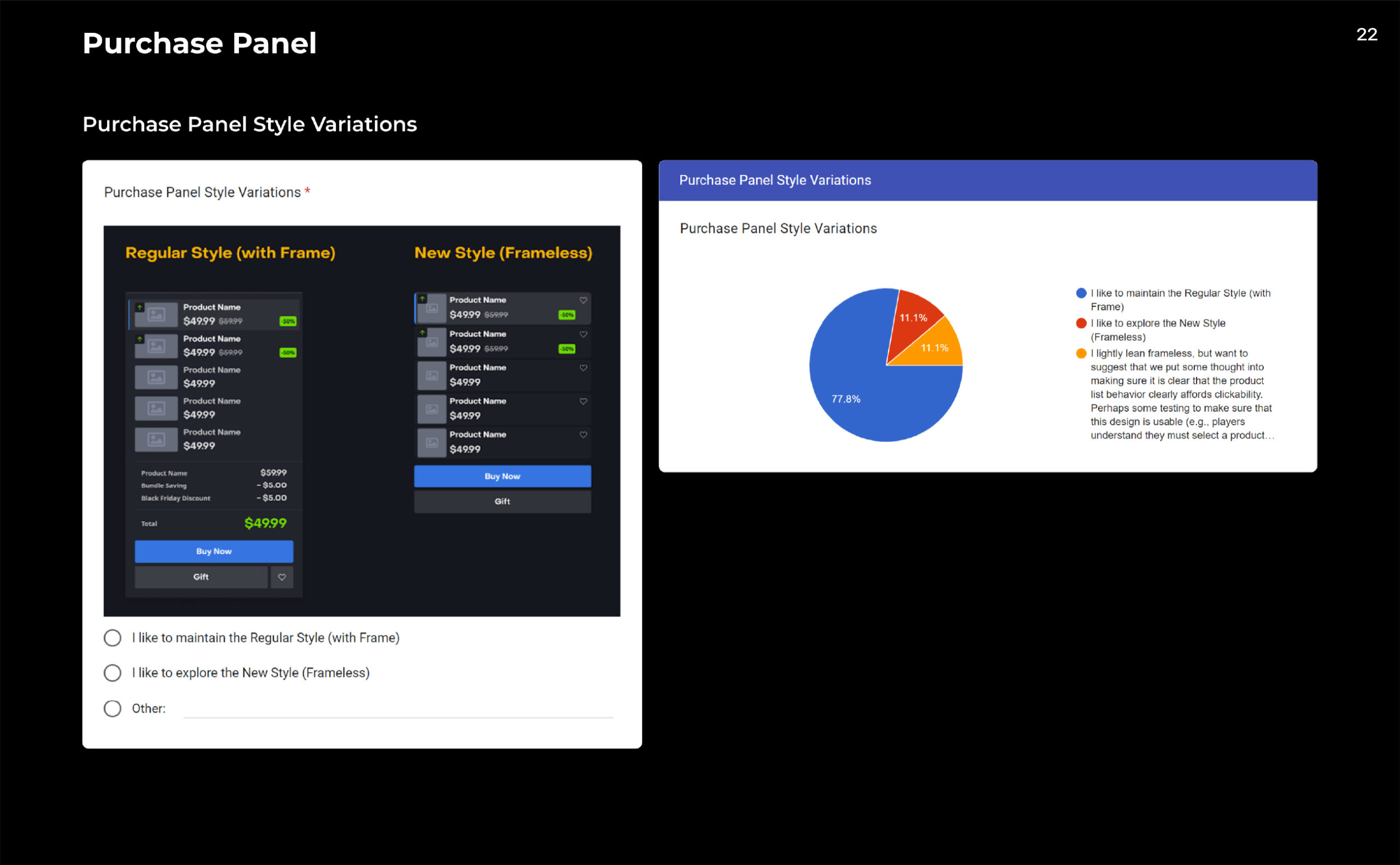
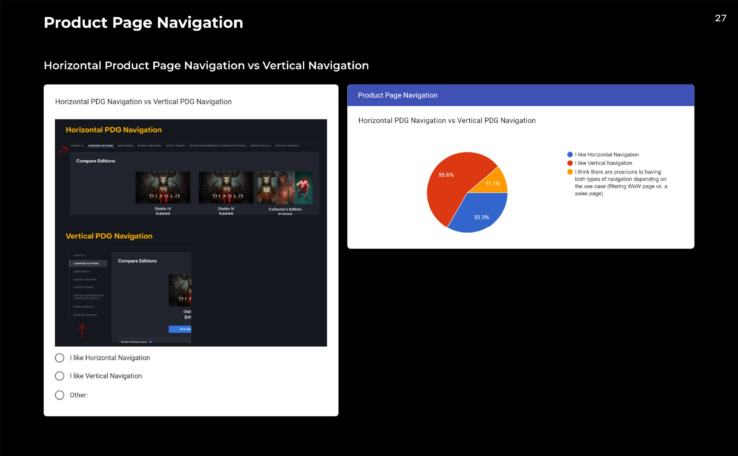
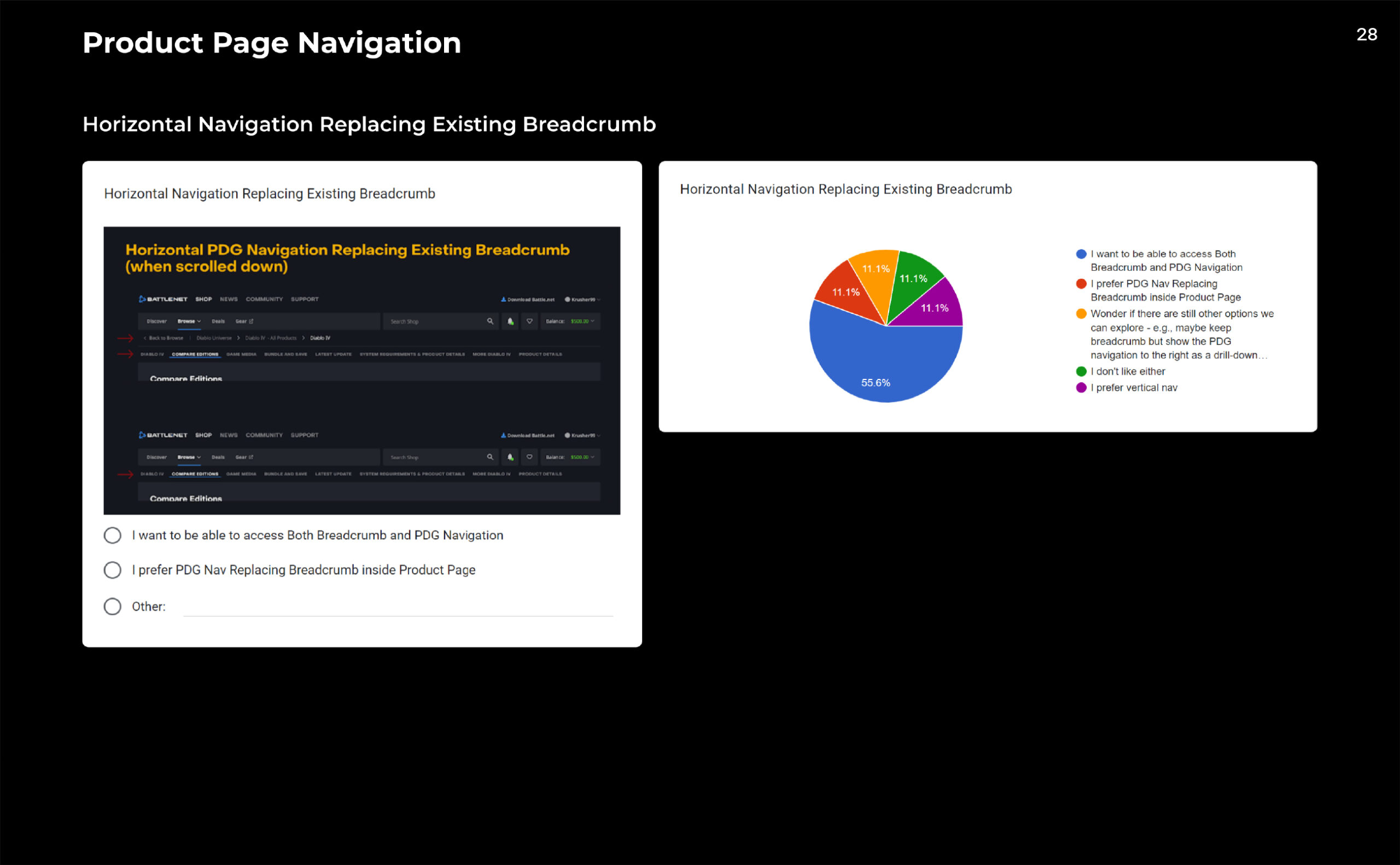

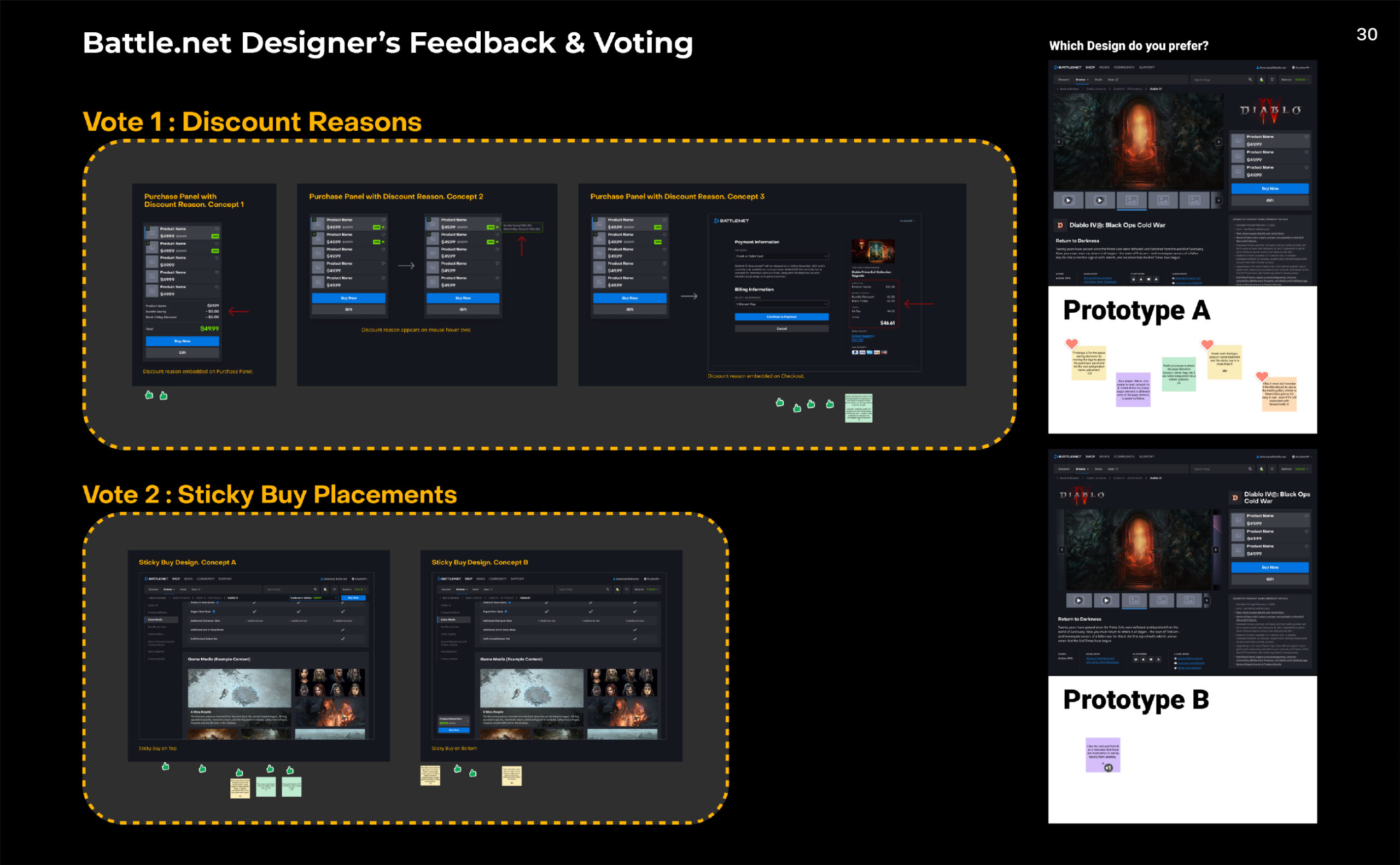
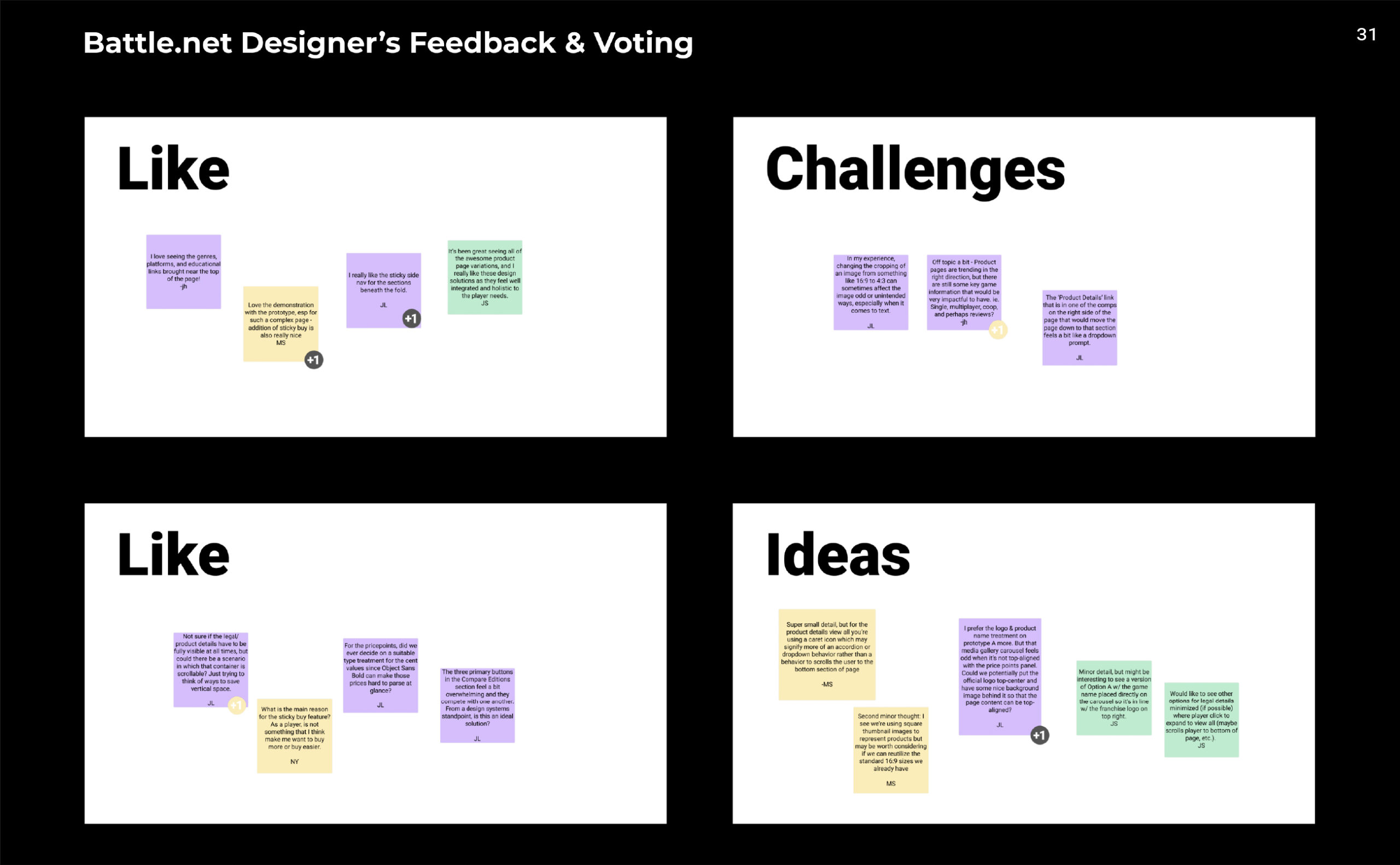

Workshop and Design Explorations
The Workshop Participation
I learned that partners and stakeholders participation in the ideation workshops are valuable. First, it avoids any surprises and unsatisfactory directions. It may be difficult for a person without a design background to understand solutions with low fidelity mockups. Second, it helps the partners to know that they are involved in the process. The participation allows brainstorming for solutions and allows me to learn about their preferences.
Problems of Workshops I learned
There may be situations where these workshops do not result in the best solution.
First, I have seen many designers use the solutions gathered from the workshop as the final direction because they were brought up by the partners, stakeholders, or decision makers. However, when I led these workshops, the non-design disciplines were rarely capable of empathizing with ‘Problems & Insights’ and ‘How Might We(s)’ solutions. This is because they are not also involved in the problem discovery stage. Especially when the problems are complex, it is difficult to simplify them into a couple sentences. This results in a lack of connecting the problems to the solutions during the workshop.
Secondly, most are easily attracted to fancy visuals because the solutions are scribbles at this stage. Coming up with more eye-catching visuals automatically draws everyone’s attention. Regardless of the solution, the fancy visuals tend to get the most votes.
Lastly, some participants focus purely on coming up with “cool” ideas. Purpose of the workshop is to come up with solutions for the discovered problems. However, some will bring ideas they liked from other sites/platforms which share none of the same problems. This often occurs when the participants do not fully understand the problems or do not understand the purpose of the workshop.
Design Mockup ideations
I compose and present various ideas for design mockups. According to IDEO founder David Kelley, “To come up with a good idea, you have to come up with many ideas”. Not all ideas may be great, but I am satisfied if one idea can inspire the partners, the stakeholders, and the team leads to a better solution.
Step 3
Final Design
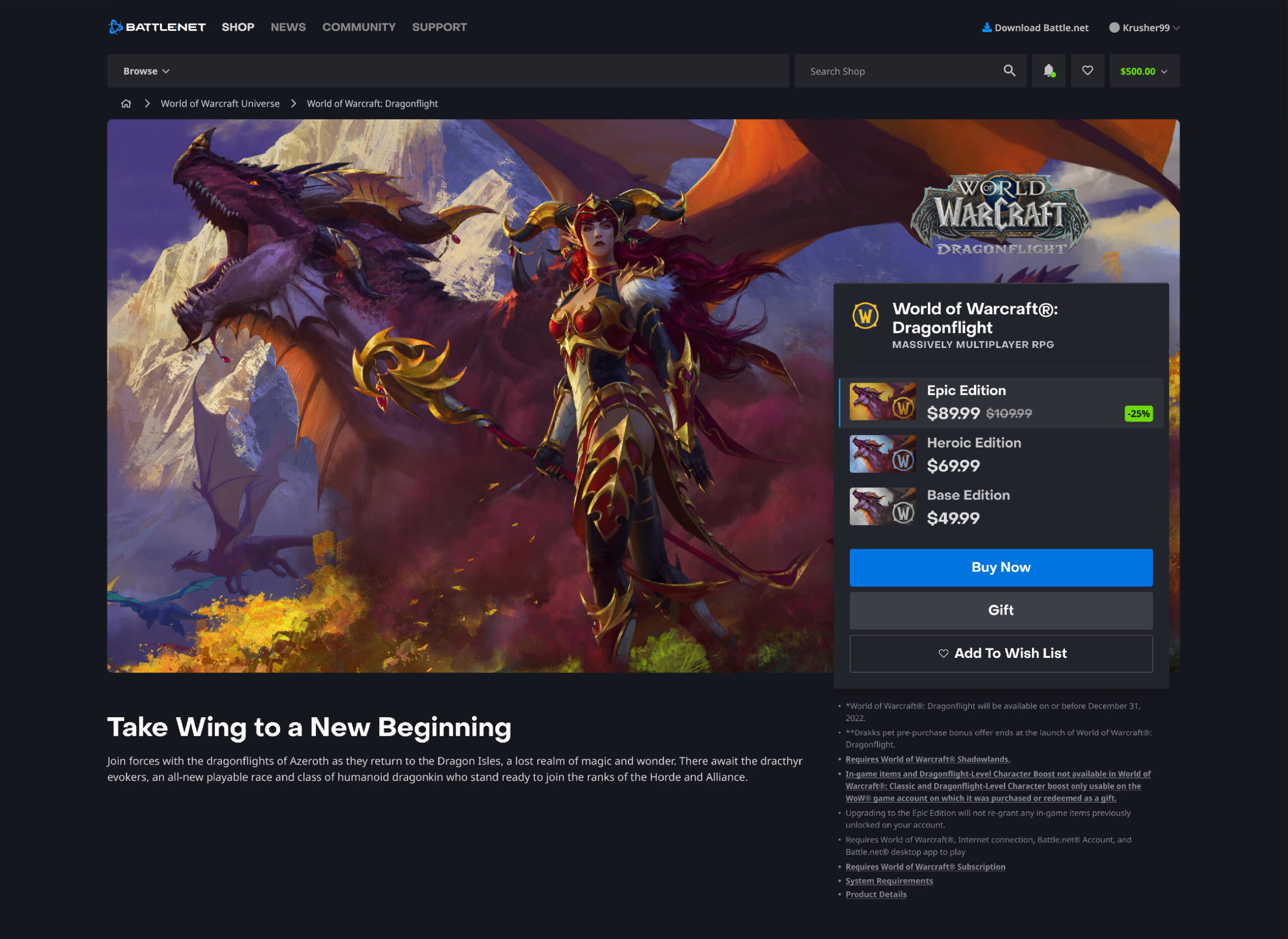
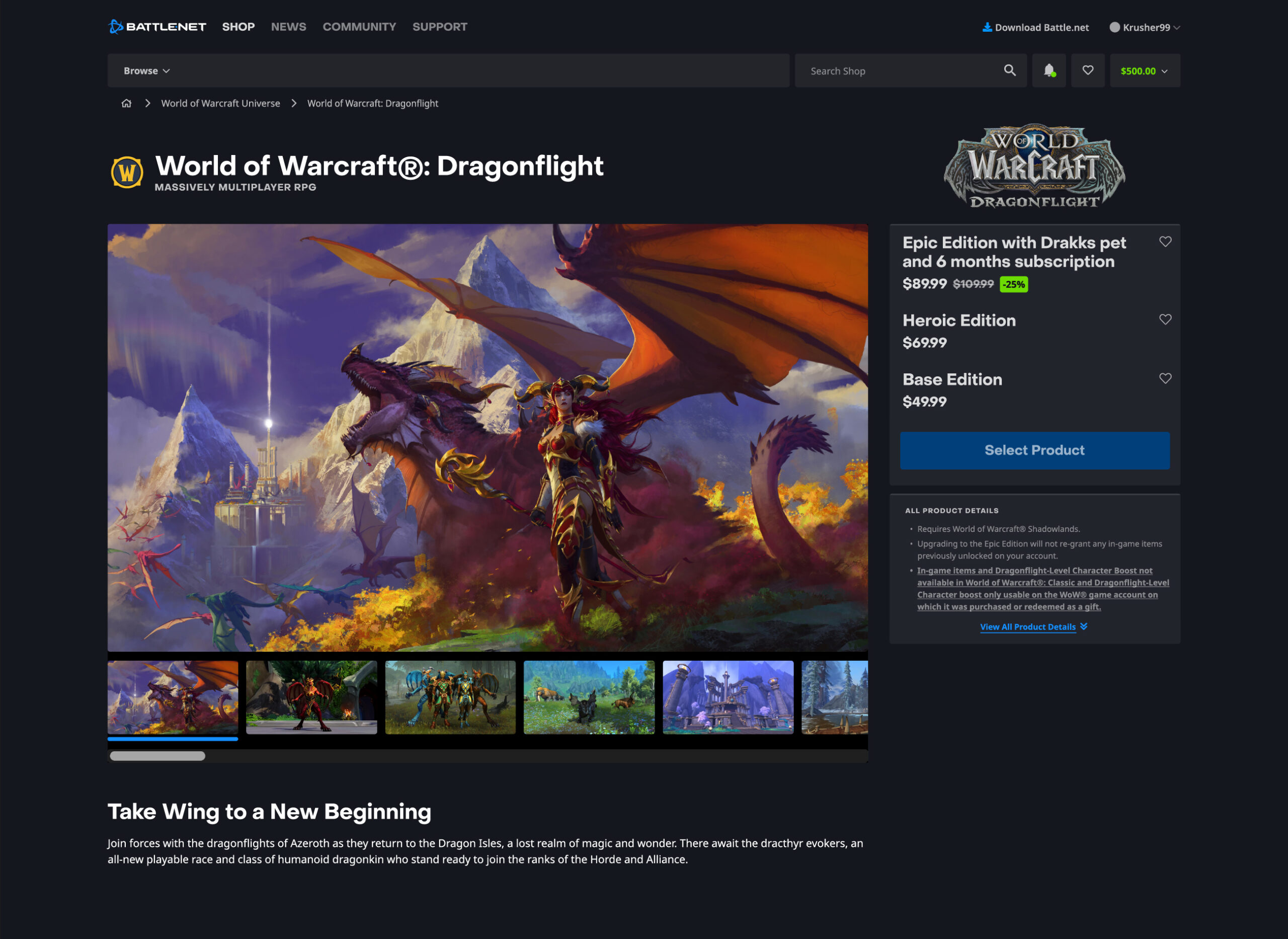
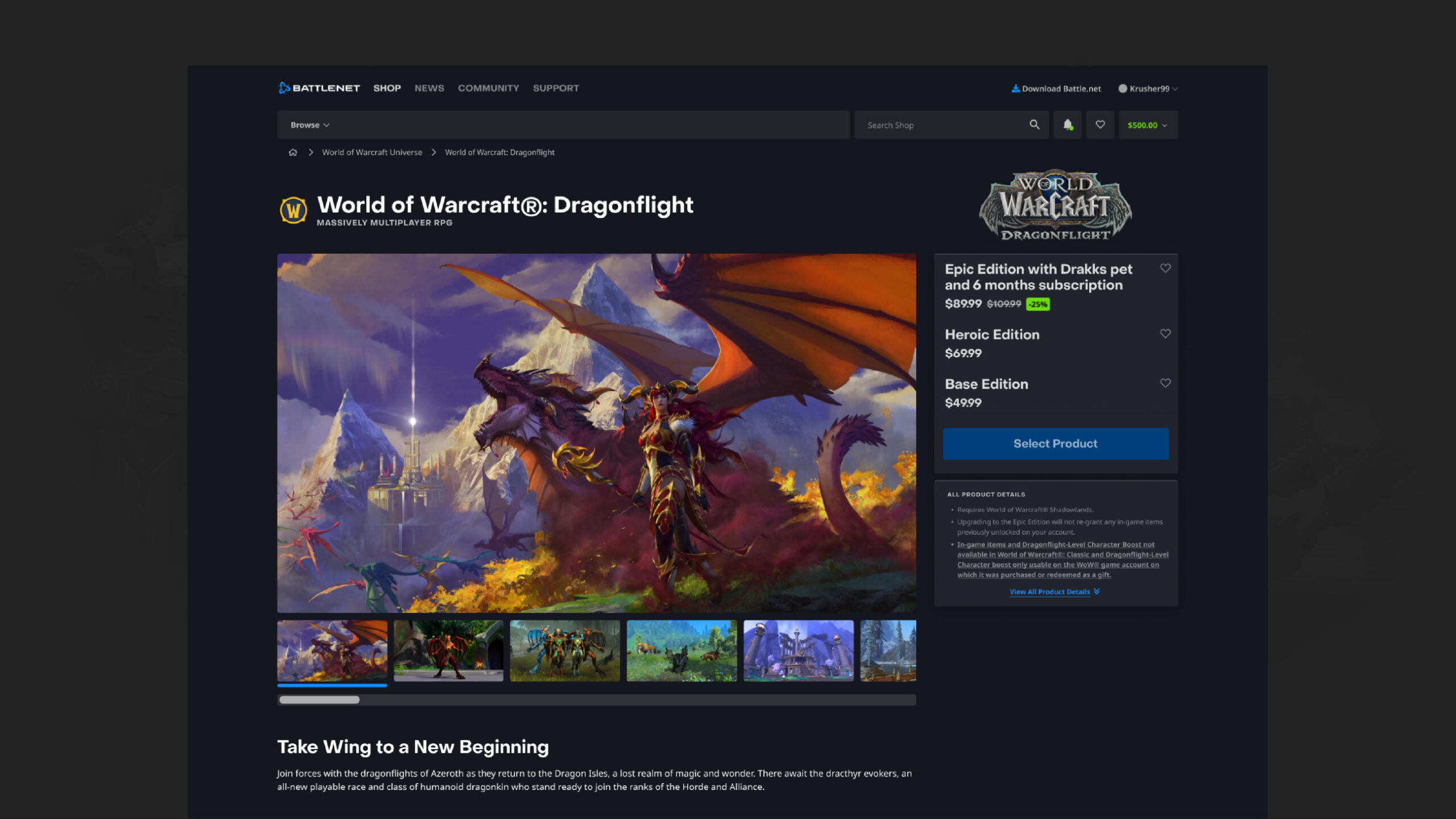
Old Product Page Design
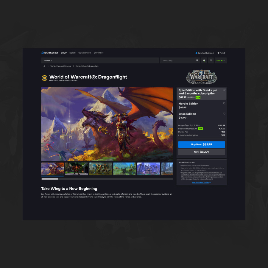
New Product Page Design
New Battle.net Product Page
New Image Display Interaction
Image Display
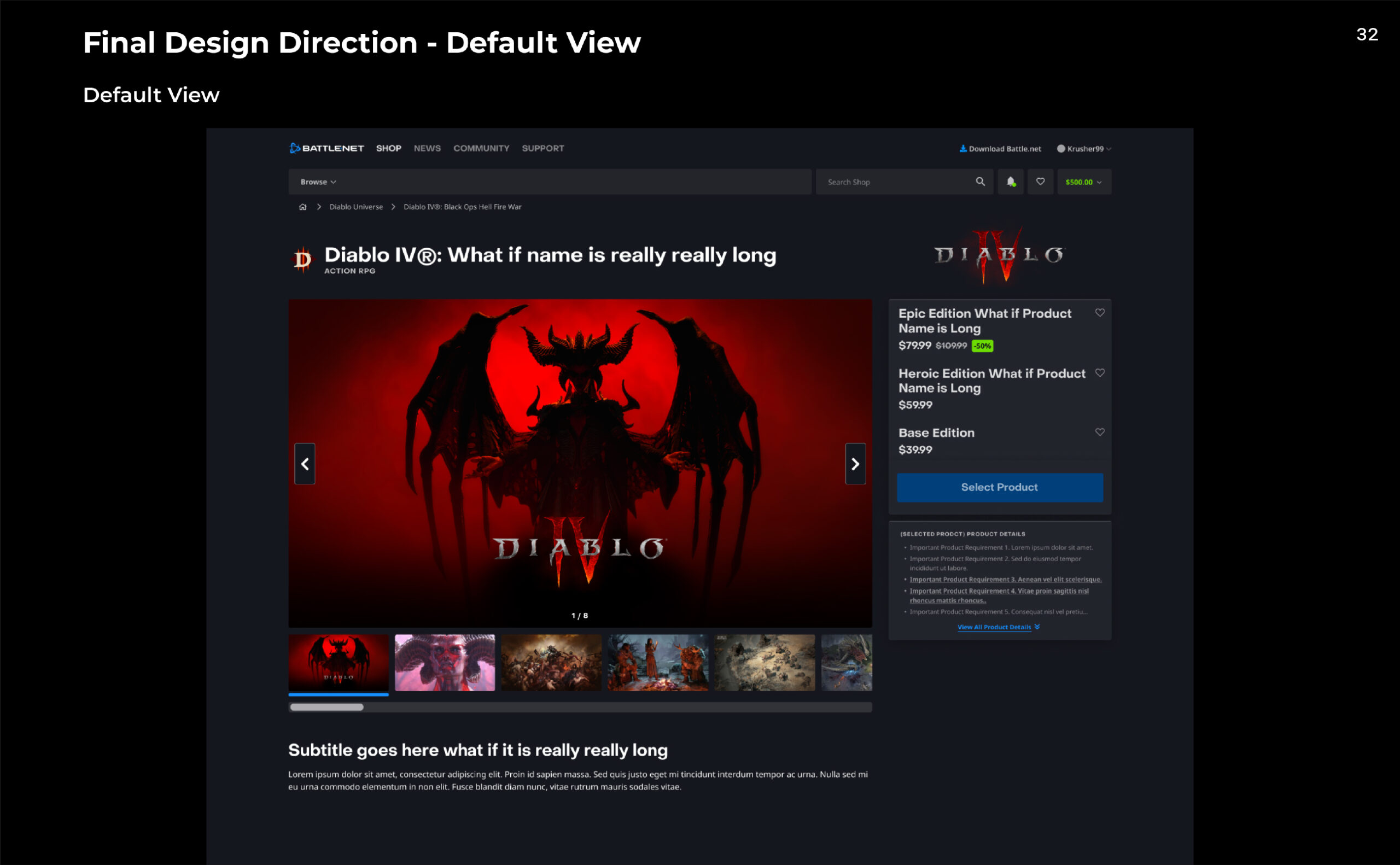
Old Product Page could not support multiple image/video assets at a glance. The new design has smooth connections between multiple assets with easy navigation. Also, the Image Display is interactive to the Purchase Panel. When Users select different product editions on the Purchase Panel, the display will show other associated images to help the Users clearly understand the product.
All the images displayed on the Product Page now are 16:9 ratio. Partner teams no longer need to worry about trimming and adjusting the focal point from the Purchase Panel.
New Purchase Panel and Legal Information Interaction
Purchase Panel
The small preview images on the old Purchase Panel were not very useful. The image was difficult to view, and they were identical images with slight color variations. With the new Purchase Panel, the small preview images are gone and are now linked with Image Display instead. With this change, the Users can now view the images larger and free the Purchase Panel of a lot of space.
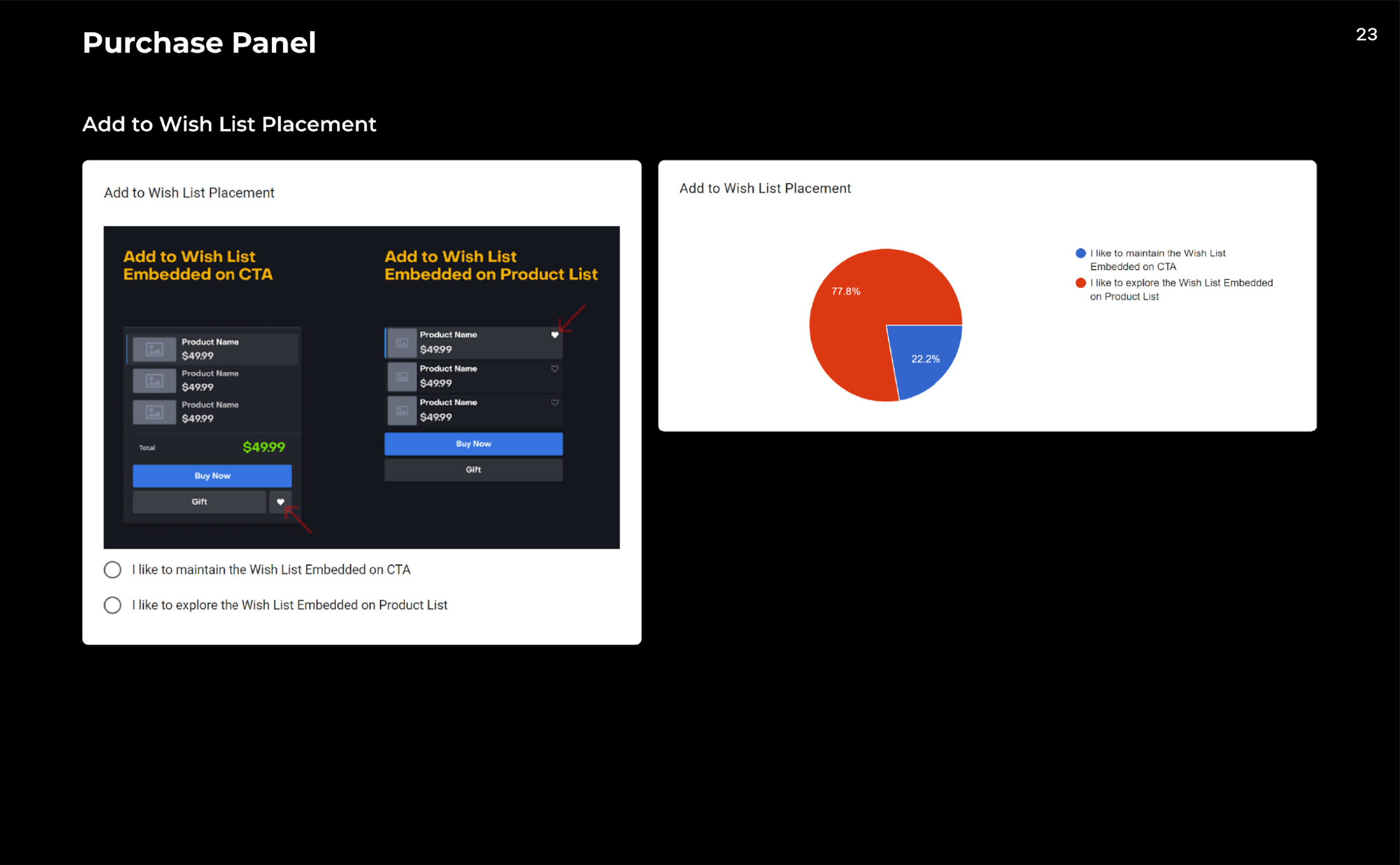
All the old Purchase Panel had a “Add to Wish List” button as tertiary CTA. Hardly any Users utilized the Wish List CTA page, and the user experience of adding and viewing their wish list was poor. The Wish List CTA is now embedded on the product selection card as a heart icon. This improved the legibility compared to the old design.
Legal Information
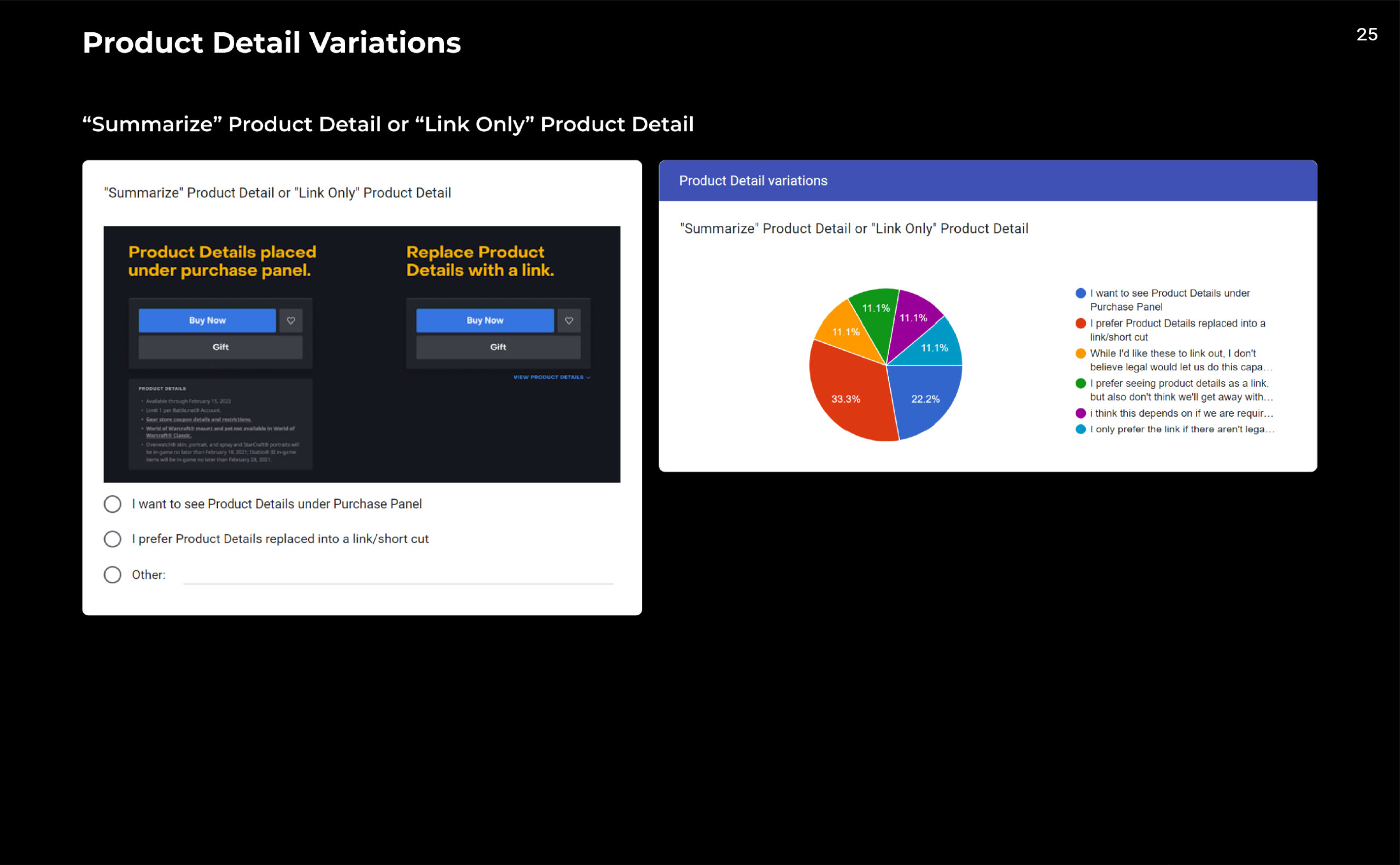
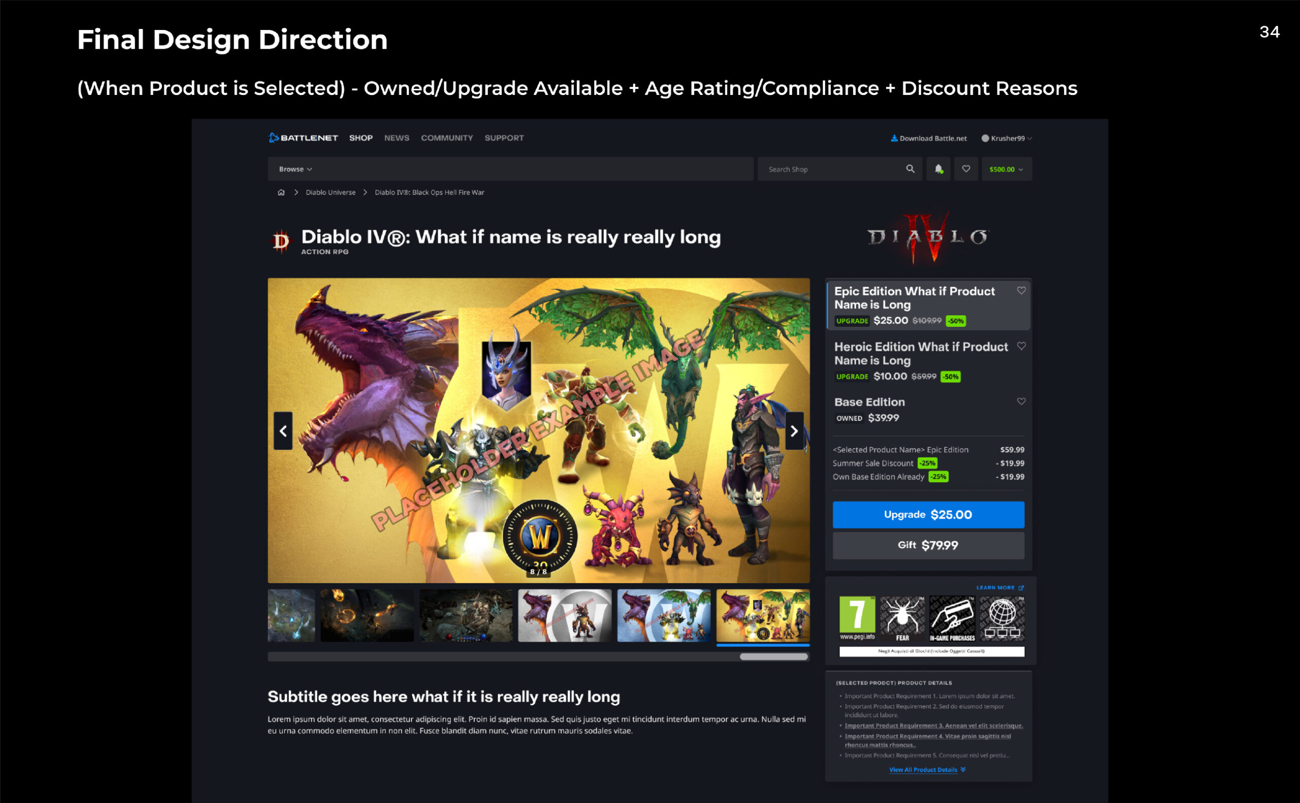
The Product Page used to show all the legal texts under the Purchase Panel and it was often worse in different regions.This is because the legal regulations vary in different countries. While the legal texts are important, placing these below the Purchase Panel distracts the Users from focusing on the purchasing experience.
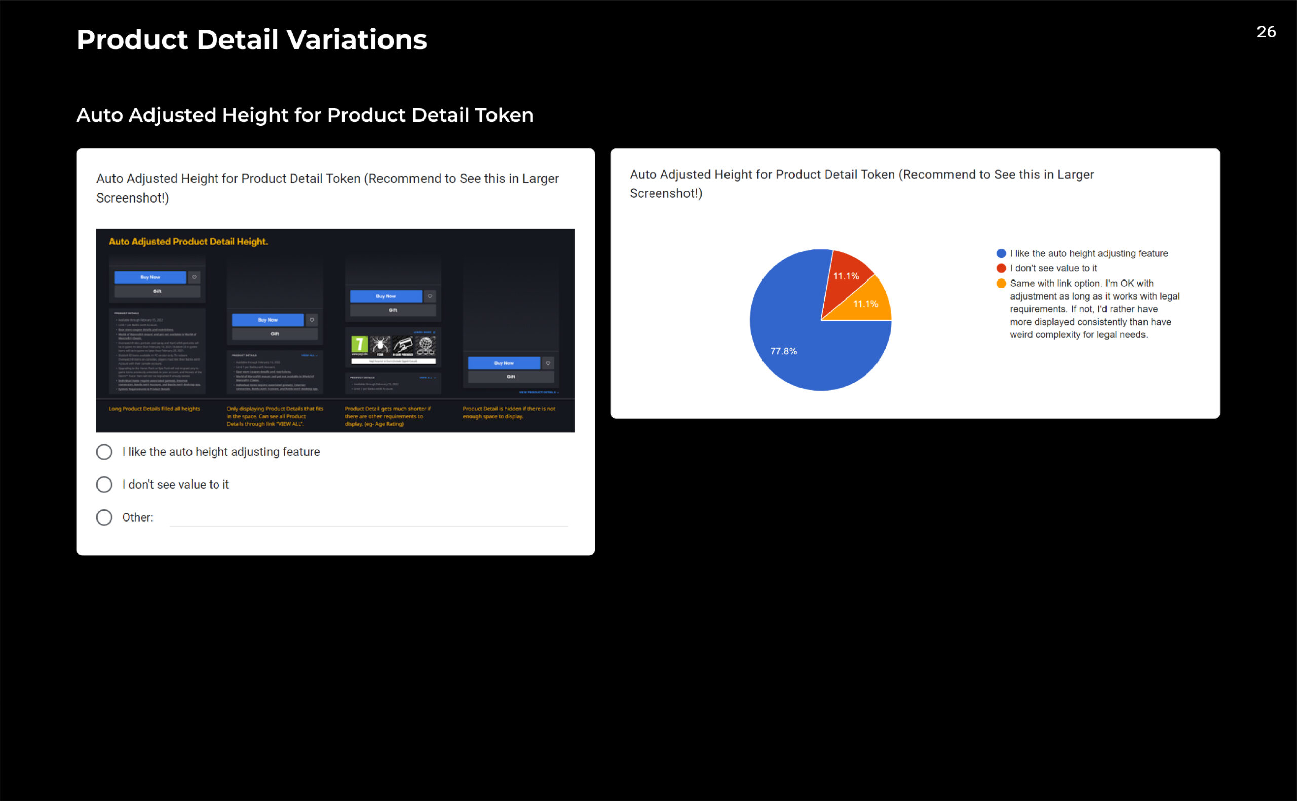
The new format has a limited number of lines for these legal texts and additional lines are relocated to the bottom of the page. There is a link text embedded for Users who wish to learn more about the product. This is beneficial for the Users because they no longer need to be confused with unclear legal text, and this is beneficial for the legal team stakeholders because the team no longer needs to be concerned about limiting the word counts.
The new legal text is now linked to the purchase panel too. Like the Image Display, the legal text also changes with different product selection. This can provide more accurate legal information for the selected product level.
New Purchase Flow
Purchase Flow Look
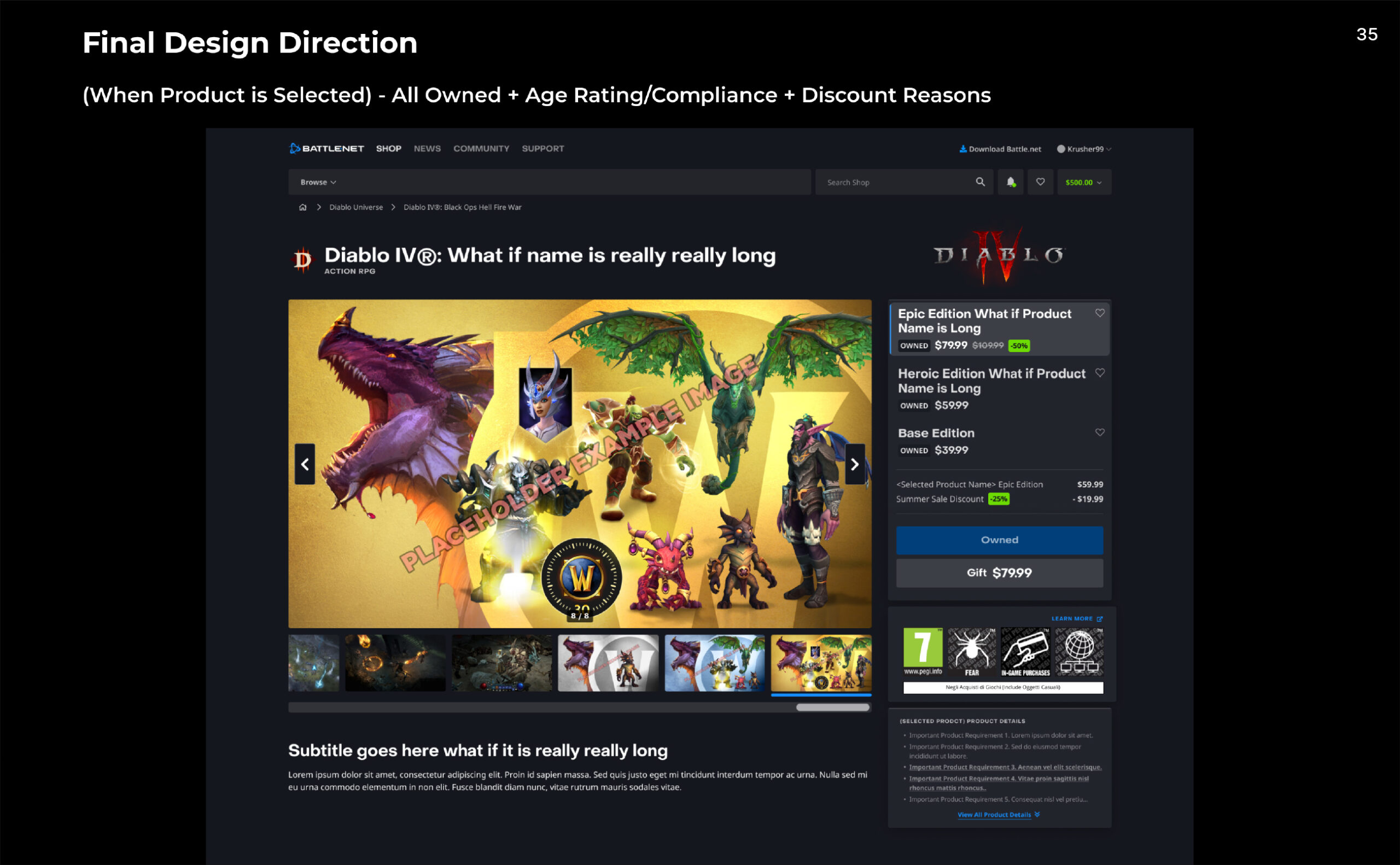
Once a user purchases one edition of a product, it impacts the price and legal information of the other editions. The new purchase flow includes updated information, displaying more accuracy for users to understand their purchases and any discounts applied.
Additionally, by replacing the primary CTA to "Owned," users can easily identify the products they already own without needing to check their purchase availability at the Checkout stage.
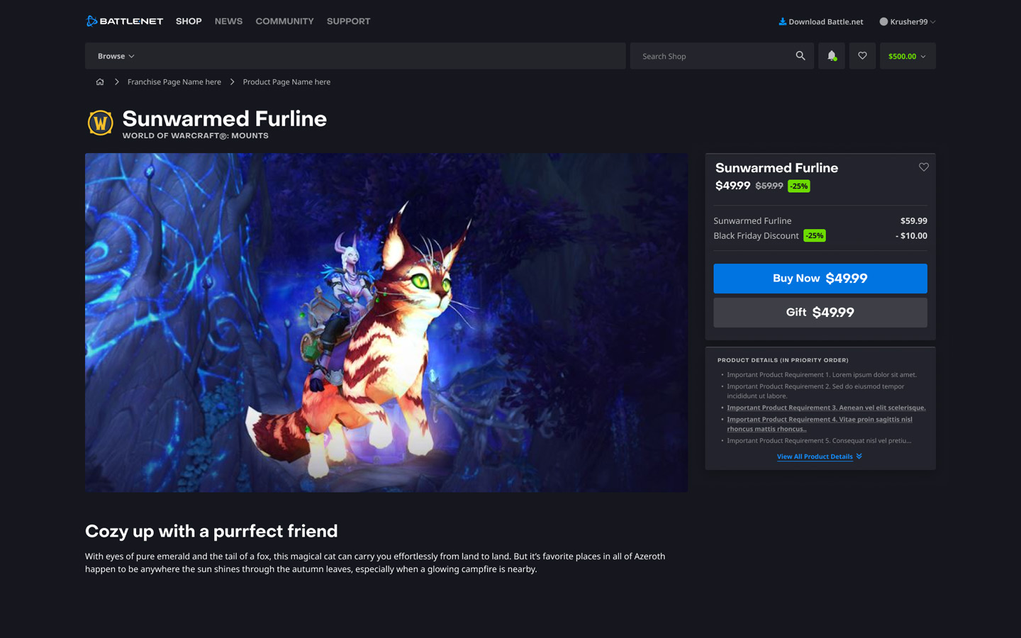
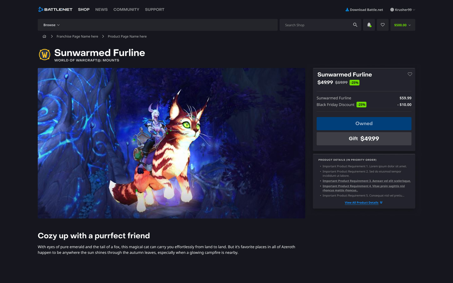
Single Product Design
Single Product Page
The single product page is simpler compared to the complex multi-product scenario. It only needs to display one product, either as available for purchase or already purchased.
Step 4
Component Update
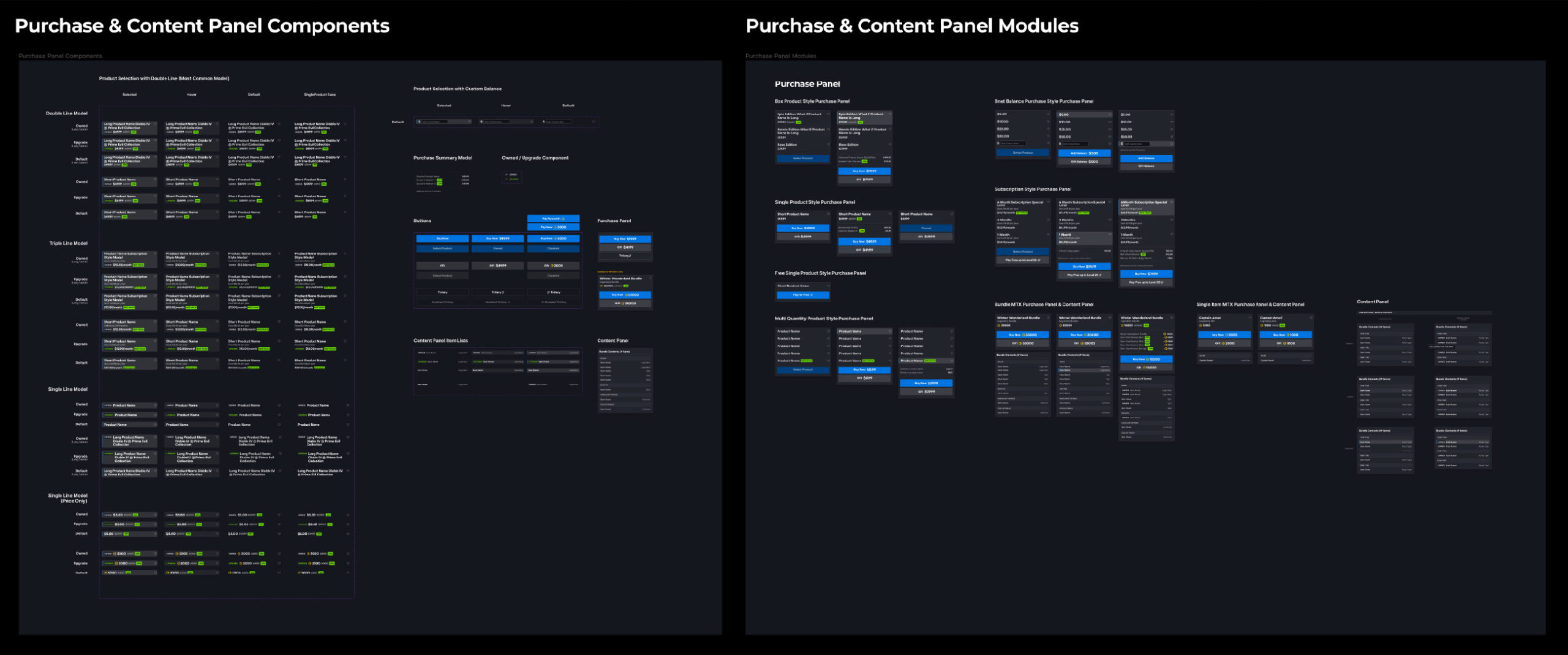
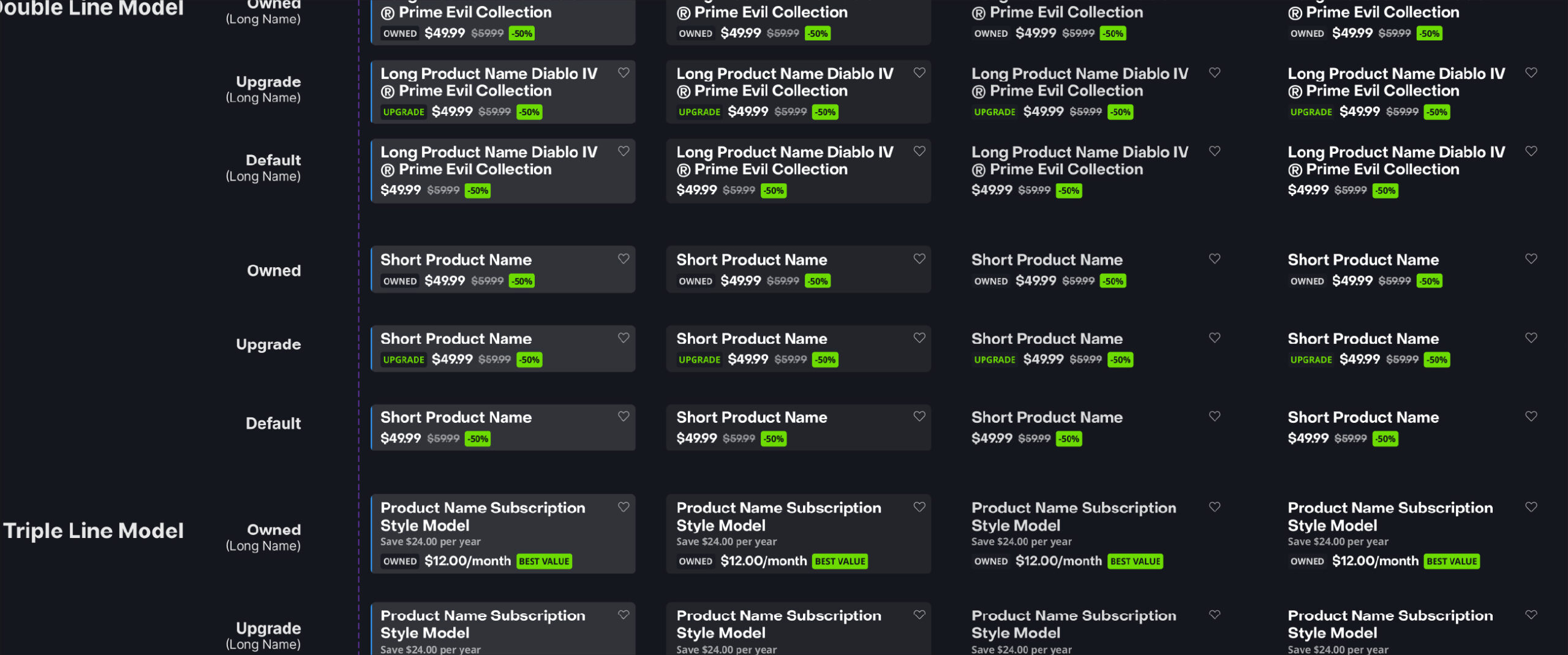
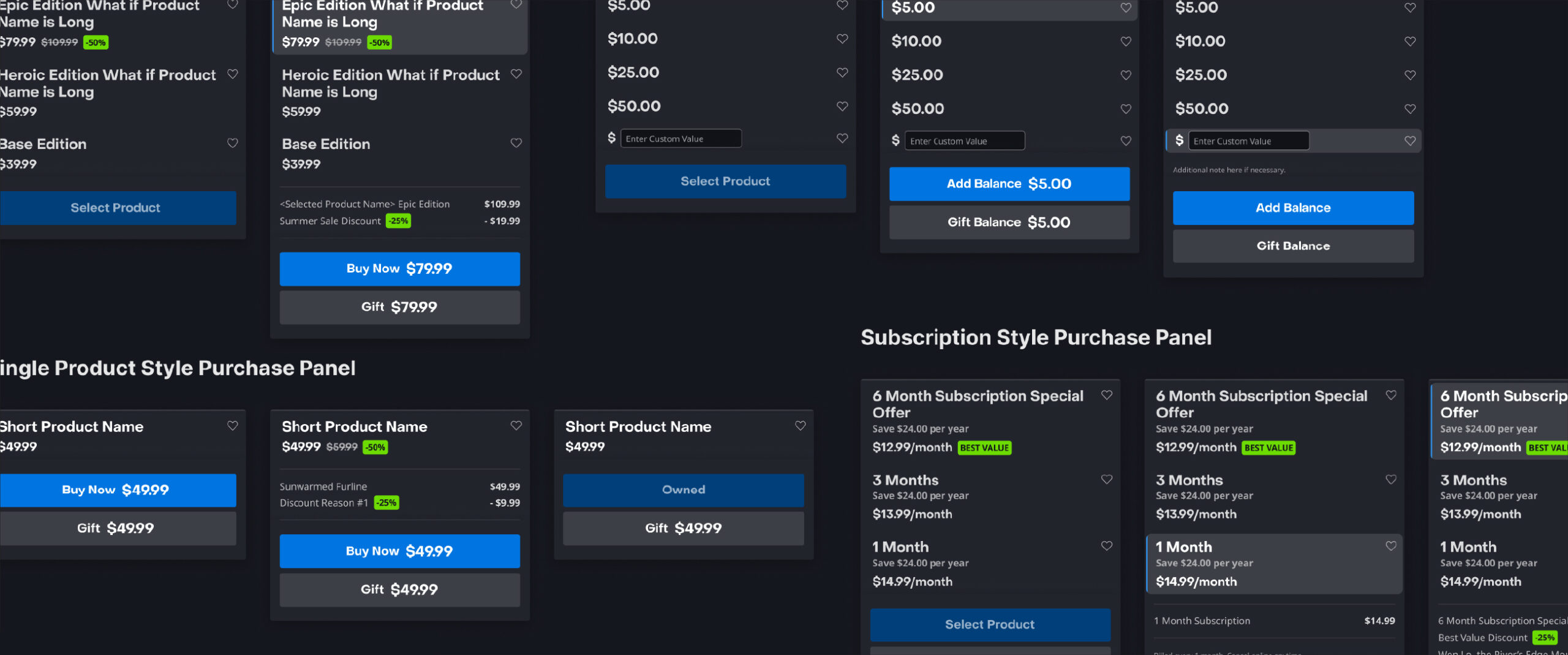
Introducing New Components
Most of the new component works were applied on the Purchase Panel and the New Image Display. The New Image Display component will be live first due to the MTX initiative. The targeted launch date is faster than the Product Page redesign project.
The team is focused on the MTX initiative, so the component review with engineers and PMs are on hold (Q4 2022). However, some of the components will be reviewed and launched following the MTX Phases. Stay tuned for more updates!
User Testing
Because the Product Page Redesign project is on hold due to the MTX initiative, user testing was done along with the MTX user testing. Once the MTX cools down, I am anticipating more user testing for more data.
Final Thoughts & Takeaway
This was one of the most complicated projects I have completed. There were many obstacles and challenges due to the complexity of product organization and the number of partners & stakeholders involved. I learned a lot from managing this project in both process planning and product understanding.
Check my other works too!
© 2025 Felix Junghwan Choi; All rights reserved.
